TL;DR
- Animated presentations use motion, including transitions, object animations, and video, to guide attention and pace the delivery of information to your audience.
- Three core animation types exist, and choosing the right one depends on what you need the audience to see and when.
- Animation works best for data reveals, storytelling arcs, and step-by-step processes. Skip it for dense reference decks and leave-behinds.
- Keeping motion smooth means limiting styles, matching speed to your speaking pace, and testing the full slideshow before you present.
- Presentations.AI automatically applies polished, on-brand animations to your slides, so you get professional motion without touching a single timing setting.
You add a few animations to your slide deck. A spinning icon here, a bounce entrance there, maybe a cube transition because it looked interesting. Then you present, and the whole thing feels like a theme park ride no one asked for.
Most people have a direction problem, not a motion problem. They know animated presentations look more engaging than static ones. They just lack clarity on which animations to use, where to place them, or when to leave a slide completely still.
That gap between wanting motion and using it well is where decks go sideways. Slides end up cluttered, pacing feels off, and the audience watches effects instead of absorbing the message.
This guide closes that gap. You'll learn what animated presentations actually are, the three types of animation available to you, and when motion helps versus when it hurts. By the end, you'll know exactly how to add movement that makes your slides clearer, not busier.
What Are Animated Presentations?
Animated presentations are slide decks that use motion to guide how an audience sees, processes, and remembers information. That motion can take several forms: a fade between slides, a chart that builds bar by bar, or a short video loop playing behind a headline. Each movement exists to direct attention to a specific place.
Static slide decks show everything at once. The audience's eyes land wherever they want, often on the wrong detail first. Animated presentations change that equation. They let you control the sequence. You decide what appears first, what follows, and what stays hidden until the right moment. A good starting point is a set of presentation templates that already have animation built into the layout, so you are not adding motion to a blank canvas.
Human vision is wired to track movement. A single object shifting on screen instantly pulls focus, without the presenter needing to say "look here." When you reveal one data point at a time, the audience absorbs each number on its own terms. When you fade into a new section, the transition signals a shift in topic before a single word is spoken.
This is also where the biggest misconception lives. Animation is about clarity, not spectacle. Spinning logos, bouncing bullet points, and checkerboard transitions make a deck feel dated rather than professional. Every motion should earn its place by helping the audience understand something faster or remember it longer. An animation that does neither is decoration, and decoration competes with your message.
Did You Know: Even a single well-placed fade on a key number can change how your audience processes and retains that takeaway — no complex animation sequence required.
Think of animated presentations as a pacing tool, not a design flourish. When motion serves the message, slides feel alive. When it falls short, they feel noisy. The difference comes down to knowing which type of animation to reach for and when to leave a slide still. If you want to start building right away, Presentations.AI's presentation maker handles animations automatically so that you can focus on the message.
Three Types of Slide Animation (and What Each One Does)
Animation works differently depending on where it lives in your deck. Some motion happens between slides. Some acts on individual objects within a single slide. Some involve embedded media that plays on its own. Understanding these three categories helps you pick the right tool for each moment.
Transitions
Transitions are the animations that play when you move from one slide to the next. A simple fade gently dissolves the current slide into the following one, creating a calm, seamless flow. A morph transition maps shared elements between two slides and smoothly moves them into new positions, which is ideal for showing change over time. A push or slide transition physically moves the old slide off-screen as the new one enters, giving a sense of forward momentum.
The feel each transition creates matters more than the effect itself. Fades feel polished and neutral. Morphs feel modern and intentional. Wipes and pushes feel energetic and directional. Pick a transition that matches your deck's tone, then stick with it for most or all of your slides. One consistent transition tells the audience "we're moving forward." Five different transitions tell them nothing.
Object Animations
Object animations act on individual elements within a slide. A text block, an icon, a chart, or an image each responds to four effect categories: entrance effects bring an element onto the slide, emphasis effects draw attention to something already visible, exit effects remove an element, and motion paths move an object along a custom route.
The most practical use is the staggered reveal. Instead of showing five bullet points at once, you bring each one in on a click or after a short delay. The audience reads one point, processes it, and then receives the next. This adjustment keeps viewers in sync with your narration rather than reading three points ahead while you discuss the first.
Object animations give you granular control. You choose what appears, when it appears, and how long the entrance takes. That precision is powerful but easy to overuse, which is why restraint matters as much as technique.
Video Clips and Motion Graphics
A static image cannot always communicate what a short clip can. A fifteen-second product demo or a looping motion graphic of a workflow delivers information that would take several slides to explain with text and screenshots alone.
Embedded video beats a static image when you need to show a process, demonstrate interaction, or create atmosphere. A looping background clip behind a keynote statement adds dramatic weight without requiring extra narration.
File size is the practical trade-off. Video and high-resolution GIFs increase your deck's total size, which can slow load times during remote presentations or cause playback hiccups on older hardware. Compress clips before embedding them, and test playback on the device you will actually present from.
When to Use Animation in a Presentation (and When to Skip It)
Knowing the types of animation is only half the equation. Knowing when to apply them and when to leave them as is is what separates a polished deck from a distracting one.
Animation earns its place in specific scenarios. The data reveals a benefit to staggered builds because the audience processes one number before the next appears. Step-by-step processes become easier to follow when each stage is animated in sequence. Storytelling arcs gain momentum from transitions that mark shifts in time, setting, or perspective.
When energy dips midway through a long presentation, a well-timed motion element can pull attention back to the screen, though animation is one option among many. There are other practical ways to re-engage an audience mid-presentation that work alongside motion rather than depending on it.
Static slides win in other situations. Dense reference decks that people read on their own after the meeting require scannability, not entrance effects. Leave-behind documents lose their animations in PDF format anyway, so the motion adds nothing. Highly technical reviews where stakeholders want to move fast are slowed down by animations that force a fixed pace. In those rooms, speed and density beat sequencing.
Context shapes the decision, too. A boardroom expects restraint. A classroom benefits from visual aids that support learning. A conference keynote can handle bolder motion because the setting is designed for spectacle. Read the room before you design the deck.
When you are unsure, apply a single test before adding any animation to a slide. For context, overusing animation is one of the most common mistakes people make when building AI presentations, and it tends to happen precisely when the goal and audience are not clearly defined upfront."
Callout: "Does this motion help the audience understand something faster or remember it longer?" If the answer is no, the slide works better without it.
That question keeps every animation intentional. It also permits you to leave slides still when stillness serves the message better than motion ever could.
How to Keep Animated Slides Smooth and Professional
Making animation feel seamless takes a few deliberate choices. These guidelines keep your motion polished and your audience focused on the content, not the effects.
Start by limiting yourself to one or two animation styles per deck. If your entrance effect is a fade-up, use that fade-up everywhere you need an entrance. Mixing fade-ups with fly-ins and zooms within the same presentation creates visual noise. Consistency signals intention. Unplanned variety signals chaos.
Match animation speed to the pace of your delivery. An animation that finishes before you start speaking feels rushed. One that lingers after your sentence ends feels sluggish. The motion and the narration should land together.
Use animation to reveal, not to decorate. Every moving element should carry information or guide attention to something specific. If an animation exists only because the slide "felt empty," remove it. Decoration competes with your message.
Keep transitions uniform across slides. A single transition style used throughout creates rhythm. Mixing several transition types breaks that rhythm and makes the deck feel stitched together from different sources.
Timing and Speed
Most presentation tools let you set animation duration in seconds. For subtle, utility-driven motion, such as a text fade or a quiet slide transition, aim for 0.3 to 0.5 seconds. For emphasis, moments when you want the audience to notice the motion itself, 0.7 to 1 seconds work well. Anything beyond one second risks feeling slow unless the animation is central to a story beat. Be cautious with auto-advance timing. Slides that move forward on a fixed timer can outpace your narration or leave awkward silences if you speak faster than planned. Click-to-advance gives you control.
Visual Consistency
Think of your animation palette the way you think of your color palette. A brand deck uses two or three colors intentionally. The same discipline applies to motion. Pick your entrance and transition styles, then use only those. Starting from a cohesive base helps. When you build on presentation templates designed with consistent visual language, animation choices feel like natural extensions of the design rather than afterthoughts bolted on. Colors, fonts, and motion style should all reflect the same visual identity.
Pro Tip: Run your slideshow end-to-end at least once at full speed before presenting. Animations that feel fine slide-by-slide can feel relentless in sequence. A full run-through reveals pacing problems your slide editor never will.
Test on the actual screen or device you will use. Animation timing feels different on a laptop screen sitting two feet away than it does on a projected display in a conference room. What looked smooth in your office may feel jarring at scale, or vice versa. A five-minute test on the real setup saves you from surprises during the real presentation.
Rehearsal discipline applies well beyond animation, too. These presentation tips cover the full preparation process if you want a broader framework.
How AI Tools Make Building Animated Decks Easier
Adding animation to a presentation has traditionally meant clicking through menus, setting keyframes for individual objects, adjusting duration sliders, and previewing the result. For non-designers, the process is tedious enough to abandon halfway through. The deck ends up over-animated from experimenting or completely static because the effort outweighs the payoff.
AI-assisted tools change that workflow at its foundation. You provide the content, an outline, a script, or a rough set of ideas, and the tool produces a fully animated deck. The AI selects animation types based on the slide's content and layout. It assigns timing that matches the pacing of your information. It sequences object entrances so that they feel logical rather than random. The decisions that used to require dozens of manual adjustments happen in the background.
Automatic brand alignment is one of the most practical benefits. AI applies motion styles that complement your existing fonts, colors, and tone. A corporate deck receives restrained fades and clean builds. A creative pitch gets bolder transitions and more expressive object motion. Animation choices stem from the same design logic that shaped the rest of the slide, so nothing feels off-brand.
The barrier to entry drops significantly. Someone who has never touched an animation panel can produce smooth, professional results on the first attempt. There is no learning curve for duration settings, easing functions, or effect sequencing. The output looks like it was built by someone who animates slides for a living.
Many modern platforms now offer some form of AI-assisted animation, and the category is growing fast. If you want a side-by-side look at how these platforms compare in animation and other features, there is a full breakdown of the best AI presentation makers in 2026 worth checking out.
Presentations.AI automatically adds smooth, on-brand animations to your slides, with no need to set timing or effects manually. That kind of hands-off workflow turns animation from a chore into something that simply happens as part of building the deck.
Animated Presentation Examples Worth Studying
Seeing animation principles in action makes them easier to apply. These four scenarios show how purposeful motion strengthens different types of presentations.
Startup pitch deck: A founder uses morph transitions to show a product evolving from an early wireframe to a polished interface. Each slide shares the same device frame, and the morph smoothly transforms the screen content from one stage to the next. The audience watches the product grow without the presenter needing to explain every design iteration. The motion communicates progress instantly.
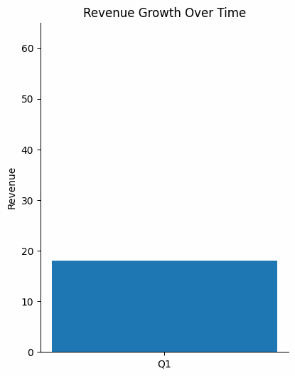
Quarterly business review. A finance lead builds a revenue chart bar by bar, pausing between each quarter's results. The staggered reveal lets the room absorb one data point before the next appears. When the final bar lands above the target line, the contrast hits harder because the audience followed the entire climb. A static chart showing all four bars at once would have buried that moment.
Classroom or training deck. An instructor animates a biological process across six steps. Each click adds a new stage to the diagram while the previous stages remain visible. Learners follow the logic in sequence instead of decoding a completed diagram on their own. The animation mirrors how the process actually unfolds in real time.
Conference keynote. A speaker places a single bold statement over a full-screen looping video of their product in use. No bullet points. No sub-headers. The embedded clip creates atmosphere and credibility while the text delivers the core message. The restraint makes the moment land.
Each example succeeds for the same reasons: motion serves the message, the animation palette stays limited, and nothing moves without a clear purpose.
Suggested Read: Explore the Presentations.AI homepage for animated presentation templates and hands-on inspiration to start building your own deck.
Make Every Motion Count
Animated presentations work when every motion earns its place. You now know the three types of animation and the scenarios where each one shines, along with the restraint principles that keep a deck feeling professional instead of frantic.
The real skill involves developing the discipline to ask whether each animation helps your audience understand faster or remember longer. Start with one transition style and one object animation approach. Master those before expanding.
Motion should feel invisible, with your audience noticing the message landing rather than the fade that carried it there. That mindset turns animation from a risk into one of the most effective communication tools in your deck.

%20(1).webp)