TL;DR
- Animated presentations use motion, including transitions, object animations, and video, to guide attention and pace the delivery of information to your audience.
- Three core animation types exist, and choosing the right one depends on what you need the audience to see and when.
- Animation works best for data reveals, storytelling arcs, and step-by-step processes. Skip it for dense reference decks and leave-behinds.
- Keeping motion smooth means limiting styles, matching speed to your speaking pace, and testing the full slideshow before you present.
- Presentations.AI automatically applies polished, on-brand animations to your slides, so you get professional motion without touching a single timing setting.
You add a few animations to your slide deck. A spinning icon here, a bounce entrance there, maybe a cube transition because it looked interesting. Then you present, and the whole thing feels like a theme park ride no one asked for.
Most people have a direction problem, not a motion problem. They know animated presentations look more engaging than static ones. They just lack clarity on which animations to use, where to place them, or when to leave a slide completely still.
That gap between wanting motion and using it well is where decks go sideways. Slides end up cluttered, pacing feels off, and the audience watches effects instead of absorbing the message.
This guide closes that gap. You'll learn what animated presentations actually are, the three types of animation available to you, and when motion helps versus when it hurts. By the end, you'll know exactly how to add movement that makes your slides clearer, not busier.
What Are Animated Presentations?
Animated presentations are slide decks that use motion to guide how an audience sees, processes, and remembers information. That motion can take several forms: a fade between slides, a chart that builds bar by bar, or a short video loop playing behind a headline. Each movement exists to direct attention to a specific place.
Static slide decks show everything at once. The audience's eyes land wherever they want, often on the wrong detail first. Animated presentations change that equation. They let you control the sequence. You decide what appears first, what follows, and what stays hidden until the right moment. A good starting point is a set of presentation templates that already have animation built into the layout, so you are not adding motion to a blank canvas.
Human vision is wired to track movement. A single object shifting on screen instantly pulls focus, without the presenter needing to say "look here." When you reveal one data point at a time, the audience absorbs each number on its own terms. When you fade into a new section, the transition signals a shift in topic before a single word is spoken.
This is also where the biggest misconception lives. Animation is about clarity, not spectacle. Spinning logos, bouncing bullet points, and checkerboard transitions make a deck feel dated rather than professional. Every motion should earn its place by helping the audience understand something faster or remember it longer. An animation that does neither is decoration, and decoration competes with your message.
Did You Know: Even a single well-placed fade on a key number can change how your audience processes and retains that takeaway — no complex animation sequence required.
Think of animated presentations as a pacing tool, not a design flourish. When motion serves the message, slides feel alive. When it falls short, they feel noisy. The difference comes down to knowing which type of animation to reach for and when to leave a slide still. If you want to start building right away, Presentations.AI's presentation maker handles animations automatically so that you can focus on the message.
Three Types of Slide Animation (and What Each One Does)
Animation works differently depending on where it lives in your deck. Some motion happens between slides. Some acts on individual objects within a single slide. Some involve embedded media that plays on its own. Understanding these three categories helps you pick the right tool for each moment.
Transitions
Transitions are the animations that play when you move from one slide to the next. A simple fade gently dissolves the current slide into the following one, creating a calm, seamless flow. A morph transition maps shared elements between two slides and smoothly moves them into new positions, which is ideal for showing change over time. A push or slide transition physically moves the old slide off-screen as the new one enters, giving a sense of forward momentum.
The feel each transition creates matters more than the effect itself. Fades feel polished and neutral. Morphs feel modern and intentional. Wipes and pushes feel energetic and directional. Pick a transition that matches your deck's tone, then stick with it for most or all of your slides. One consistent transition tells the audience "we're moving forward." Five different transitions tell them nothing.
Object Animations
Object animations act on individual elements within a slide. A text block, an icon, a chart, or an image each responds to four effect categories: entrance effects bring an element onto the slide, emphasis effects draw attention to something already visible, exit effects remove an element, and motion paths move an object along a custom route.
The most practical use is the staggered reveal. Instead of showing five bullet points at once, you bring each one in on a click or after a short delay. The audience reads one point, processes it, and then receives the next. This adjustment keeps viewers in sync with your narration rather than reading three points ahead while you discuss the first.
Object animations give you granular control. You choose what appears, when it appears, and how long the entrance takes. That precision is powerful but easy to overuse, which is why restraint matters as much as technique.
Video Clips and Motion Graphics
A static image cannot always communicate what a short clip can. A fifteen-second product demo or a looping motion graphic of a workflow delivers information that would take several slides to explain with text and screenshots alone.
Embedded video beats a static image when you need to show a process, demonstrate interaction, or create atmosphere. A looping background clip behind a keynote statement adds dramatic weight without requiring extra narration.
File size is the practical trade-off. Video and high-resolution GIFs increase your deck's total size, which can slow load times during remote presentations or cause playback hiccups on older hardware. Compress clips before embedding them, and test playback on the device you will actually present from.
When to Use Animation in a Presentation (and When to Skip It)
Knowing the types of animation is only half the equation. Knowing when to apply them and when to leave them as is is what separates a polished deck from a distracting one.
Animation earns its place in specific scenarios. The data reveals a benefit to staggered builds because the audience processes one number before the next appears. Step-by-step processes become easier to follow when each stage is animated in sequence. Storytelling arcs gain momentum from transitions that mark shifts in time, setting, or perspective.
When energy dips midway through a long presentation, a well-timed motion element can pull attention back to the screen, though animation is one option among many. There are other practical ways to re-engage an audience mid-presentation that work alongside motion rather than depending on it.
Static slides win in other situations. Dense reference decks that people read on their own after the meeting require scannability, not entrance effects. Leave-behind documents lose their animations in PDF format anyway, so the motion adds nothing. Highly technical reviews where stakeholders want to move fast are slowed down by animations that force a fixed pace. In those rooms, speed and density beat sequencing.
Context shapes the decision, too. A boardroom expects restraint. A classroom benefits from visual aids that support learning. A conference keynote can handle bolder motion because the setting is designed for spectacle. Read the room before you design the deck.
When you are unsure, apply a single test before adding any animation to a slide. For context, overusing animation is one of the most common mistakes people make when building AI presentations, and it tends to happen precisely when the goal and audience are not clearly defined upfront."
Callout: "Does this motion help the audience understand something faster or remember it longer?" If the answer is no, the slide works better without it.
That question keeps every animation intentional. It also permits you to leave slides still when stillness serves the message better than motion ever could.
How to Keep Animated Slides Smooth and Professional
Making animation feel seamless takes a few deliberate choices. These guidelines keep your motion polished and your audience focused on the content, not the effects.
Start by limiting yourself to one or two animation styles per deck. If your entrance effect is a fade-up, use that fade-up everywhere you need an entrance. Mixing fade-ups with fly-ins and zooms within the same presentation creates visual noise. Consistency signals intention. Unplanned variety signals chaos.
Match animation speed to the pace of your delivery. An animation that finishes before you start speaking feels rushed. One that lingers after your sentence ends feels sluggish. The motion and the narration should land together.
Use animation to reveal, not to decorate. Every moving element should carry information or guide attention to something specific. If an animation exists only because the slide "felt empty," remove it. Decoration competes with your message.
Keep transitions uniform across slides. A single transition style used throughout creates rhythm. Mixing several transition types breaks that rhythm and makes the deck feel stitched together from different sources.
Timing and Speed
Most presentation tools let you set animation duration in seconds. For subtle, utility-driven motion, such as a text fade or a quiet slide transition, aim for 0.3 to 0.5 seconds. For emphasis, moments when you want the audience to notice the motion itself, 0.7 to 1 seconds work well. Anything beyond one second risks feeling slow unless the animation is central to a story beat. Be cautious with auto-advance timing. Slides that move forward on a fixed timer can outpace your narration or leave awkward silences if you speak faster than planned. Click-to-advance gives you control.
Visual Consistency
Think of your animation palette the way you think of your color palette. A brand deck uses two or three colors intentionally. The same discipline applies to motion. Pick your entrance and transition styles, then use only those. Starting from a cohesive base helps. When you build on presentation templates designed with consistent visual language, animation choices feel like natural extensions of the design rather than afterthoughts bolted on. Colors, fonts, and motion style should all reflect the same visual identity.
Pro Tip: Run your slideshow end-to-end at least once at full speed before presenting. Animations that feel fine slide-by-slide can feel relentless in sequence. A full run-through reveals pacing problems your slide editor never will.
Test on the actual screen or device you will use. Animation timing feels different on a laptop screen sitting two feet away than it does on a projected display in a conference room. What looked smooth in your office may feel jarring at scale, or vice versa. A five-minute test on the real setup saves you from surprises during the real presentation.
Rehearsal discipline applies well beyond animation, too. Ces conseils de présentation couvrent l'ensemble du processus de préparation si vous souhaitez un cadre plus large.
Comment les outils d'IA facilitent la création de présentations animées
Ajouter de l'animation à une présentation signifiait traditionnellement cliquer dans les menus, définir des images clés pour des objets individuels, ajuster les curseurs de durée et prévisualiser le résultat. Pour les non-designers, le processus est suffisamment fastidieux pour être abandonné à mi-chemin. La présentation finit par être sur-animée à force d'expérimenter ou complètement statique parce que l'effort dépasse le bénéfice.
Les outils assistés par l'IA transforment ce flux de travail en profondeur. Vous fournissez le contenu, un plan, un script ou un ensemble d'idées brutes, et l'outil produit une présentation entièrement animée. L'IA sélectionne les types d'animation en fonction du contenu et de la mise en page de la diapositive. Elle attribue un timing qui correspond au rythme de votre information. Elle séquence les entrées d'objets de manière à ce qu'elles semblent logiques plutôt qu'aléatoires. Les décisions qui nécessitaient auparavant des dizaines d'ajustements manuels se produisent en arrière-plan.
L'harmonisation automatique avec la marque est l'un des avantages les plus pratiques. L'IA applique des styles de mouvement qui complètent vos polices, couleurs et tonalités existantes. Une présentation d'entreprise bénéficie de fondus discrets et de constructions épurées. Un pitch créatif obtient des transitions plus audacieuses et des mouvements d'objets plus expressifs. Les choix d'animation découlent de la même logique de conception qui a façonné le reste de la diapositive, afin que rien ne semble décalé par rapport à la marque.
La barrière à l'entrée diminue considérablement. Quelqu'un qui n'a jamais touché à un panneau d'animation peut produire des résultats fluides et professionnels dès la première tentative. Il n'y a pas de courbe d'apprentissage pour les réglages de durée, les fonctions d'atténuation ou le séquençage des effets. Le résultat donne l'impression d'avoir été créé par quelqu'un dont c'est le métier d'animer des diapositives.
De nombreuses plateformes modernes proposent désormais une forme d'animation assistée par l'IA, et cette catégorie se développe rapidement. Si vous souhaitez une comparaison côte à côte de ces plateformes en termes d'animation et d'autres fonctionnalités, il existe un comparatif détaillé des meilleurs créateurs de présentations IA en 2026 à consulter.
Presentations.AI ajoute automatiquement des animations fluides et conformes à votre marque à vos diapositives, sans avoir besoin de régler manuellement le timing ou les effets. Ce type de flux de travail autonome transforme l'animation d'une corvée en quelque chose qui se produit simplement lors de la création de la présentation.
Exemples de présentations animées à étudier
Voir les principes d'animation en action facilite leur application. Ces quatre scénarios montrent comment un mouvement intentionnel renforce différents types de présentations.
Pitch deck de startup : Un fondateur utilise des transitions de morphing pour montrer l'évolution d'un produit, d'une ébauche de wireframe à une interface peaufinée. Chaque diapositive utilise le même cadre d'appareil, et le morphing transforme en douceur le contenu de l'écran d'une étape à l'autre. Le public voit le produit se développer sans que le présentateur n'ait besoin d'expliquer chaque itération de conception. Le mouvement communique instantanément le progrès.
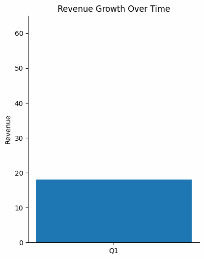
Bilan d'activité trimestriel. Un responsable financier construit un graphique de revenus barre par barre, marquant une pause entre les résultats de chaque trimestre. La révélation échelonnée permet à l'auditoire d'assimiler un point de données avant que le suivant n'apparaisse. Lorsque la dernière barre dépasse la ligne cible, le contraste est d'autant plus saisissant que le public a suivi toute la progression. Un graphique statique montrant les quatre barres en même temps aurait masqué ce moment.
Présentation en classe ou de formation. Un instructeur anime un processus biologique en six étapes. Chaque clic ajoute une nouvelle étape au diagramme tandis que les étapes précédentes restent visibles. Les apprenants suivent la logique séquentiellement au lieu de décoder un diagramme complet par eux-mêmes. L'animation reflète la manière dont le processus se déroule réellement en temps réel.
Discours d'ouverture de conférence. Un orateur place une seule déclaration audacieuse sur une vidéo en boucle plein écran de son produit en cours d'utilisation. Pas de puces. Pas de sous-titres. Le clip intégré crée une atmosphère et de la crédibilité tandis que le texte délivre le message essentiel. La sobriété rend le moment percutant.
Chaque exemple réussit pour les mêmes raisons : le mouvement sert le message, la palette d'animation reste limitée et rien ne bouge sans un objectif clair.
Lecture suggérée : Explorez le Presentations.AI page d'accueil pour des modèles de présentation animés et de l'inspiration concrète pour commencer à créer votre propre présentation.