%20(1).webp)
If you have ever walked out of a presentation thinking, "That could have been just an email," or sat through a slide deck that felt like someone printed out a Wikipedia article and read it to you, you already know what bad slide design feels like from the other side.
The good news: The 10 common presentation mistakes are fixable. Most of them take less than five minutes to correct once you know what to look for.
This article is aimed at anyone who presents regularly, whether that is in a conference room, a classroom, a sales call, or a job interview. You do not need a design background to apply any of these fixes.
Here are the 10 most common presentation mistakes, what each one actually costs you, and exactly what to do instead.
TL;DR
- Too much text on a slide forces your audience to read instead of listen.
- Reading off the screen is the fastest way to signal you don't actually know your material.
- A weak opening loses the room in the first 30 seconds.
- No clear structure means your audience has to work to follow you.
- Bad font choices and low contrast make slides physically hard to read.
- Visuals that don't connect to your point add noise instead of clarity.
- Design inconsistencies such as mismatched colors and different fonts per section signal lack of attention to detail.
- Data slides without a clear takeaway just make people stare at charts with no idea why they’re looking at them.
Where Presentations Go Wrong
Presentations fail due to too much text, a weak opening, visuals that don't earn their place, design that shifts style mid-deck. The mistakes are almost always the same, and almost always fixable. Here are the ten that show up most often.
1. Cramming Too Much Text onto One Slide
Dense slides create a fork in your audience's attention. They either read your slide or they listen to you. Research on cognitive load consistently shows they cannot do both at once, and when forced to choose, comprehension of both drops. You end up with an audience that is half-reading, half-listening, and fully confused.
Fix: Apply the one-idea rule. Each slide gets one point. If you need a paragraph to explain a slide, split it into two slides. If you need a bulleted list of six items, ask whether all six items are equally important: Usually two or three of them carry most of the weight, and the rest can live in your speaker notes.
A practical test: Shrink your slide preview to thumbnail size. If you cannot read the main point at that size, there is too much on the slide.
2. Reading Directly from Your Slides
Reading your slides word-for-word does two things: It signals to your audience that you did not prepare well enough to know your own material, and it makes you redundant. Your audience can read faster than you can talk, so they have already finished the slide before you are halfway through reading it. You are not adding anything — you are just slowing them down.
Fix: your slides should show the conclusion or the key piece of evidence. Your spoken words should tell the story around it. Think of each slide as a headline, not a transcript. If someone can understand your entire presentation without hearing you speak, your slides are doing too much of the work.
If you are worried about forgetting your content, use speaker notes. They are invisible to your audience and give you a full talk track without cluttering the slides themselves. This guide on how to start a presentation has a good section on building talk tracks that keep you on point without scripting yourself into a corner.
3. Starting with a Weak Opening
People make a split-second decision about whether a presentation is worth their attention. That decision happens in the opening. A weak opening: A long self-introduction, a housekeeping announcement, a slow "Let me just pull up the slides" tells your audience that you are not really thinking about their time.
Fix: Start in the middle of the story. Open with a number that surprises people, or a question that is hard to answer. Open with the most important thing you are going to say, and then spend the rest of the presentation proving it. For specific openers that work in different contexts, the presentation tips guide has a breakdown of opening structures by presentation type.
The goal is to give your audience a reason to lean in within the first 30 seconds. Everything after that will land better because they are already paying attention.
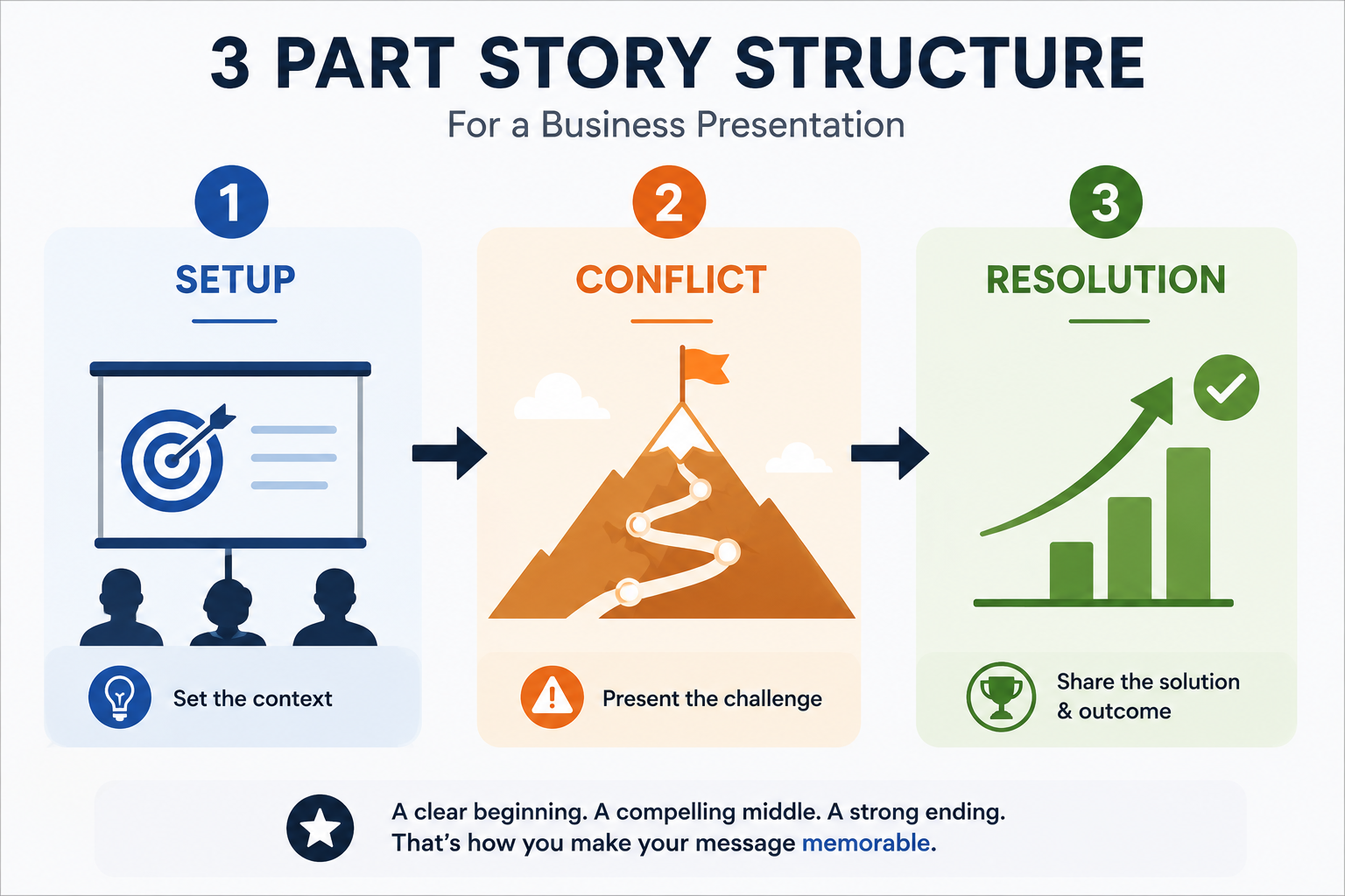
4. No Clear Structure
The most common version of this mistake: Slides that cover a lot of ground without building toward anything. Every slide feels self-contained. There is no sense of tension or progress. The audience sits through it and walks away unsure what the point was.
Fix: Use a three-part structure. Set up the situation. Introduce the tension or the problem. Resolve it. Even a straightforward quarterly update can follow this arc: here is where we are, here is the gap between where we are and where we need to be, here is what we are doing about it. That arc gives your audience a reason to stay engaged. They want to see how it resolves. If you are building a presentation from scratch, a solid presentation outline will help you map the structure before you design a single slide.
5. Poor Use of Visuals
A stock photo of a handshake on a slide about quarterly revenue, an icon that vaguely represents "growth" next to a sentence about compliance: These do not add value to your presentation. Charts, diagrams, and timelines can replace 300 words of explanation.
Fix: before adding any visual, ask what job it is doing. If the answer is "it looked nice" or "it filled the space," remove it. If the answer is "it shows the trend I'm talking about" or "it creates the contrast I need my audience to feel," keep it. Every visual should earn its place. If you are using an AI presentation maker that auto-generates layouts, it can handle the visual selection logic for you.
6. Bad Font Choices and Low Contrast
Font choices that feel refined in a design app often fall apart at projection scale or on lower-resolution screens. Thin font weights, light colors on white backgrounds, decorative typefaces with tight kerning: All of these trade readability for aesthetics, and that is the wrong trade in a presentation.
Fix: use a clean sans-serif font (Arial, Calibri, Inter, Helvetica: Any of these work). Keep body text at 24pt minimum and headlines at 32pt or larger. Ensure strong contrast between your text color and background color. A simple test: stand six feet back from your monitor. If you squint, your audience will too.
7. Inconsistent Design Across Slides
Inconsistency erodes credibility in a subtle but reliable way. It tells your audience that different parts of the deck came from different places and nobody unified them. For business presentations especially, that is not a reassuring signal.
Fix: before you start designing, define four things: Your primary color, your secondary color, your font (one font family is enough), and your logo placement. Lock those in as a template and do not deviate. If you are starting from scratch, pre-built presentation templates with locked design elements can eliminate this category of mistake entirely.
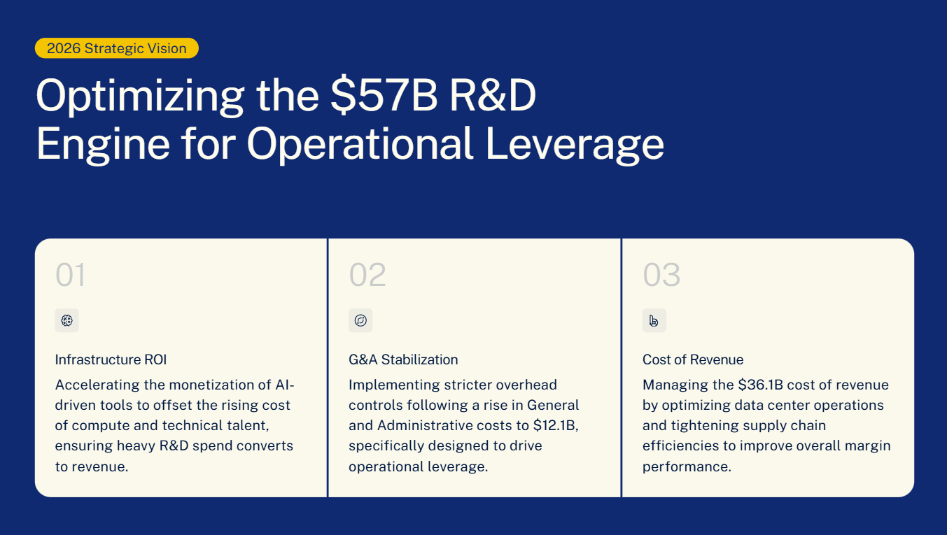
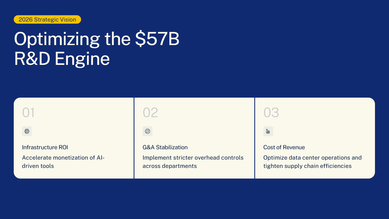
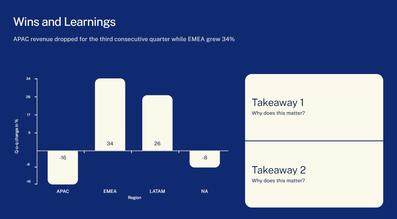
8. Data Slides Without a Clear Takeaway
Putting data on a slide is not the same as making an argument. A chart is evidence. An insight is the point. If your slide shows the chart but does not state the point, you are making your audience do interpretive work that you should have done for them, and they will draw different conclusions, or no conclusion at all.
Fix: Every data slide needs a headline that states the conclusion, not a description of the chart. Not "Q3 Revenue by Region" but "APAC revenue dropped for the third consecutive quarter while EMEA grew 34%." The chart is there to prove the headline. If the headline is missing, the chart is just decoration with numbers on it.
9. Excessive Animations and Transitions
Animations were exciting in 2005. A slide that flies in from the left, text that spins in one word at a time, a transition that makes your slide look like a page flipping — none of this adds anything to a modern presentation. It slows down your pacing, breaks the audience's focus, and gives the impression that you are filling time with motion because the content cannot hold attention on its own.
There is a narrow legitimate use case for animation: sequencing. If you are revealing information deliberately — showing one step of a process at a time, or building a chart data point by data point to support a narrative — a simple fade works well. That is it.
The quick fix: remove all animations and transitions. Then add back only the ones that genuinely serve your pacing. Most presentations end up with zero or one. If the slide still communicates without the animation, the animation was unnecessary.
10. Skipping the Final Review
Skipping the final review is how "[PLACEHOLDER TEXT]" ends up on slide seven, or how slide nine contradicts the data you cited on slide three. A quick final review catches the things your tired brain missed.
Fix: Build a 10-minute review ritual. Read every slide out loud (you will catch things your eyes skip over when reading silently). Check that the slide order matches the structure you intended. Verify that all links, videos, and charts are working. Delete any slides that were backups. For a full pre-presentation checklist, this presentation tips article covers the complete pre-presentation workflow.
How Presentations.AI Helps You Avoid These Mistakes Automatically
If you are building presentations regularly, some of these mistakes are worth trying to eliminate at the systems level rather than catching them each time on review. That is the idea behind Presentations.AI, it is an AI presentation tool built to handle the production-side mistakes so you can focus on the content.
On the text overload problem: the AI picks clean, minimal layouts that are designed to hold one idea at a time. There is no blank canvas tempting you to fill it with six bullet points and a paragraph of context. The templates are built to resist overcrowding — if you add too much, the layout pushes back.
On design consistency: the Brand Sync feature pulls your company colors, fonts, and logo from your website URL and applies them across every slide automatically. You do not need to track down hex codes or manually resize a logo on twelve different slides. The deck looks like it came from a design team even if it is just you working alone at 10pm.
On visual quality: the AI selects layouts and visual components based on your content type, not random aesthetic choices. Charts, timelines, and infographics get formatted appropriately for the data. You are not starting from a blank slide wondering what kind of chart fits best.
For anyone using pre-built templates, the anti-fragile design means those templates adapt when you change content — they do not break when you add a bullet point or swap an image the way a rigid PowerPoint template does.
None of that replaces the work of understanding your audience and structuring a compelling narrative. The tool handles production; the thinking is still yours. But removing the production friction means you have more time and attention left for the parts that actually matter.
Getting Better at Presentations
The best presentations are usually not the ones where the presenter worked the hardest in the build. They are the ones where the presenter was ruthless in the edit. Every mistake in this list, from dense text to weak openings to data slides without takeaways — has the same root cause: something that should have been cut or simplified was left in. Getting better at presenting is largely a process of getting better at noticing what your audience does not need and removing it before they have to suffer through it.
Start with the mistake that shows up most often in your own decks. Fix that one first. Then work through the rest. You do not need to solve all ten at once. But if you walk into your next presentation having fixed even two or three of these, your audience will notice — even if they cannot tell you exactly why it felt better.