TL;DR
- Animated presentations use motion, including transitions, object animations, and video, to guide attention and pace the delivery of information to your audience.
- Three core animation types exist, and choosing the right one depends on what you need the audience to see and when.
- Animation works best for data reveals, storytelling arcs, and step-by-step processes. Skip it for dense reference decks and leave-behinds.
- Keeping motion smooth means limiting styles, matching speed to your speaking pace, and testing the full slideshow before you present.
- Presentations.AI automatically applies polished, on-brand animations to your slides, so you get professional motion without touching a single timing setting.
You add a few animations to your slide deck. A spinning icon here, a bounce entrance there, maybe a cube transition because it looked interesting. Then you present, and the whole thing feels like a theme park ride no one asked for.
Most people have a direction problem, not a motion problem. They know animated presentations look more engaging than static ones. They just lack clarity on which animations to use, where to place them, or when to leave a slide completely still.
That gap between wanting motion and using it well is where decks go sideways. Slides end up cluttered, pacing feels off, and the audience watches effects instead of absorbing the message.
This guide closes that gap. You'll learn what animated presentations actually are, the three types of animation available to you, and when motion helps versus when it hurts. By the end, you'll know exactly how to add movement that makes your slides clearer, not busier.
What Are Animated Presentations?
Animated presentations are slide decks that use motion to guide how an audience sees, processes, and remembers information. That motion can take several forms: a fade between slides, a chart that builds bar by bar, or a short video loop playing behind a headline. Each movement exists to direct attention to a specific place.
Static slide decks show everything at once. The audience's eyes land wherever they want, often on the wrong detail first. Animated presentations change that equation. They let you control the sequence. You decide what appears first, what follows, and what stays hidden until the right moment. A good starting point is a set of presentation templates that already have animation built into the layout, so you are not adding motion to a blank canvas.
Human vision is wired to track movement. A single object shifting on screen instantly pulls focus, without the presenter needing to say "look here." When you reveal one data point at a time, the audience absorbs each number on its own terms. When you fade into a new section, the transition signals a shift in topic before a single word is spoken.
This is also where the biggest misconception lives. Animation is about clarity, not spectacle. Spinning logos, bouncing bullet points, and checkerboard transitions make a deck feel dated rather than professional. Every motion should earn its place by helping the audience understand something faster or remember it longer. An animation that does neither is decoration, and decoration competes with your message.
Did You Know: Even a single well-placed fade on a key number can change how your audience processes and retains that takeaway — no complex animation sequence required.
Think of animated presentations as a pacing tool, not a design flourish. When motion serves the message, slides feel alive. When it falls short, they feel noisy. The difference comes down to knowing which type of animation to reach for and when to leave a slide still. If you want to start building right away, Presentations.AI's presentation maker handles animations automatically so that you can focus on the message.
Three Types of Slide Animation (and What Each One Does)
Animation works differently depending on where it lives in your deck. Some motion happens between slides. Some acts on individual objects within a single slide. Some involve embedded media that plays on its own. Understanding these three categories helps you pick the right tool for each moment.
Transitions
Transitions are the animations that play when you move from one slide to the next. A simple fade gently dissolves the current slide into the following one, creating a calm, seamless flow. A morph transition maps shared elements between two slides and smoothly moves them into new positions, which is ideal for showing change over time. A push or slide transition physically moves the old slide off-screen as the new one enters, giving a sense of forward momentum.
The feel each transition creates matters more than the effect itself. Fades feel polished and neutral. Morphs feel modern and intentional. Wipes and pushes feel energetic and directional. Pick a transition that matches your deck's tone, then stick with it for most or all of your slides. One consistent transition tells the audience "we're moving forward." Five different transitions tell them nothing.
Object Animations
Object animations act on individual elements within a slide. A text block, an icon, a chart, or an image each responds to four effect categories: entrance effects bring an element onto the slide, emphasis effects draw attention to something already visible, exit effects remove an element, and motion paths move an object along a custom route.
The most practical use is the staggered reveal. Instead of showing five bullet points at once, you bring each one in on a click or after a short delay. The audience reads one point, processes it, and then receives the next. This adjustment keeps viewers in sync with your narration rather than reading three points ahead while you discuss the first.
Object animations give you granular control. You choose what appears, when it appears, and how long the entrance takes. That precision is powerful but easy to overuse, which is why restraint matters as much as technique.
Video Clips and Motion Graphics
A static image cannot always communicate what a short clip can. A fifteen-second product demo or a looping motion graphic of a workflow delivers information that would take several slides to explain with text and screenshots alone.
Embedded video beats a static image when you need to show a process, demonstrate interaction, or create atmosphere. A looping background clip behind a keynote statement adds dramatic weight without requiring extra narration.
File size is the practical trade-off. Video and high-resolution GIFs increase your deck's total size, which can slow load times during remote presentations or cause playback hiccups on older hardware. Compress clips before embedding them, and test playback on the device you will actually present from.
When to Use Animation in a Presentation (and When to Skip It)
Knowing the types of animation is only half the equation. Knowing when to apply them and when to leave them as is is what separates a polished deck from a distracting one.
Animation earns its place in specific scenarios. The data reveals a benefit to staggered builds because the audience processes one number before the next appears. Step-by-step processes become easier to follow when each stage is animated in sequence. Storytelling arcs gain momentum from transitions that mark shifts in time, setting, or perspective.
When energy dips midway through a long presentation, a well-timed motion element can pull attention back to the screen, though animation is one option among many. There are other practical ways to re-engage an audience mid-presentation that work alongside motion rather than depending on it.
Static slides win in other situations. Dense reference decks that people read on their own after the meeting require scannability, not entrance effects. Leave-behind documents lose their animations in PDF format anyway, so the motion adds nothing. Highly technical reviews where stakeholders want to move fast are slowed down by animations that force a fixed pace. In those rooms, speed and density beat sequencing.
Context shapes the decision, too. A boardroom expects restraint. A classroom benefits from visual aids that support learning. A conference keynote can handle bolder motion because the setting is designed for spectacle. Read the room before you design the deck.
When you are unsure, apply a single test before adding any animation to a slide. For context, overusing animation is one of the most common mistakes people make when building AI presentations, and it tends to happen precisely when the goal and audience are not clearly defined upfront."
Callout: "Does this motion help the audience understand something faster or remember it longer?" If the answer is no, the slide works better without it.
That question keeps every animation intentional. It also permits you to leave slides still when stillness serves the message better than motion ever could.
How to Keep Animated Slides Smooth and Professional
Making animation feel seamless takes a few deliberate choices. These guidelines keep your motion polished and your audience focused on the content, not the effects.
Start by limiting yourself to one or two animation styles per deck. If your entrance effect is a fade-up, use that fade-up everywhere you need an entrance. Mixing fade-ups with fly-ins and zooms within the same presentation creates visual noise. Consistency signals intention. Unplanned variety signals chaos.
Match animation speed to the pace of your delivery. An animation that finishes before you start speaking feels rushed. One that lingers after your sentence ends feels sluggish. The motion and the narration should land together.
Use animation to reveal, not to decorate. Every moving element should carry information or guide attention to something specific. If an animation exists only because the slide "felt empty," remove it. Decoration competes with your message.
Keep transitions uniform across slides. A single transition style used throughout creates rhythm. Mixing several transition types breaks that rhythm and makes the deck feel stitched together from different sources.
Timing and Speed
Most presentation tools let you set animation duration in seconds. For subtle, utility-driven motion, such as a text fade or a quiet slide transition, aim for 0.3 to 0.5 seconds. For emphasis, moments when you want the audience to notice the motion itself, 0.7 to 1 seconds work well. Anything beyond one second risks feeling slow unless the animation is central to a story beat. Be cautious with auto-advance timing. Slides that move forward on a fixed timer can outpace your narration or leave awkward silences if you speak faster than planned. Click-to-advance gives you control.
Visual Consistency
Think of your animation palette the way you think of your color palette. A brand deck uses two or three colors intentionally. The same discipline applies to motion. Pick your entrance and transition styles, then use only those. Starting from a cohesive base helps. When you build on presentation templates designed with consistent visual language, animation choices feel like natural extensions of the design rather than afterthoughts bolted on. Colors, fonts, and motion style should all reflect the same visual identity.
Pro Tip: Run your slideshow end-to-end at least once at full speed before presenting. Animations that feel fine slide-by-slide can feel relentless in sequence. A full run-through reveals pacing problems your slide editor never will.
Test on the actual screen or device you will use. Animation timing feels different on a laptop screen sitting two feet away than it does on a projected display in a conference room. What looked smooth in your office may feel jarring at scale, or vice versa. A five-minute test on the real setup saves you from surprises during the real presentation.
Rehearsal discipline applies well beyond animation, too. Estos consejos para presentaciones cubren todo el proceso de preparación si buscas un marco más amplio.
Cómo las herramientas de IA facilitan la creación de presentaciones animadas
Tradicionalmente, añadir animación a una presentación significaba hacer clic en menús, establecer fotogramas clave para objetos individuales, ajustar los controles deslizantes de duración y previsualizar el resultado. Para los no diseñadores, el proceso es tan tedioso que se abandona a mitad de camino. La presentación termina sobreanimada por la experimentación o completamente estática porque el esfuerzo supera la recompensa.
Las herramientas asistidas por IA cambian ese flujo de trabajo desde su base. Tú proporcionas el contenido, un esquema, un guion o un conjunto de ideas aproximadas, y la herramienta produce una presentación completamente animada. La IA selecciona los tipos de animación basándose en el contenido y el diseño de la diapositiva. Asigna una temporización que coincide con el ritmo de tu información. Secuencia las entradas de los objetos para que parezcan lógicas en lugar de aleatorias. Las decisiones que antes requerían docenas de ajustes manuales ocurren en segundo plano.
La alineación automática con la marca es uno de los beneficios más prácticos. La IA aplica estilos de movimiento que complementan tus fuentes, colores y tono existentes. Una presentación corporativa recibe desvanecimientos sobrios y construcciones limpias. Una propuesta creativa obtiene transiciones más audaces y un movimiento de objetos más expresivo. Las elecciones de animación provienen de la misma lógica de diseño que dio forma al resto de la diapositiva, por lo que nada se siente fuera de la marca.
La barrera de entrada disminuye significativamente. Alguien que nunca ha tocado un panel de animación puede producir resultados fluidos y profesionales en el primer intento. No hay curva de aprendizaje para la configuración de duración, las funciones de suavizado o la secuenciación de efectos. El resultado parece haber sido creado por alguien que anima diapositivas profesionalmente.
Muchas plataformas modernas ofrecen ahora alguna forma de animación asistida por IA, y la categoría está creciendo rápidamente. Si quieres una comparación detallada de cómo se comparan estas plataformas en animación y otras características, hay un análisis completo de los mejores creadores de presentaciones con IA en 2026 que vale la pena revisar.
Presentations.AI añade automáticamente animaciones fluidas y acordes con la marca a tus diapositivas, sin necesidad de configurar la temporización o los efectos manualmente. Este tipo de flujo de trabajo sin intervención convierte la animación de una tarea tediosa en algo que simplemente ocurre como parte de la creación de la presentación.
Ejemplos de presentaciones animadas que vale la pena estudiar
Ver los principios de animación en acción facilita su aplicación. Estos cuatro escenarios muestran cómo el movimiento intencionado refuerza diferentes tipos de presentaciones.
Pitch deck de startup: Un fundador utiliza transiciones de transformación para mostrar la evolución de un producto desde un boceto inicial hasta una interfaz pulida. Cada diapositiva comparte el mismo marco de dispositivo, y la transformación cambia suavemente el contenido de la pantalla de una etapa a la siguiente. La audiencia ve cómo el producto crece sin que el presentador necesite explicar cada iteración de diseño. El movimiento comunica el progreso al instante.
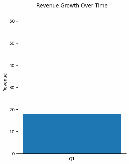
Revisión trimestral de negocios. Un responsable de finanzas construye un gráfico de ingresos barra por barra, haciendo una pausa entre los resultados de cada trimestre. La revelación escalonada permite que la sala asimile un punto de datos antes de que aparezca el siguiente. Cuando la barra final supera la línea objetivo, el contraste es más marcado porque la audiencia siguió todo el ascenso. Un gráfico estático que mostrara las cuatro barras a la vez habría opacado ese momento.
Presentación para aula o formación. Un instructor anima un proceso biológico a lo largo de seis pasos. Cada clic añade una nueva etapa al diagrama mientras las etapas anteriores permanecen visibles. Los alumnos siguen la lógica en secuencia en lugar de descifrar un diagrama completo por sí mismos. La animación refleja cómo se desarrolla el proceso en tiempo real.
Conferencia magistral. Un orador coloca una frase contundente sobre un video en bucle a pantalla completa de su producto en uso. Sin viñetas. Sin subtítulos. El clip incrustado crea atmósfera y credibilidad mientras el texto transmite el mensaje principal. La sobriedad hace que el momento impacte.
Cada ejemplo tiene éxito por las mismas razones: el movimiento sirve al mensaje, la paleta de animación se mantiene limitada y nada se mueve sin un propósito claro.
Lectura recomendada: Explora el Presentations.AI página de inicio para plantillas de presentaciones animadas e inspiración práctica para empezar a crear tu propia presentación.