TL;DR
- Titles work best at 36-44pt, subtitles at 28-32pt, body text at 18-24pt, and captions at 12-16pt for most rooms.
- Bigger rooms and bigger screens need bigger type. Scale your font sizes up as the audience distance from the slide grows.
- Virtual presentations need larger body text (24pt or more) because viewers watch on small screens with limited visual real estate.
- Use the 6x6 rule and the back-of-the-room test to catch oversized blocks of text and unreadable slides before presenting.
- Presentations.AI auto-sizes text by slide type, so your fonts stay readable on any screen without manual adjustments.
Squinting at a slide from the back of a conference room is a familiar kind of frustration. So is leaning into a laptop screen trying to read a wall of 14pt body copy during a video call. Font size may seem like a small design detail, but it quietly determines whether your audience reads your slides or tunes out.
The tricky part is that there is no single right number. The best font size shifts with the room, the screen, the setting, and the type of text on the slide. Title text follows one rule. Body copy follows another. Captions follow a third.
This guide gives you clear, practical numbers for every part of your deck. You will learn the ideal sizes for titles, subtitles, body text, and captions. It also covers how to adjust them for in-person versus virtual talks, along with the simple rules professionals use to test readability before they ever hit the present.
What Is the Ideal Font Size for Presentations?
The short answer: most presentations should use titles at 36-44pt, subtitles at 28-32pt, body text at 18-24pt, and captions at 12-16pt. These ranges work for most business decks, classroom slides, and conference talks displayed on a standard projector or a large monitor.
Ideal is a moving target. The right size depends on the type of text and how far away your audience is sitting. A slide that looks perfectly balanced on your laptop can become unreadable on a 10-foot screen. The reverse applies when a stadium-sized title shows up on someone's phone during a webinar.
Why font size matters more than you think
Font size is the difference between an audience that follows along and one that gives up. When the type is too small, people stop reading and start checking their phones. When it is too large, your slide feels aggressive and forces you to cut content that matters.
Sizing is also tied to trust. Clean, readable typography signals that you have put effort into your message. A slide with 11pt body copy imported from a Word document does not just look small. It tells the audience that the presenter did not check how it would look in the room.
The quick baseline to start from
If you only remember one set of numbers, use this:
- Titles: 40pt
- Subtitles: 30pt
- Body text: 22pt
- Captions and footnotes: 14pt
Start there, then adjust up or down based on the room, the screen, and the format. The next sections break down exactly when to scale, and by how much.
Pro Tip: Never go below 18pt for any text your audience needs to read. If something has to be smaller than that, it probably belongs in a handout, not on the slide.
Recommended Font Sizes by Slide Element
Every part of your slide does a different job, so each part needs its own size range. Titles need to grab attention from anywhere in the room. Body text needs to be readable without feeling like a textbook. Captions need to support without competing.
Here is the breakdown in one place:
Titles: 36-44pt
Titles set the frame for everything else on the slide. At 36-44pt, they stay bold enough to read from the back row without crowding the rest of your layout. If your title runs onto two lines, drop a few points before you shrink the body text.
Subtitles: 28-32pt
Subtitles bridge your title and your content. Keep them at 28-32pt so they feel distinct from the title but clearly larger than body copy. A good rule is to make subtitles roughly 70% of your title size.
Body text: 18-24pt
Body text is where most font-size mistakes happen. Designers used to working on documents default to 11pt or 12pt, which disappears on a projector. Stick to 18-24pt, and lean toward the higher end when your slide has more than two lines of text.
Captions and footnotes: 12-16pt
Source citations and image credits belong in the 12-16pt range. They should be visible but should draw no focus from the main content. If a caption carries information your audience needs to read aloud, promote it to body size instead.
Pro Tip: A simple ratio to keep in mind: titles are about twice the size of body text, and body text is about 1.5x the size of captions. If your hierarchy breaks that ratio, the slide will feel visually off even if the audience cannot say why.
How Room Size, Screen Type, and Format Change Font Size
The numbers above assume an average room and a standard screen. Once those variables change, your sizing needs to adapt accordingly. The same 22pt body text can feel perfect in a 20-person meeting room and completely unreadable in a 200-seat auditorium.
In-person presentations
Audience distance is the biggest factor for in-person talks. A common guideline: the farthest viewer should sit no more than eight times the height of the screen away. If your back row exceeds that distance, scale every font size up by 4-8 points.
- Small meeting rooms (under 20 people): Standard sizes work fine.
- Mid-size conference rooms: Bump titles to 44pt and body text to 24pt.
- Large auditoriums or stages: Titles at 48-60pt, body at 28pt or higher.
Virtual presentations and webinars
Virtual settings flip the rules. Your audience watches on laptops, tablets, or phones, with your slides squeezed into a shared-screen window next to a video grid. That smaller display swallows small type quickly.
For virtual meetings, push body text to 24pt or higher and keep titles around 40pt. Avoid long blocks of text entirely. A viewer on a phone will find even 18pt body copy difficult to read.
Screen type matters too
A 4K monitor, a projector, and a phone screen render text differently. Projectors tend to soften edges and reduce contrast, which makes thin or small fonts harder to read. When in doubt, design for the lowest-quality screen in the room.
Pro Tip: Before a hybrid presentation, open your deck on your phone. If body text is hard to read there, your remote viewers will struggle too.
Rules of Thumb and Common Mistakes to Avoid
Simple tests catch font-size problems before they become public. Two of the most useful rules predate modern slide software and still hold up today.
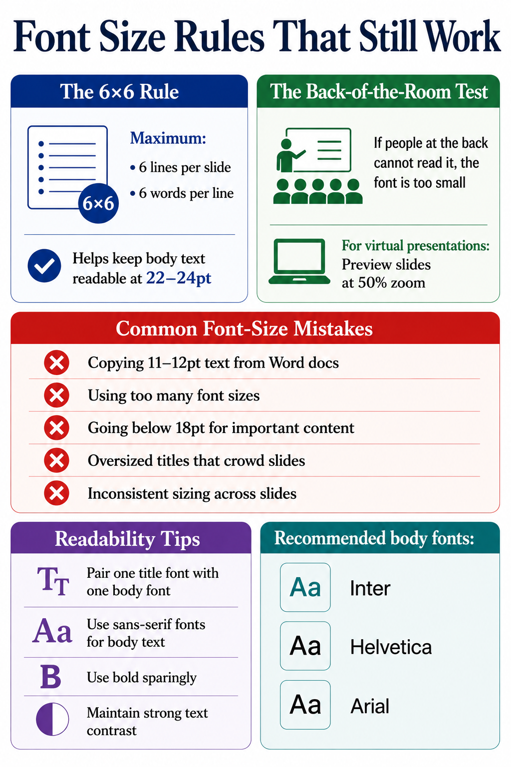
The 6x6 rule
The 6x6 rule says: no more than six lines per slide, and no more than six words per line. It addresses the symptom rather than the font size directly. When you respect 6x6, your body text naturally has room to breathe at 22-24pt instead of shrinking to fit a wall of words. Applying this alongside a solid presentation outline keeps both your content and your typography in good shape from the start.
The back-of-the-room test
Project your slide and walk to the back of the room. If you cannot comfortably read every line, your font is too small. For virtual decks, preview your slides at 50% zoom on your laptop. That approximates how they look in a shared-screen window. Running this test regularly sharpens your overall presentation skills over time.
Common font-size mistakes
A few patterns show up repeatedly in weak decks:
- Copying body copy from a Word document. Document text is 11-12pt. On a slide, it vanishes.
- Mixing too many sizes. Stick to a maximum of three sizes per slide: title, body, caption.
- Going under 18pt for any readable content. If it matters, make it big enough.
- Oversized titles that crowd the slide. A 60pt title in a small room looks aggressive and eats your content space.
- Inconsistent sizing across slides. Your title is 40pt on slide 2 and 36pt on slide 5. Small inconsistencies erode trust.
Font pairing and readability tips
Font size works hand in hand with font choice. A heavy sans-serif at 22pt reads cleaner than a thin serif at the same size. These presentation tips on pairing and hierarchy apply once you have sizing dialed in:
- Pair one display font for titles with one clean body font for everything else.
- Stick to sans-serif fonts like Inter, Helvetica, or Arial for body text on screen.
- Use bold sparingly. Emphasis loses power when half the slide is bolded.
- Maintain a strong contrast between text and background. Light grey on white kills readability at any size.
Did You Know: Line spacing matters almost as much as font size. Setting line height to 1.3-1.5x your font size keeps text readable, even when sizes get tight.
How Presentations.AI Handles Font Sizing for You
Manually checking title sizes, body ranges, and caption hierarchy across 30 slides gets tedious fast. That is where AI presentation software changes the workflow. The AI presentation maker at Presentations.AI applies font-size rules automatically based on slide type, so titles stay in the 36-44pt range and body text holds at 18-24pt, with captions scaled below both.

The platform reads the role of each text block and scales it to fit the layout without breaking your hierarchy. If you add a long subtitle, it adjusts spacing rather than shrinking type into the unreadable zone. If you switch a deck from in-person to webinar mode, the system bumps body sizes up so remote viewers can follow along.
A few ways this saves time:
- Smart defaults by slide type. Title slides, content slides, and data slides each get their own tuned size ranges.
- Consistent sizing across the deck. No more 40pt on slide 2 and 36pt on slide 5. The system locks your title size once and applies it everywhere.
- Readability checks are built in. The editor flags text that drops below the 18pt threshold, so nothing slips through unnoticed.
- One-click resizing for new formats. Switching from a boardroom presentation to a webinar automatically adjusts text scaling.
The AI slide creator handles the formatting rules so you can focus on building the argument rather than measuring point sizes slide by slide.
Size It Right and Let Your Message Do the Rest
Font size is one of the smallest design choices that makes the biggest difference. Get it right, and your audience reads, follows, and remembers. Get it wrong, and the message gets lost before it lands. The numbers to anchor on are simple: titles at 36-44pt, subtitles at 28-32pt, body text at 18-24pt, and captions at 12-16pt. Adjust upward for large rooms and virtual viewers, and keep all readable content at 18pt or above.
Pair those sizes with the 6x6 rule and the back-of-the-room test, and your decks will read clearly across any setting. Font sizing is about respecting the distance between your slide and the person reading it.


%20(1).webp)