Introduction
Many presentations follow the same structure: a title slide, followed by 20 screens of bullet points stacked in a tiny font. The speaker reads the text, while the audience checks their phones.
Visual presentations take the opposite approach. They lean on images, icons, and clean layouts to carry the message. The audience watches, listens, and actually remembers what you said.
The good news: you do not need to be a designer to make this shift. You need a clear message, the right types of visuals, and a handful of principles that keep your slides focused.
This guide breaks down what visual presentations are and why they consistently outperform text-heavy decks. It also covers exactly how to make your next set of slides more visual, step by step, with examples and practical tips you can use today.
Key Takeaways (TL;DR)
- Visual presentations communicate through images, icons, charts, and minimal text instead of the dense bullet-point slides most people default to.
- Audiences absorb and retain visual information far more effectively than blocks of text read aloud from a crowded slide.
- The best visual slides follow a simple rule: one idea per slide, supported by one clear visual element that reinforces the message.
- You do not need design skills to create visual presentations. Consistent colors, generous whitespace, and smart templates do the heavy lifting.
- Presentations.AI builds visual slides automatically, selecting images, icons, and layouts based on your topic so every slide looks professionally designed.
What Is a Visual Presentation?
A visual presentation is a deck built to communicate through images, icons, charts, and intentionally minimal text. Instead of cramming every talking point onto a slide, visual presentations let each slide carry one idea, supported by a visual element that makes the point instantly clear.
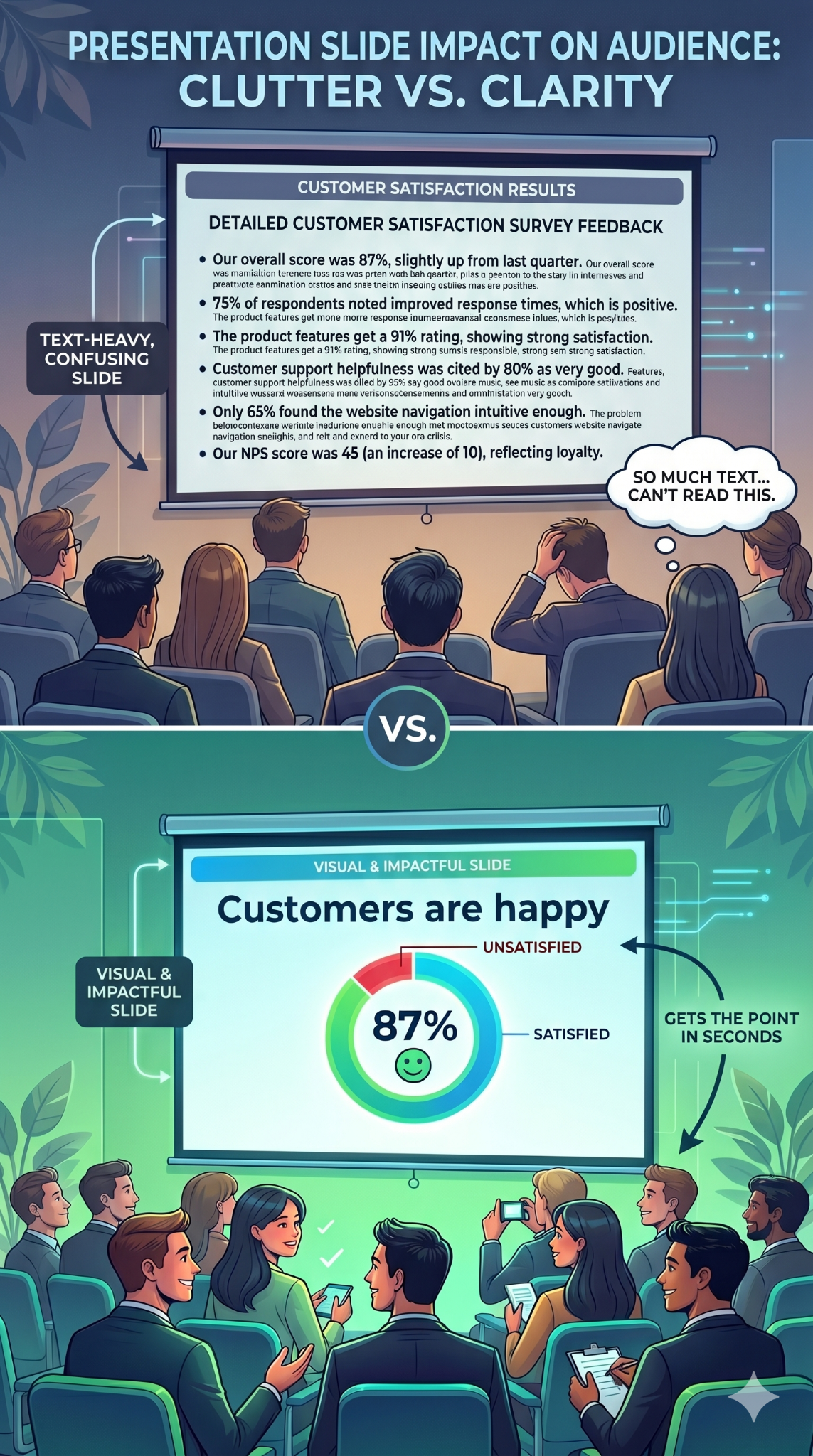
Consider the difference this way. A text-heavy slide about quarterly revenue might list eight bullet points, three sub-bullets, and a footnote nobody reads. A visual slide covering the same content shows a single bar chart, a bold headline with the key number, and nothing else. Same information. Completely different experience for the audience.
Visual presentations are about clarity, not decoration or making slides look trendy. Every image, icon, or chart earns its place by communicating faster than a paragraph could.
This approach works across many contexts:
- Startup founders use visual decks to pitch investors
- Teachers use them to explain complex processes
- Managers use them to keep weekly updates focused
- Conference speakers use them to hold a room for 30 minutes
Why Visual Presentations Work Better Than Text-Heavy Slides
Your brain is wired for images. It processes visual information faster than text. When a slide shows a clear chart or a compelling photograph, the audience absorbs the point almost instantly. When a slide shows a paragraph, the audience has to read, decode, and interpret before they understand anything.
That processing gap matters because attention is limited. Text-heavy slides force people to read the screen and listen to the speaker at the same time. These are competing demands, and the brain handles them poorly. Audience members default to one or the other. They read ahead and tune you out, or they ignore the slide entirely. Either way, the slide fails.
Visual slides eliminate that conflict. When a slide shows an image or a simple chart, the audience glances at it, gets the point, and returns their focus to you. The visual reinforces your words instead of competing with them.
Retention follows the same pattern. People remember what they see far longer than what they read on a crowded slide. A striking image paired with a spoken story creates two memory anchors instead of one. The importance of graphics and visuals in presentations comes down to this: visuals make your message stick.
A persuasion advantage exists as well. A well-designed chart makes data feel credible. A photograph of a real customer creates emotional resonance that no bullet point can match. Visuals inform and convince.
Did You Know: When audiences read slides and listen to a speaker simultaneously, they retain less of both. The brain splits its attention between processing text and processing speech, and comprehension drops for each. Visual slides solve this by letting the image communicate at a glance, so the audience can focus fully on what you are saying.
Types of Visuals That Actually Hold Attention
Choosing the right types of visual presentation elements for each slide is where most people get stuck. The key is matching the format to the message.
Here are the categories that matter most, and when to reach for each one.
Images and Photography
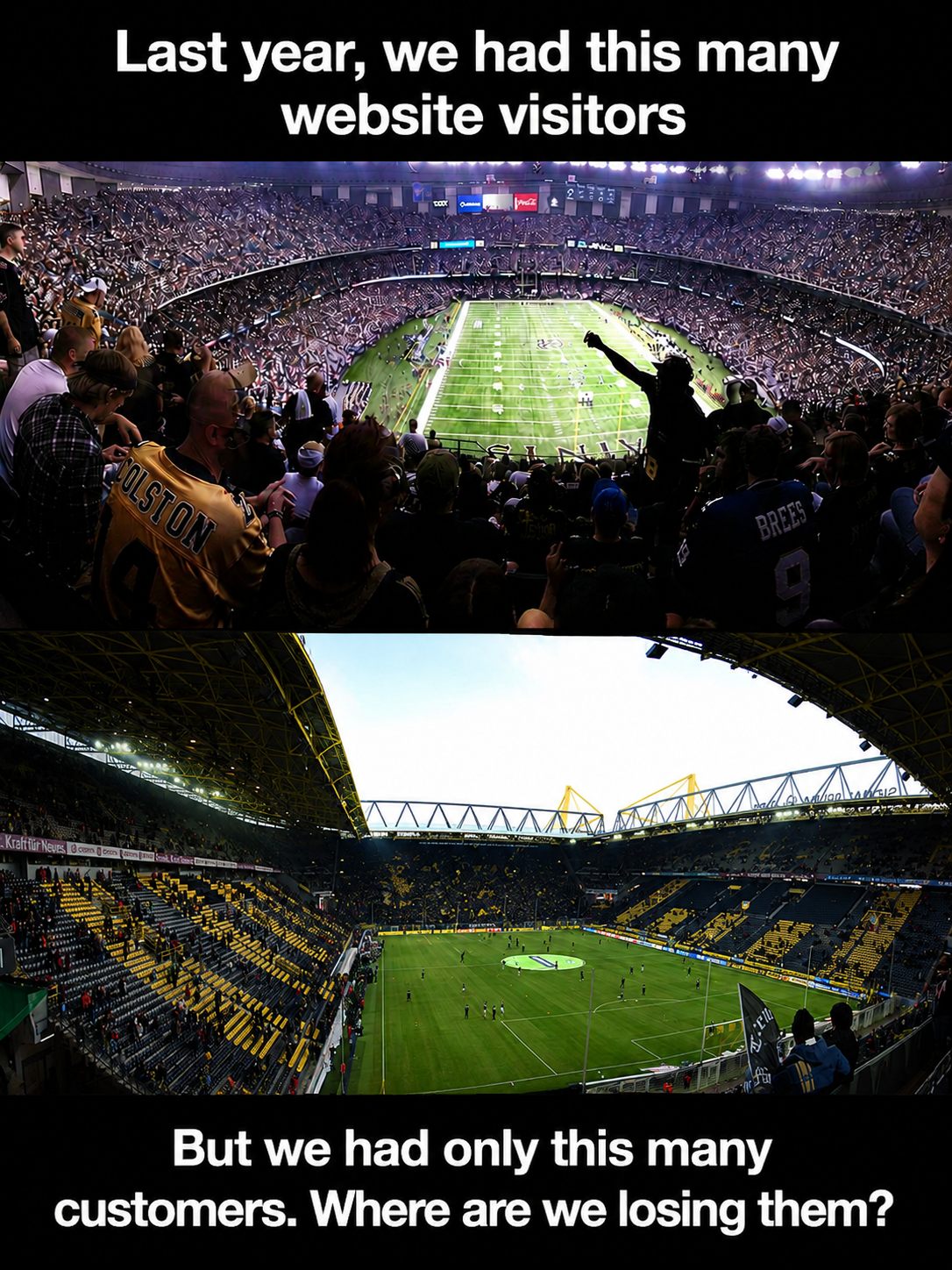
A single high-quality photograph can replace an entire paragraph of descriptive text. Use images to set emotional tone, show real-world context, or ground an abstract idea in something tangible. A full-bleed photo of a packed stadium says "massive audience" faster than any sentence could.
Choose images that connect directly to your point. Generic stock photos of handshakes and skyscrapers add nothing. Specific, relevant photography adds everything.
Icons, Illustrations, and Graphics
Icons are the workhorses of clean slides. They simplify abstract concepts into recognizable shapes and guide the viewer's eye across a layout. A consistent icon set also creates visual coherence from slide to slide.
Use a matching icon set throughout your deck to keep the style cohesive. Pair each icon with a short label of up to 2 or 3 words. This combination replaces bullet-point lists with something scannable and visually appealing. Illustrations work the same way at a larger scale, adding personality to visual aid presentation examples in student projects and creative pitches alike.
Charts, Graphs, and Diagrams
When your slide includes data, present it visually rather than verbally. A bar chart comparing four numbers communicates in a second. A paragraph describing those same four numbers takes thirty seconds and still confuses half the room.
Diagrams and flowcharts handle processes and relationships. Timelines show sequence. Any time you catch yourself writing "first, then, next, finally" in a slide, a diagram will do the job better.
Color, whitespace, and typography also function as visual tools. A bold headline in a large font size against an open background is itself a visual choice. These elements direct attention and create hierarchy on every slide.
Visual Presentation Examples Worth Learning From
Abstract advice only goes so far. Seeing examples of visual presentations in action makes the principles concrete and gives you patterns to reuse.
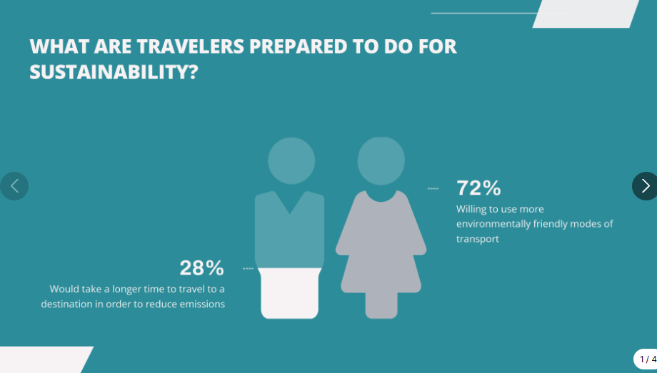
Single-stat Slide
One number displayed in large, bold font. A supporting image or color block behind it. No clutter. This pattern works when you want the audience to walk away remembering one data point, such as revenue growth, customer count, or a percentage that matters. Startup founders and students presenting research findings consistently use this pattern.
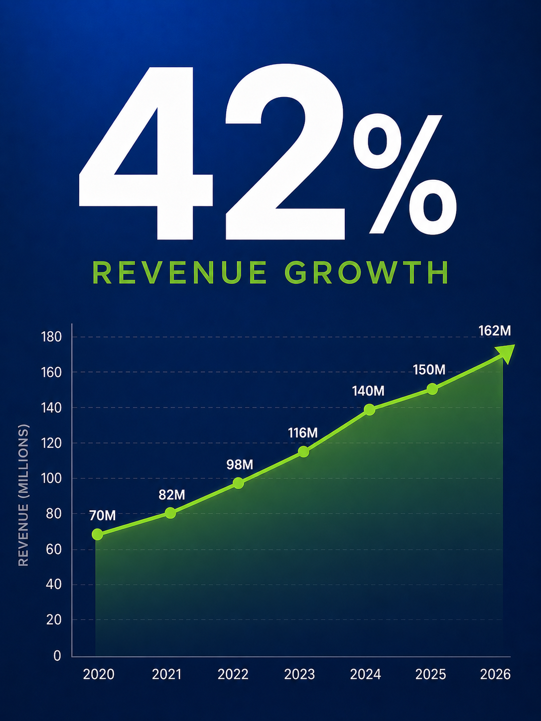
Image-led Narrative
A full-bleed photograph fills the slide. A short headline overlays the image, telling one piece of a story. Slide after slide, the photos and headlines build a visual narrative that the audience follows like a film. Conference speakers and visual presentation examples for students often rely on this approach.
Icon grid
Four icons arranged in a grid, each with a two-word label beneath it. This single slide replaces a four-bullet list and communicates the same information with more clarity and less friction. It works in team updates, training decks, and classroom presentations.
Before-and-after
Show a text-heavy slide on the left and its visual redesign on the right. The contrast is immediate and persuasive. This pattern is particularly useful when you are convincing a team to adopt a more visual approach.
These patterns translate across contexts. They work in boardrooms, lecture halls, and Zoom calls. The ideas behind visual presentations stay the same: simplify, focus, and let the visual carry the weight.
Pro Tip: Start building a personal swipe file. Whenever you see a slide that grabs your attention, at a conference, in a webinar, or on social media, screenshot it. Over time, you will have a library of proven patterns to draw from. Browsing presentation templates is another fast way to collect visual layouts that work.
How to Make Your Next Presentation More Visual (Step by Step)
You understand why visual presentations work. Here is the process for building one, from blank page to finished deck.
Checklist
- Outline your key messages (three to five main points maximum)
- Gather supporting visuals: photos, icons, data, or diagrams
- Choose or generate a template that matches your topic
- Commit to one idea per slide from the very first draft
Start With Your Story, Not Your Slides
Open a blank document before you open any presentation software. Write down the three to five points your audience absolutely needs to walk away with. Arrange them in a logical sequence that builds toward your conclusion. This narrative arc is the backbone of your deck. Every slide you create should serve one of those points.
One Idea Per Slide
The simplest rule changes everything. Each slide carries a single concept. One message, one supporting visual, and enough open space for both to breathe. When you feel tempted to squeeze two ideas onto one slide, make two slides instead. Slides are free. Audience attention is finite.
Swap Text for Visuals
Go through your draft and look for substitutions. A four-bullet list becomes an icon grid. A paragraph about growth becomes a line chart. Every time you remove a block of text and replace it with a visual, your slide gets faster to understand and harder to ignore.
Lock In a Consistent Style
Pick two colors, one heading font, and one body font. Apply a single image treatment to every slide. Consistency makes even simple visual presentations feel polished and professional. Inconsistency, even with great visuals, makes a deck look rushed.
Let a Tool Handle the Design
Manually selecting images, aligning elements, and testing layouts for every slide takes significant time. Templates and AI tools remove the guesswork. An AI presentation maker can do the heavy lifting for you. Presentations.AI builds visual presentations automatically, with the AI picking the right images, icons, and layouts based on your topic, so every slide looks designed without the manual work. You focus on what you want to say. The tool handles how it looks.
Edit Ruthlessly
Once your draft is assembled, review every slide with one question: Does this element support the slide's single idea? If a visual is decorative but communicative, cut it. If text restates what the image already shows, delete it. The strongest visual presentations are the ones where nothing is left to remove.
Quick Design Tips for Non-Designers
A design degree is unnecessary to make slides look sharp. These six principles handle most of the work.
Embrace whitespace: Empty space directs focus to what matters and keeps slides from feeling cramped.
Limit your color palette: Two or three colors maximum. More than that creates visual noise that distracts from your content.
Use only two fonts: One for headings, one for body text. That is it. Mixing fonts is the fastest way to make a deck feel chaotic.
Size visuals generously: If an image or chart is worth including, make it large enough to read from the back of the room. Small visuals buried in a corner serve nobody.
Align everything to a grid: Consistent alignment signals professionalism, even on the simplest slides. Most presentation tools have snap-to-grid features built in.
When in doubt, simplify: Remove elements until only what is necessary remains. These principles are already baked into good templates and AI-generated decks from tools like Presentations.AI, which means you start ahead of the curve.
Summary
- Whitespace directs attention, so leave room to breathe
- Two to three colors, no more
- Two fonts: one heading, one body
- Make visuals large enough to matter
- Align everything to a grid
- Simplify until nothing unnecessary remains
Mistakes That Kill the Visual Impact of Your Slides
Specific, avoidable errors flatten even well-intentioned visual presentations.
Overcrowding slides: Adding images on top of existing text walls makes slides busier, not better. Visuals should replace text, not compete with it.
Using low-quality or generic images: A blurry photo or an overused stock image undermines credibility. Every image should feel intentional and connected to your message.
Inconsistent styling: Mixing three font families, five colors, and different image treatments across slides makes a deck look assembled from spare parts. Pick a style and commit.
No visual variety or pacing. When every slide uses the same layout, the deck becomes monotonous even with strong visuals. Alternate between image-led slides and chart slides to create a rhythm that keeps the audience engaged.
Make Your Next Presentation Visual-led
Every slide you build is a choice between competing for your audience's attention and earning it. Visual presentations earn it. They trade dense text for clarity and bullet points for images.
The principles are straightforward: lead with one idea per slide and choose visuals that communicate faster than words. Strip away everything that does not serve the message. Design training is unnecessary.
A clear story, intentional visual choices, and the willingness to simplify are what matter. Start with your next deck. Pick one text-heavy slide, replace the paragraph with a single chart or image, and see the difference for yourself. That first swap is usually all it takes to change how you build presentations going forward.