Introduction
Many presentations follow the same structure: a title slide, followed by 20 screens of bullet points stacked in a tiny font. The speaker reads the text, while the audience checks their phones.
Visual presentations take the opposite approach. They lean on images, icons, and clean layouts to carry the message. The audience watches, listens, and actually remembers what you said.
The good news: you do not need to be a designer to make this shift. You need a clear message, the right types of visuals, and a handful of principles that keep your slides focused.
This guide breaks down what visual presentations are and why they consistently outperform text-heavy decks. It also covers exactly how to make your next set of slides more visual, step by step, with examples and practical tips you can use today.
Key Takeaways (TL;DR)
- Visual presentations communicate through images, icons, charts, and minimal text instead of the dense bullet-point slides most people default to.
- Audiences absorb and retain visual information far more effectively than blocks of text read aloud from a crowded slide.
- The best visual slides follow a simple rule: one idea per slide, supported by one clear visual element that reinforces the message.
- You do not need design skills to create visual presentations. Consistent colors, generous whitespace, and smart templates do the heavy lifting.
- Presentations.AI builds visual slides automatically, selecting images, icons, and layouts based on your topic so every slide looks professionally designed.
What Is a Visual Presentation?
A visual presentation is a deck built to communicate through images, icons, charts, and intentionally minimal text. Instead of cramming every talking point onto a slide, visual presentations let each slide carry one idea, supported by a visual element that makes the point instantly clear.
Consider the difference this way. A text-heavy slide about quarterly revenue might list eight bullet points, three sub-bullets, and a footnote nobody reads. A visual slide covering the same content shows a single bar chart, a bold headline with the key number, and nothing else. Same information. Completely different experience for the audience.
Visual presentations are about clarity, not decoration or making slides look trendy. Every image, icon, or chart earns its place by communicating faster than a paragraph could.
This approach works across many contexts:
- Startup founders use visual decks to pitch investors
- Teachers use them to explain complex processes
- Managers use them to keep weekly updates focused
- Conference speakers use them to hold a room for 30 minutes
Why Visual Presentations Work Better Than Text-Heavy Slides
Your brain is wired for images. It processes visual information faster than text. When a slide shows a clear chart or a compelling photograph, the audience absorbs the point almost instantly. When a slide shows a paragraph, the audience has to read, decode, and interpret before they understand anything.
That processing gap matters because attention is limited. Text-heavy slides force people to read the screen and listen to the speaker at the same time. These are competing demands, and the brain handles them poorly. Audience members default to one or the other. They read ahead and tune you out, or they ignore the slide entirely. Either way, the slide fails.
Visual slides eliminate that conflict. When a slide shows an image or a simple chart, the audience glances at it, gets the point, and returns their focus to you. The visual reinforces your words instead of competing with them.
Retention follows the same pattern. People remember what they see far longer than what they read on a crowded slide. A striking image paired with a spoken story creates two memory anchors instead of one. The importance of graphics and visuals in presentations comes down to this: visuals make your message stick.
A persuasion advantage exists as well. A well-designed chart makes data feel credible. A photograph of a real customer creates emotional resonance that no bullet point can match. Visuals inform and convince.
Did You Know: When audiences read slides and listen to a speaker simultaneously, they retain less of both. The brain splits its attention between processing text and processing speech, and comprehension drops for each. Visual slides solve this by letting the image communicate at a glance, so the audience can focus fully on what you are saying.
Types of Visuals That Actually Hold Attention
Choosing the right types of visual presentation elements for each slide is where most people get stuck. The key is matching the format to the message.
Here are the categories that matter most, and when to reach for each one.
Images and Photography
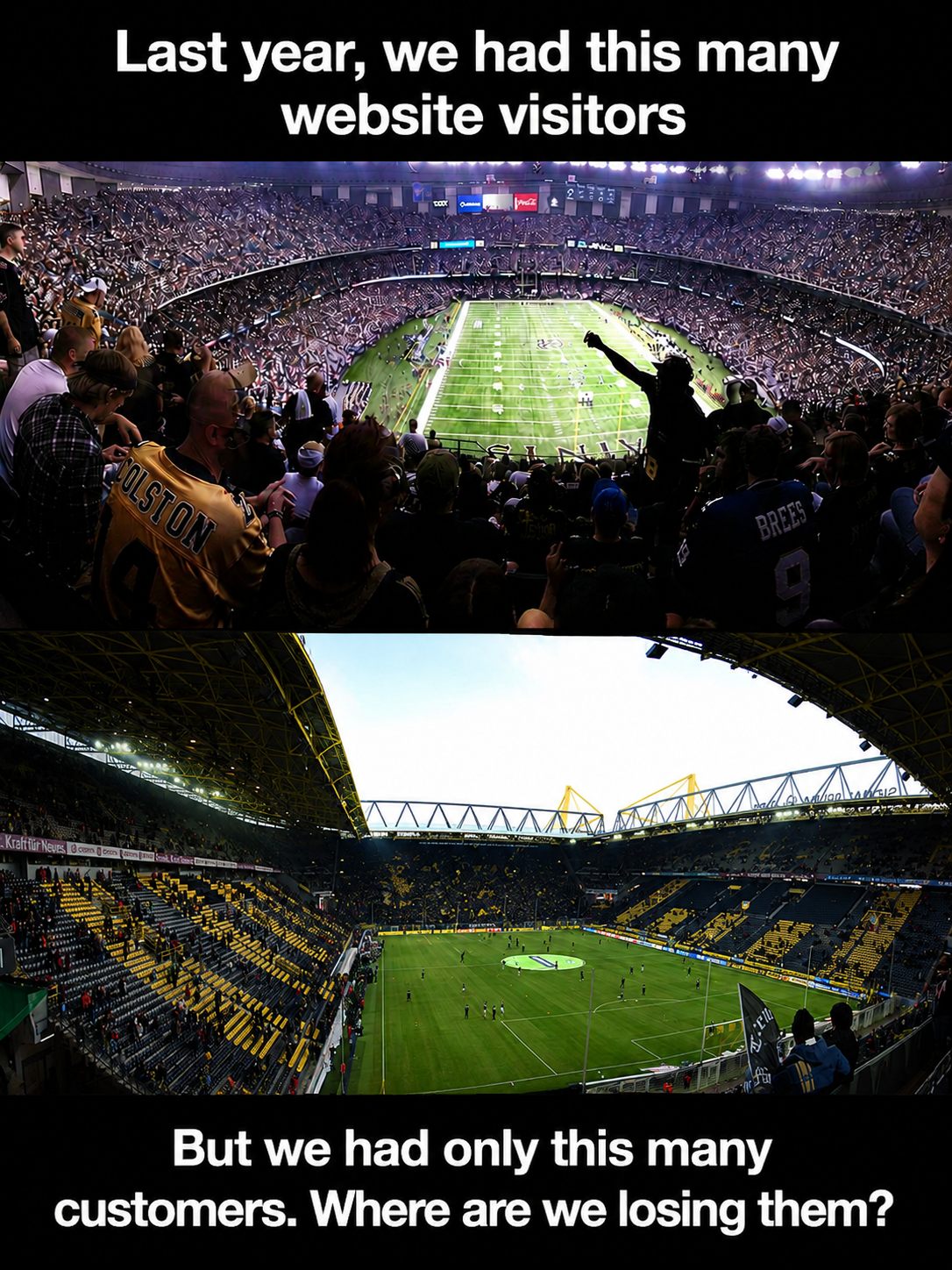
A single high-quality photograph can replace an entire paragraph of descriptive text. Use images to set emotional tone, show real-world context, or ground an abstract idea in something tangible. A full-bleed photo of a packed stadium says "massive audience" faster than any sentence could.
Choose images that connect directly to your point. Generic stock photos of handshakes and skyscrapers add nothing. Specific, relevant photography adds everything.
Icons, Illustrations, and Graphics
Icons are the workhorses of clean slides. They simplify abstract concepts into recognizable shapes and guide the viewer's eye across a layout. A consistent icon set also creates visual coherence from slide to slide.
Use a matching icon set throughout your deck to keep the style cohesive. Pair each icon with a short label of up to 2 or 3 words. This combination replaces bullet-point lists with something scannable and visually appealing. Illustrations work the same way at a larger scale, adding personality to visual aid presentation examples in student projects and creative pitches alike.
Charts, Graphs, and Diagrams
When your slide includes data, present it visually rather than verbally. A bar chart comparing four numbers communicates in a second. A paragraph describing those same four numbers takes thirty seconds and still confuses half the room.
Diagrams and flowcharts handle processes and relationships. Timelines show sequence. Any time you catch yourself writing "first, then, next, finally" in a slide, a diagram will do the job better.
Color, whitespace, and typography also function as visual tools. A bold headline in a large font size against an open background is itself a visual choice. These elements direct attention and create hierarchy on every slide.
Visual Presentation Examples Worth Learning From
Abstract advice only goes so far. Seeing examples of visual presentations in action makes the principles concrete and gives you patterns to reuse.
Single-stat Slide
One number displayed in large, bold font. A supporting image or color block behind it. No clutter. This pattern works when you want the audience to walk away remembering one data point, such as revenue growth, customer count, or a percentage that matters. Startup founders and students presenting research findings consistently use this pattern.
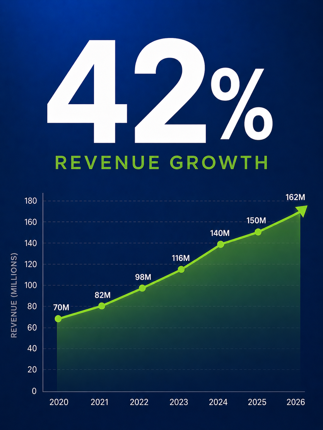
Image-led Narrative
A full-bleed photograph fills the slide. A short headline overlays the image, telling one piece of a story. Slide after slide, the photos and headlines build a visual narrative that the audience follows like a film. Conference speakers and visual presentation examples for students often rely on this approach.
Icon grid
Four icons arranged in a grid, each with a two-word label beneath it. This single slide replaces a four-bullet list and communicates the same information with more clarity and less friction. It works in team updates, training decks, and classroom presentations.
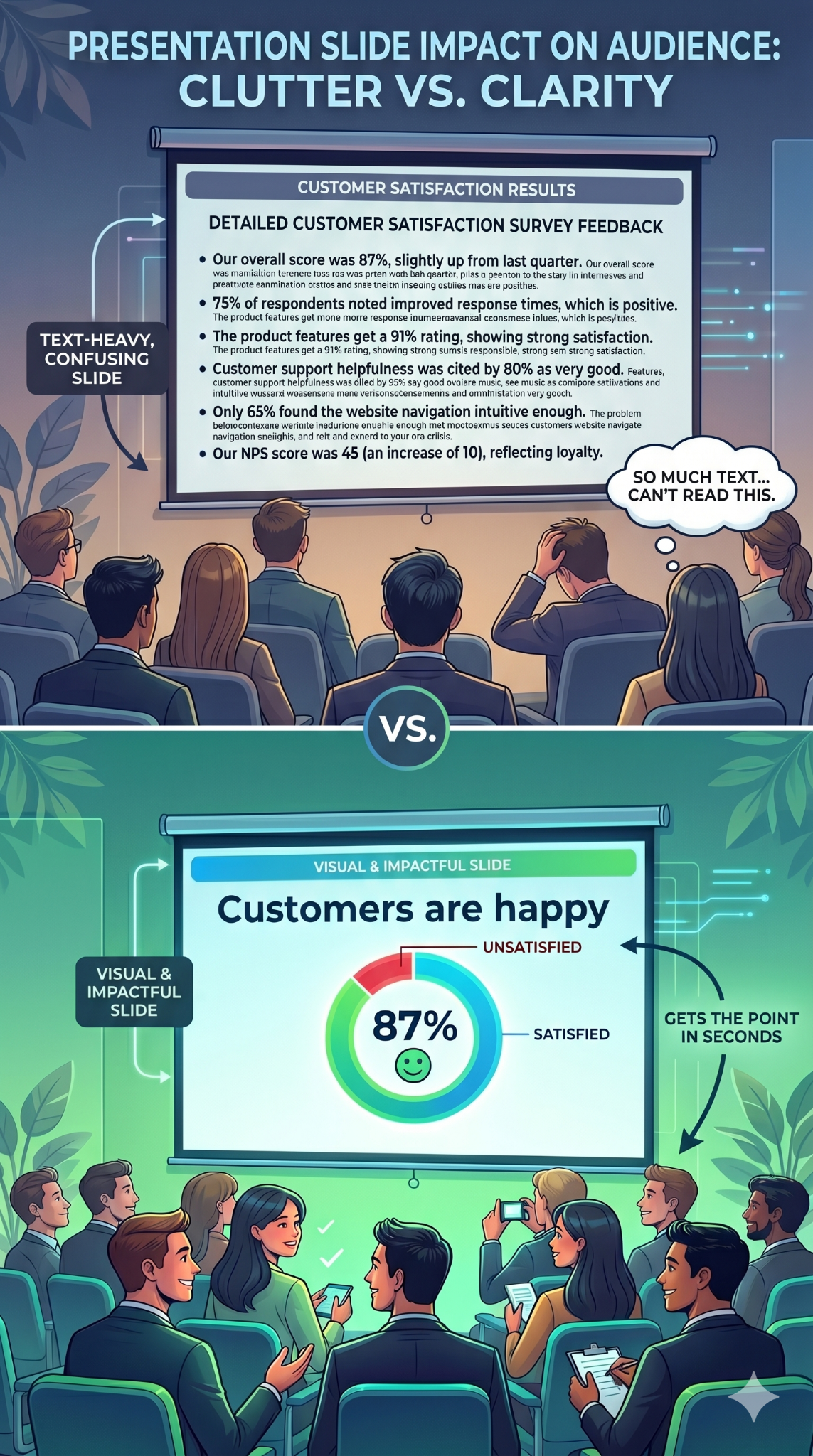
Before-and-after
Show a text-heavy slide on the left and its visual redesign on the right. The contrast is immediate and persuasive. This pattern is particularly useful when you are convincing a team to adopt a more visual approach.
These patterns translate across contexts. They work in boardrooms, lecture halls, and Zoom calls. The ideas behind visual presentations stay the same: simplify, focus, and let the visual carry the weight.
Pro Tip: Start building a personal swipe file. Whenever you see a slide that grabs your attention, at a conference, in a webinar, or on social media, screenshot it. Over time, you will have a library of proven patterns to draw from. Browsing presentation templates is another fast way to collect visual layouts that work.
How to Make Your Next Presentation More Visual (Step by Step)
You understand why visual presentations work. Here is the process for building one, from blank page to finished deck.
Checklist
- Outline your key messages (three to five main points maximum)
- Gather supporting visuals: photos, icons, data, or diagrams
- Choose or generate a template that matches your topic
- Commit to one idea per slide from the very first draft
Start With Your Story, Not Your Slides
Open a blank document before you open any presentation software. Write down the three to five points your audience absolutely needs to walk away with. Arrange them in a logical sequence that builds toward your conclusion. This narrative arc is the backbone of your deck. Every slide you create should serve one of those points.
One Idea Per Slide
The simplest rule changes everything. Each slide carries a single concept. One message, one supporting visual, and enough open space for both to breathe. When you feel tempted to squeeze two ideas onto one slide, make two slides instead. Slides are free. Audience attention is finite.
Swap Text for Visuals
下書きを見直し、置き換えられる箇所を探しましょう。4つの箇条書きはアイコングリッドに、成長に関する段落は折れ線グラフに。テキストの塊を削除してビジュアルに置き換えるたびに、スライドはより早く理解され、無視されにくくなります。
一貫したスタイルを確立する
2色、見出し用フォント1種、本文用フォント1種を選びましょう。すべてのスライドに同じ画像処理を適用します。一貫性があれば、シンプルなビジュアルプレゼンテーションでも洗練されたプロフェッショナルな印象を与えます。一貫性がないと、たとえ素晴らしいビジュアルであっても、プレゼン資料は急いで作ったように見えてしまいます。
デザインはツールに任せる
各スライドで手動で画像を選択し、要素を配置し、レイアウトをテストするにはかなりの時間がかかります。テンプレートやAIツールを使えば、当て推量をする必要がなくなります。 AIプレゼンテーション作成ツール が、面倒な作業を代行してくれます。Presentations.AIは、AIがトピックに基づいて適切な画像、アイコン、レイアウトを選択することで、手作業なしでデザインされたようなビジュアルプレゼンテーションを自動的に作成します。あなたは伝えたいことに集中し、見た目はツールに任せましょう。
徹底的に編集する
下書きが完成したら、次の質問を念頭に置いて各スライドを見直しましょう。「この要素はスライドの唯一のアイデアをサポートしているか?」装飾的なだけのビジュアルなら、削除しましょう。テキストが画像がすでに示していることを繰り返しているなら、削除しましょう。最も強力なビジュアルプレゼンテーションは、削除するものが何もないものです。
デザイナーではない人のための簡単なデザインのヒント
スライドをシャープに見せるためにデザインの学位は必要ありません。これらの6つの原則がほとんどの作業をカバーします。
余白を活用する: 余白は重要なものに焦点を当てさせ、スライドが窮屈に感じるのを防ぎます。
色のパレットを制限する: 最大2色か3色まで。それ以上だと、コンテンツから注意をそらす視覚的なノイズになります。
フォントは2種類のみ使用する: 見出しに1つ、本文に1つ。それだけです。フォントを混ぜると、プレゼン資料が最も早く混沌とした印象になります。
ビジュアルはゆったりと配置する: 画像やグラフを載せる価値があるなら、部屋の後ろからでも読めるくらい大きくしましょう。片隅に埋もれた小さなビジュアルは、誰の役にも立ちません。
すべてをグリッドに揃える: 一貫した配置は、最もシンプルなスライドであってもプロ意識を示します。ほとんどのプレゼンテーションツールには、グリッドにスナップする機能が組み込まれています。
迷ったらシンプルに: 必要なものだけが残るまで要素を削除しましょう。これらの原則は、優れたテンプレートや、次のようなツールでAIが生成したデッキにすでに組み込まれています。 Presentations.AI、つまり、あなたは最初から有利なスタートを切れるということです。
まとめ
- 余白は注意を引くので、ゆとりを持たせましょう
- 色は2〜3色まで
- フォントは2種類:見出し用と本文用
- ビジュアルは意味のある大きさにする
- すべてをグリッドに揃える
- 不要なものがなくなるまでシンプルに
スライドの視覚的インパクトを損なう間違い
意図の良いビジュアルプレゼンテーションであっても、特定の回避可能な誤りによってその効果は損なわれてしまいます。
スライドへの情報過多: 既存の文字だらけのスライドに画像を重ねても、スライドがごちゃごちゃするだけで、改善にはなりません。ビジュアルはテキストと競合するのではなく、テキストに置き換わるべきです。
低品質または汎用的な画像の使用: ぼやけた写真や使い古されたストック画像は、信頼性を損ねます。すべての画像は意図を持って選ばれ、メッセージと結びついていると感じられるべきです。
スタイルの不統一: 3種類のフォント、5色、異なる画像処理をスライド全体で混在させると、資料が寄せ集めのように見えてしまいます。スタイルを一つ選び、それに統一しましょう。
視覚的な変化や緩急がない。 すべてのスライドが同じレイアウトだと、たとえ優れたビジュアルを使っていても、資料は単調になってしまいます。画像中心のスライドとグラフのスライドを交互に使うことで、聴衆の関心を引きつけるリズムを作りましょう。
次のプレゼンテーションをビジュアル主導にしましょう
スライドを一枚作るたびに、聴衆の注意を奪い合うか、それとも勝ち取るかの選択を迫られます。ビジュアルプレゼンテーションは、その注意を勝ち取ります。文字だらけのテキストを明瞭さに、箇条書きを画像に置き換えるのです。
原則はシンプルです。スライドごとに一つのアイデアを提示し、言葉よりも速く伝わるビジュアルを選びましょう。メッセージに貢献しないものはすべて削ぎ落とすのです。デザインの専門知識は必要ありません。
大切なのは、明確なストーリー、意図的なビジュアルの選択、そして簡素化する意欲です。次の資料から始めてみましょう。文字だらけのスライドを一枚選び、その段落を一つのグラフや画像に置き換えて、その違いを実感してください。この最初の置き換えが、今後のプレゼンテーション作成方法を変えるきっかけとなることがほとんどです。