Many sales presentations still open the same way. Company history slide. Mission statement. Team photo. By the time you get to the problem your prospect actually cares about, they've already checked Slack twice and mentally moved on to their next meeting.
The examples in this post do the opposite. They lead with the buyer's world, not the seller's ego, and they're structured to hold attention through a clear, logical arc that ends with an obvious next step.
What separates a sales presentation that closes from one that gets a polite "We'll circle back"? After analyzing dozens of real-world decks across SaaS, services, and consulting, we found three consistent patterns. Read on to learn these patterns.
TL;DR
- Many sales presentations fail because the deck loses the buyer's attention before even getting to the problem they want to solve.
- Structure matters more than design polish. The best sales decks follow predictable patterns: Problem → Stakes → Solution → Proof → Ask.
- One-size-fits-all templates usually backfire. A SaaS demo deck and an enterprise proposal deck need fundamentally different layouts, pacing, and proof points.
- Customization speed is the real bottleneck. Reps who can adapt a proven example to a specific prospect in minutes close more.
- Your brand should show up automatically, not eat up half your prep time on font matching and color codes.
- Examples in this post can be rebuilt using AI-powered presentation tools like Presentations.AI.
How We Selected These Examples
Not every pretty deck is an effective sales deck. We filtered with three criteria:
1. Structural clarity: Each example follows a recognizable narrative arc that a buyer can follow without a presenter walking them through every slide. If a deck only works when someone's talking over it, it doesn’t make the cut.
2. Real-world applicability: We prioritized examples from actual sales contexts: SaaS product demos, agency pitches, enterprise proposals, investor-facing revenue decks, and partnership requirements.
3. Rebuildability: Every example here can be recreated or adapted using modern presentation tools. Where relevant, we'll call out how features like Brand Sync (which auto-pulls your brand's colors, fonts, and logo from your company URL) or AI-driven layout adaptation eliminate the grunt work of customizing these for your own pipeline.
With that framing set, let's get into the examples, starting with the format that most sales teams need first: the cold outreach deck that earns a second meeting.
Decks That Earn a Second Meeting
Decks have the hardest job in sales: These five sales presentation examples are built for that exact environment. short, async-friendly, and focused on the buyer's problem.
Example 1: The Stat-led Opener
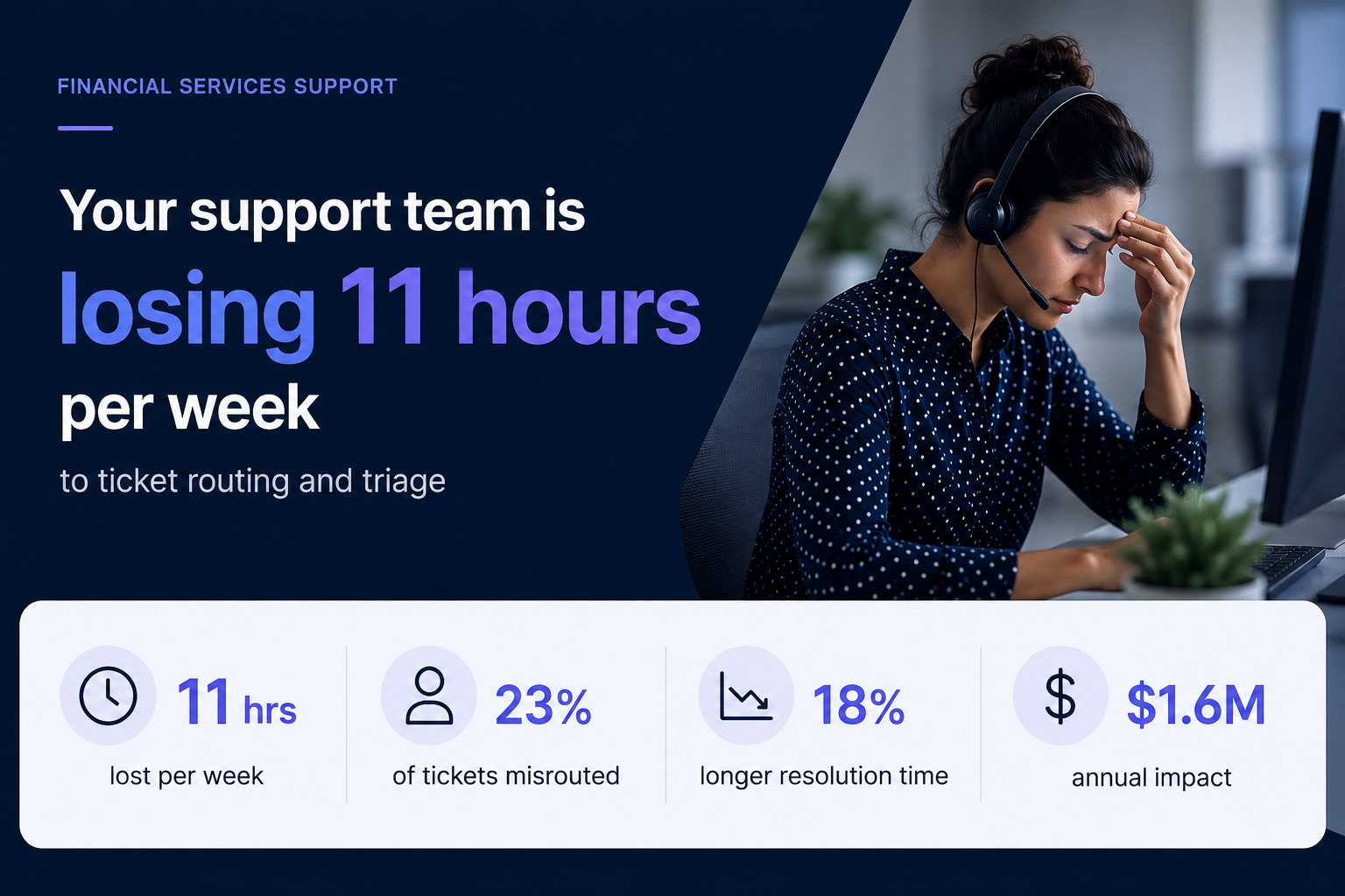
Format: 6–8 slides.
- Opens with industry-specific stats that quantify the problem (e.g., "Your support team is losing 11 hours per week to ticket routing")
- Followed by two slides unpacking why the status quo costs real money
- One slide introducing the solution at a headline level
- One customer proof point
- Calendar-link CTA
Why it works: It earns attention with specificity. A generic "companies waste time on X" slide gets skipped. A slide that names the prospect's actual pain with a number attached signals you've done your homework. The short length respects the buyer's time and makes the entire deck scrollable in under 90 seconds.
No more than a couple of your slides should be about you. The rest should be about the buyer's world. If your current cold deck has four company-about slides and two problem slides, flip it.
Pro tip: Match the client’s visual identity, not yours. Sending a cold deck styled in the buyer's brand palette is an instant credibility signal that takes seconds, rather than a manual design pass. Tools like Presentation.AI can match a brand template with just a URL.
Example 2: The "Before / After" Narrative Deck
Format: 10 slides. Two-act structure.
- Act 1 (slides 1–5): paints a vivid "before" picture of the buyer's current workflow, using screenshots, process diagrams, or data to show friction.
- Act 2 (slides 6–10): shows the "after". Same workflow, streamlined, with measurable improvements from a comparable customer.
Why it works: It makes the transformation tangible without requiring a live demo. Prospects forward this format to internal stakeholders because it tells a self-contained story. The contrast structure is cognitively easy to follow, even for someone skimming at 6 PM on a Friday.
The side-by-side visual on the transition slide (usually slide 5 or 6). A single slide showing "Current state → future state" with a clear arrow does more persuasion work than three paragraphs of body copy.
Example 3: The Data-led Industry Brief
Format: 7 slides disguised as a mini-report. Opens with a market trend or benchmark stat relevant to the prospect's industry, spends three slides building the "so what?" behind the data, then pivots to how your product addresses the gap — framed as insight, not a pitch.
Why it works: It leads with value. The prospect opens it expecting to learn something, not to be sold. By the time your product appears on slide 5, you've already positioned yourself as someone who understands their market. This is the highest reply rate cold deck format we've seen in outbound sales orgs.
If the first slide of your cold outreach deck mentions your product name, you're pitching too early.
Example 4: The One-pager
Format: Technically one slide, but designed as a dense, scannable single page with modular content blocks: problem summary, solution headline, three proof points, and a next-step CTA, often exported as PDF.
Why it works: Buyers share it. It's the deck equivalent of a business card; easy to forward in Slack, attach to an internal email thread, or pull up in a procurement review. No scrolling required.
Forcing your entire pitch into one slide reveals what's actually essential. Build this version even if you also send a longer deck, since it's the artifact most likely to survive inside the buyer's organization.
Pro tip: Presentations.AI's anti-fragile templates keep these dense layouts intact when you swap content blocks for different verticals. One master one-pager, adapted per prospect, without layouts breaking every time you change a headline.
Example 5: The Video-embedded Micro Deck
Format: 4–5 slides. Slide 1 is a personalized Loom or video thumbnail. Slides 2–4 reinforce the video's key points visually: A problem slide, a product screenshot, and a results stat. Slide 5 is the CTA.
Why it works: Combines the warmth of video outreach with the scanability of a deck. Buyers who don't watch the video still get the core argument. Buyers who do watch get reinforcement. It covers both interaction styles within a single asset.
Every key point exists in two formats (spoken and visual). This is especially powerful for async deals where you can't control how each stakeholder consumes your material.
Demo decks serve a different purpose than outreach decks. Your buyer already agreed to a meeting — now the question is whether they'll agree to a next meeting. These sales presentation examples are designed for live walkthroughs, screen shares, and the critical first 20 minutes of a discovery or demo call.
Example 6: The Discovery-first Demo Framework
Format: 12–15 slides, but you only show 8–10 per call. Opens with 2–3 discovery slides (questions for the prospect, not statements about your product). Then branches into relevant product sections based on the answers. Ends with a mutual action plan slide, not a pricing table.
Why it works: It turns a monologue into a conversation. The branching structure means reps aren't flipping past irrelevant slides and saying, "We can skip this one." A move that silently communicates poor preparation. The discovery opening also surfaces objections early, rather than letting them stack up during a rushed Q&A.
Build 5–6 interchangeable product sections (3 slides each) that reps can sequence based on what the prospect says in the first five minutes. This requires templates that don't collapse when you reorder slides, which is exactly what anti-fragile layouts solve.
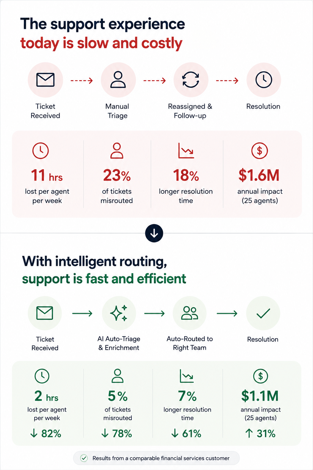
Example 7: The ROI Calculator Deck
Format: 10 slides. Follows a tight loop: Current cost → hidden cost → total cost of inaction → your product's cost → net savings → payback timeline. Slide 8 is always an interactive or semi-interactive calculation customized to the prospect's numbers (headcount, deal volume, average cycle time, whatever drives their cost).
Why it works: Finance gets involved in nearly every B2B deal over $25K. This deck gives your champion the exact ammunition they need for the budget conversation you'll never be invited to. The ROI slide gets screenshotted and dropped into internal justification docs more than any other single slide format.
The "payback timeline" slide. Showing when the investment breaks even reframes the decision from "should we spend this?" to "can we afford to wait?"\
Pro tip: Paste your prospect's earnings report URL or company brief into Presentations.AI as a source input. Clip-E will pull relevant data points to populate the cost assumptions, saving you from the manual research loop that leads reps to skip ROI slides entirely.
Example 8: The Competitive Displacement Deck
Format: 8–10 slides. Never mentions the competitor by name (critical). Instead, frames the comparison around the capability gaps the prospect has already expressed. Slide structure:
"What you told us matters" → "Where your current approach falls short" → "How our approach is architecturally different" → customer switch story → migration timeline.
Why it works: Naming competitors invites defensiveness. Framing the conversation around the buyer's stated frustrations keeps it collaborative. The migration timeline slide is the secret weapon — it answers the unspoken objection ("switching sounds painful") before the prospect has to voice it.
One real example of a company that moved from a similar setup, with a timeline and a before/after metric, neutralizes more risk anxiety than any feature comparison grid.
Example 9: The Multi-stakeholder Demo Deck
Format: 14–16 slides with clearly labeled "sections" for different personas:
- 3-slide executive summary for the VP
- 実装チーム向け技術詳細(5スライド)
- エンドユーザー推進者向けの導入・展開計画(3スライド)
各セクションは視覚的に区別されています(異なるアクセントカラーやヘッダーデザインを使用)。
なぜ機能するのかエンタープライズ案件には6~10人の意思決定者がいます。ステークホルダーに一枚岩の資料を送り、自分たちに関連する部分を探させるようでは、ほとんどの人は見ようとしないでしょう。このセグメント化された形式なら、推進者は「9ページに飛んでください、そこが私たちのチーム向けの部分です」と言え、社内レビューサイクルを即座に短縮できます。
ヘッダーバーのちょっとした色の変化だけでも「この部分はあなた向けです」というサインになり、資料に組み込みのナビゲーションシステムを与えます。Brand Syncはこれを自動的に処理します。セクションのパレットを一度設定すれば、手動で色を選ぶことなく、すべてのスライドに適用されます。
例10:更新・拡張資料
形式6~8枚のスライド。契約更新の60~90日前に使用します。
- スライド1顧客が契約した際の当初の目標の振り返り。
- スライド2利用データと導入指標。
- スライド3達成された成果(提示されたKPIに紐付け)。
- スライド4利用開始後に何が変わったか(新機能、拡張された機能)。
- スライド5拡張の機会。まだ利用していないものと、それが何をもたらすか。
- スライド6: 更新条件と次のステップ
その理由: 「契約期限が近づいています」から始まる更新の会話は、顧客を評価モードに陥らせます。「これまでの成果です」から始まる更新の会話は、顧客を感謝モードにします。この資料構成は、更新の決定を実現された価値に結びつけ、価格への敏感さを二の次にするものです。
顧客自身のエンゲージメント数値を提示しましょう。ログイン数、利用機能、完了したワークフローなどです。チームが月に400回もツールを利用している証拠を見せられれば、「このツールは不要だ」と反論するのは難しいでしょう。
全ての事例に共通するパターン:優れた営業資料に共通すること
10種類の異なるフォーマット、文脈、ユースケースを見てきた結果、どの優れた営業プレゼンテーションにも共通するいくつかの構成原則が見えてきました。
買い手の課題は常に製品よりも先に提示されます。 このリストにある効果的な営業資料で、製品概要から始まるものは一つもありません。最も強力な事例では、スライドの40~60%を買い手の世界、つまり彼らの苦痛、コスト、ワークフローの摩擦に費やし、その後に解決策を提示しています。
すべての資料には、たった一つの役割があります。 コールドアウトリーチ資料は次のミーティングを獲得し、デモ資料は次のステップに進み、提案資料は委員会を通過し、更新資料は提供された価値に焦点を当てます。
カスタマイズの速度: ブランドカラーの手動調整、ロゴの入れ替え、見込み客ごとのレイアウト再フォーマット、そして要素が壊れないようにエクスポートすること。これらは、営業チーム全体での資料活用を阻害する目に見えない負担です。常に契約を獲得している営業担当者は、デザインに何時間も費やしていません。彼らはカスタマイズに数分を費やし、実際の会話に何時間も費やしています。
出力フォーマットの柔軟性は必須です。 画面上で視覚的に魅力的であり、.pptxやPDFとしてエクスポートしても構造が損なわれない資料が必要です。もしあなたのプレゼンテーションツールが、美しいウェブレンダリングはできるものの、PowerPointファイルが壊れてしまうようなら、資料があなたの手を離れた瞬間に、あなたはストーリーのコントロールを失うことになります。
これらの事例から独自の営業資料を作成する方法
事例を研究することは役立ちますが、それらを自身のパイプラインに合わせて再構築することで、価値は倍増します。「この構成は良い」から「見込み客に送ったばかりだ」という状態まで、デザインの回り道をすることなく到達できる実践的なワークフローをご紹介します。
ステップ1: 営業フェーズに合ったフォーマットを選びましょう。あなたのことを全く知らない相手にコールドアウトリーチを送る場合は、事例1~5から始めましょう。ライブデモの準備をしている場合は、6~8を使用してください。購買委員会と対面する場合は、事例9~10を使用してください。
ステップ2: 白紙の状態からではなく、既存のコンテンツから始めましょう。テンプレートから完成した資料を作成する最も速い方法は、既存の資料を取り込むことです。これは、通話記録、提案書、製品概要、あるいは競合他社のランディングページURLでも構いません。
ステップ3: ブランドを自動的に反映させましょう。会社のURLをPresentations.AIのブランド同期機能(例)に入力するだけです。色、フォント、ロゴが手動で調整することなく、すべてのスライドに適用されます。顧客のブランドに合わせて資料を作成する場合は、顧客のURLを入力してください。
ステップ4: スライドごとにではなく、対話形式で修正を繰り返しましょう。各スライドをクリックして編集する代わりに、Clip-Eのような機能を使って、希望する内容を記述することで資料全体に変更を加えることができます。「ROIのセクションをもっと目立たせてください。」「課題のスライドの後に顧客の成功事例を追加してください。」「役員向けバージョンとして、これを6枚のスライドに短縮してください。」といった指示で、レイアウトが崩れることなく資料が調整されます。
ステップ5: きれいにエクスポートし、スマートに共有しましょう。PowerPointを常用する購入者向けには.pptx形式でエクスポートします。ブラウザで閲覧する購入者向けには、追跡可能なリンクを共有します。どちらの方法でも、内蔵のアナリティクス機能により、どのスライドが閲覧されたか、見込み客が価格ページにどれくらいの時間を費やしたか、資料が転送されたかどうかを確認できます。
次の資料の作り方
10の事例すべてに共通する点は明確です。買い手の課題が最優先され、構成が説得力を生み出し、営業担当者が実際にカスタマイズできるほど迅速に調整が行われます。これらにはデザインの才能や何時間もの準備は必要ありません。必要なのは適切な出発点と、反復作業を処理してくれるツールであり、それによってあなたは対話に集中できます。
あなたを全く知らない見込み客にコールドワンペーパーを送る場合でも、6人の購買委員会にエンタープライズ向け提案書を説明する場合でも、あなたが口を開く前に、そのフォーマット自体が営業の半分を担っているべきです。
現在の営業フェーズに最も近い事例を選び、実際のコンテンツを取り込み、ブランドが本来あるべき姿で、一貫して、手作業での修正なしに表示されるようにしましょう。Presentations.AIのようなツールは、それを標準にするために作られています。