Many sales presentations still open the same way. Company history slide. Mission statement. Team photo. By the time you get to the problem your prospect actually cares about, they've already checked Slack twice and mentally moved on to their next meeting.
The examples in this post do the opposite. They lead with the buyer's world, not the seller's ego, and they're structured to hold attention through a clear, logical arc that ends with an obvious next step.
What separates a sales presentation that closes from one that gets a polite "We'll circle back"? After analyzing dozens of real-world decks across SaaS, services, and consulting, we found three consistent patterns. Read on to learn these patterns.
TL;DR
- Many sales presentations fail because the deck loses the buyer's attention before even getting to the problem they want to solve.
- Structure matters more than design polish. The best sales decks follow predictable patterns: Problem → Stakes → Solution → Proof → Ask.
- One-size-fits-all templates usually backfire. A SaaS demo deck and an enterprise proposal deck need fundamentally different layouts, pacing, and proof points.
- Customization speed is the real bottleneck. Reps who can adapt a proven example to a specific prospect in minutes close more.
- Your brand should show up automatically, not eat up half your prep time on font matching and color codes.
- Examples in this post can be rebuilt using AI-powered presentation tools like Presentations.AI.
How We Selected These Examples
Not every pretty deck is an effective sales deck. We filtered with three criteria:
1. Structural clarity: Each example follows a recognizable narrative arc that a buyer can follow without a presenter walking them through every slide. If a deck only works when someone's talking over it, it doesn’t make the cut.
2. Real-world applicability: We prioritized examples from actual sales contexts: SaaS product demos, agency pitches, enterprise proposals, investor-facing revenue decks, and partnership requirements.
3. Rebuildability: Every example here can be recreated or adapted using modern presentation tools. Where relevant, we'll call out how features like Brand Sync (which auto-pulls your brand's colors, fonts, and logo from your company URL) or AI-driven layout adaptation eliminate the grunt work of customizing these for your own pipeline.
With that framing set, let's get into the examples, starting with the format that most sales teams need first: the cold outreach deck that earns a second meeting.
Decks That Earn a Second Meeting
Decks have the hardest job in sales: These five sales presentation examples are built for that exact environment. short, async-friendly, and focused on the buyer's problem.
Example 1: The Stat-led Opener
Format: 6–8 slides.
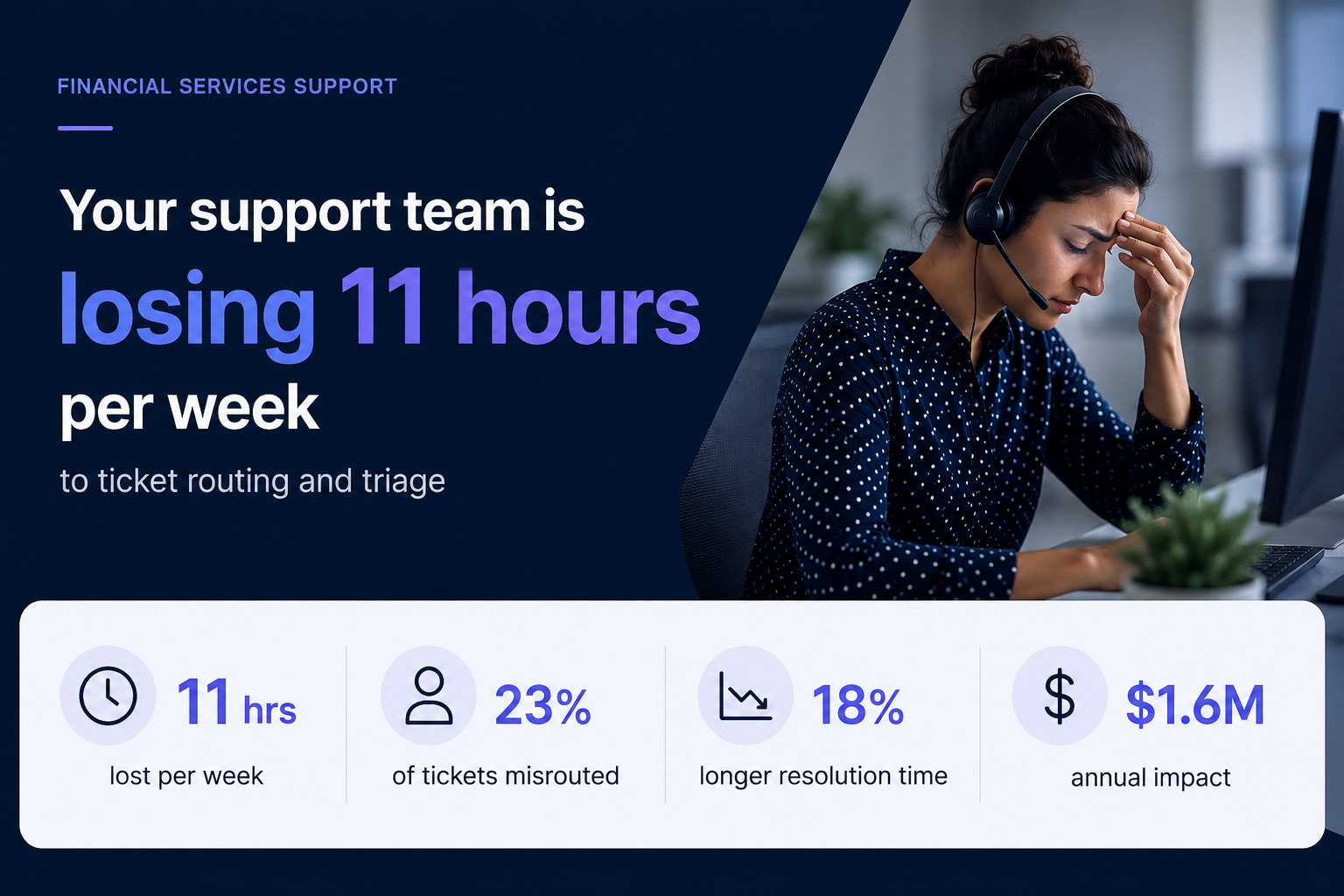
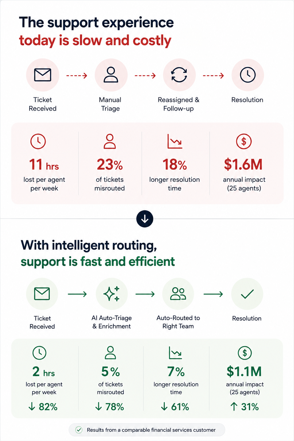
- Opens with industry-specific stats that quantify the problem (e.g., "Your support team is losing 11 hours per week to ticket routing")
- Followed by two slides unpacking why the status quo costs real money
- One slide introducing the solution at a headline level
- One customer proof point
- Calendar-link CTA
Why it works: It earns attention with specificity. A generic "companies waste time on X" slide gets skipped. A slide that names the prospect's actual pain with a number attached signals you've done your homework. The short length respects the buyer's time and makes the entire deck scrollable in under 90 seconds.
No more than a couple of your slides should be about you. The rest should be about the buyer's world. If your current cold deck has four company-about slides and two problem slides, flip it.
Pro tip: Match the client’s visual identity, not yours. Sending a cold deck styled in the buyer's brand palette is an instant credibility signal that takes seconds, rather than a manual design pass. Tools like Presentation.AI can match a brand template with just a URL.
Example 2: The "Before / After" Narrative Deck
Format: 10 slides. Two-act structure.
- Act 1 (slides 1–5): paints a vivid "before" picture of the buyer's current workflow, using screenshots, process diagrams, or data to show friction.
- Act 2 (slides 6–10): shows the "after". Same workflow, streamlined, with measurable improvements from a comparable customer.
Why it works: It makes the transformation tangible without requiring a live demo. Prospects forward this format to internal stakeholders because it tells a self-contained story. The contrast structure is cognitively easy to follow, even for someone skimming at 6 PM on a Friday.
The side-by-side visual on the transition slide (usually slide 5 or 6). A single slide showing "Current state → future state" with a clear arrow does more persuasion work than three paragraphs of body copy.
Example 3: The Data-led Industry Brief
Format: 7 slides disguised as a mini-report. Opens with a market trend or benchmark stat relevant to the prospect's industry, spends three slides building the "so what?" behind the data, then pivots to how your product addresses the gap — framed as insight, not a pitch.
Why it works: It leads with value. The prospect opens it expecting to learn something, not to be sold. By the time your product appears on slide 5, you've already positioned yourself as someone who understands their market. This is the highest reply rate cold deck format we've seen in outbound sales orgs.
If the first slide of your cold outreach deck mentions your product name, you're pitching too early.
Example 4: The One-pager
Format: Technically one slide, but designed as a dense, scannable single page with modular content blocks: problem summary, solution headline, three proof points, and a next-step CTA, often exported as PDF.
Why it works: Buyers share it. It's the deck equivalent of a business card; easy to forward in Slack, attach to an internal email thread, or pull up in a procurement review. No scrolling required.
Forcing your entire pitch into one slide reveals what's actually essential. Build this version even if you also send a longer deck, since it's the artifact most likely to survive inside the buyer's organization.
Pro tip: Presentations.AI's anti-fragile templates keep these dense layouts intact when you swap content blocks for different verticals. One master one-pager, adapted per prospect, without layouts breaking every time you change a headline.
Example 5: The Video-embedded Micro Deck
Format: 4–5 slides. Slide 1 is a personalized Loom or video thumbnail. Slides 2–4 reinforce the video's key points visually: A problem slide, a product screenshot, and a results stat. Slide 5 is the CTA.
Why it works: Combines the warmth of video outreach with the scanability of a deck. Buyers who don't watch the video still get the core argument. Buyers who do watch get reinforcement. It covers both interaction styles within a single asset.
Every key point exists in two formats (spoken and visual). This is especially powerful for async deals where you can't control how each stakeholder consumes your material.
Demo decks serve a different purpose than outreach decks. Your buyer already agreed to a meeting — now the question is whether they'll agree to a next meeting. These sales presentation examples are designed for live walkthroughs, screen shares, and the critical first 20 minutes of a discovery or demo call.
Example 6: The Discovery-first Demo Framework
Format: 12–15 slides, but you only show 8–10 per call. Opens with 2–3 discovery slides (questions for the prospect, not statements about your product). Then branches into relevant product sections based on the answers. Ends with a mutual action plan slide, not a pricing table.
Why it works: It turns a monologue into a conversation. The branching structure means reps aren't flipping past irrelevant slides and saying, "We can skip this one." A move that silently communicates poor preparation. The discovery opening also surfaces objections early, rather than letting them stack up during a rushed Q&A.
Build 5–6 interchangeable product sections (3 slides each) that reps can sequence based on what the prospect says in the first five minutes. This requires templates that don't collapse when you reorder slides, which is exactly what anti-fragile layouts solve.
Example 7: The ROI Calculator Deck
Format: 10 slides. Follows a tight loop: Current cost → hidden cost → total cost of inaction → your product's cost → net savings → payback timeline. Slide 8 is always an interactive or semi-interactive calculation customized to the prospect's numbers (headcount, deal volume, average cycle time, whatever drives their cost).
Why it works: Finance gets involved in nearly every B2B deal over $25K. This deck gives your champion the exact ammunition they need for the budget conversation you'll never be invited to. The ROI slide gets screenshotted and dropped into internal justification docs more than any other single slide format.
The "payback timeline" slide. Showing when the investment breaks even reframes the decision from "should we spend this?" to "can we afford to wait?"\
Pro tip: Paste your prospect's earnings report URL or company brief into Presentations.AI as a source input. Clip-E will pull relevant data points to populate the cost assumptions, saving you from the manual research loop that leads reps to skip ROI slides entirely.
Example 8: The Competitive Displacement Deck
Format: 8–10 slides. Never mentions the competitor by name (critical). Instead, frames the comparison around the capability gaps the prospect has already expressed. Slide structure:
"What you told us matters" → "Where your current approach falls short" → "How our approach is architecturally different" → customer switch story → migration timeline.
Why it works: Naming competitors invites defensiveness. Framing the conversation around the buyer's stated frustrations keeps it collaborative. The migration timeline slide is the secret weapon — it answers the unspoken objection ("switching sounds painful") before the prospect has to voice it.
One real example of a company that moved from a similar setup, with a timeline and a before/after metric, neutralizes more risk anxiety than any feature comparison grid.
Example 9: The Multi-stakeholder Demo Deck
Format: 14–16 slides with clearly labeled "sections" for different personas:
- 3-slide executive summary for the VP
- 5页技术深度解析,供实施团队参考
- 3页用户采纳/推广计划,供最终用户负责人参考
每个部分在视觉上都独具特色(采用不同的强调色或标题处理方式)。
运作原理:企业交易通常有6-10个决策者。如果你向所有利益相关者发送一份庞大的演示文稿,并期望他们自行寻找相关内容,大多数人根本不会费心。这种分段式格式能让你的负责人说:“跳到第9页,那是我们团队需要看的部分”,从而立即缩短内部审查周期。
即使是标题栏简单的颜色变化,也能传达“这部分是为你准备的”信号,并为演示文稿提供内置导航系统。Brand Sync 会自动处理这一切——你只需设置一次部分调色板,它就会自动应用到每张幻灯片,无需手动选择颜色。
示例10:续约/拓展演示文稿
格式:6-8页。在合同续约前60-90天使用。
- 幻灯片1:客户签约时的原始目标回顾。
- 幻灯片2:使用数据和采纳指标。
- 幻灯片3:已实现的成果(与客户设定的KPI挂钩)。
- 幻灯片4:自客户开始使用以来发生的变化(新功能、扩展能力)。
- 幻灯片5:拓展机会。客户尚未使用的功能以及这些功能将带来的价值。
- 幻灯片6: 续订条款和后续步骤
为什么它有效: 以“您的合同即将到期”开头的续订对话会让客户进入评估模式。而以“这是您所取得的成就”开头的续订对话则会让他们进入欣赏模式。这种演示文稿结构将续订决策与已实现的价值挂钩,从而使价格敏感度退居次要地位。
向客户展示他们自己的参与度数据。登录次数、使用的功能、完成的工作流程。当您看到您的团队每月使用该工具400次的证据时,很难争辩说您不需要它。
所有示例中的共同模式:最佳销售演示文稿的共同点
在审视了十种不同的格式、情境和用例之后,一些结构性原则在每一个高效的销售演示中都显而易见:
买家的问题永远先于您的产品。 此列表上没有一个有效的销售演示文稿以产品概述开头。最出色的示例将40%至60%的幻灯片用于描述买家的世界。在介绍解决方案之前,先阐述他们的痛点、成本和工作流程中的摩擦。
每个演示文稿都只有一个明确的任务: 冷启动外联演示文稿旨在争取第二次会议。演示文稿旨在推进下一步。提案演示文稿旨在通过委员会审批。续订演示文稿旨在强调已交付的价值。
定制速度: 手动匹配品牌颜色、更换标志、为每个潜在客户重新排版布局,以及导出时没有损坏的元素:这是扼杀销售团队演示文稿采用率的无形负担。那些持续成交的销售代表不会在设计上花费数小时。他们只花几分钟进行定制,而将大部分时间投入到实际的对话中。
输出格式的灵活性不容妥协: 您需要演示文稿在屏幕上具有视觉吸引力,并且在导出为.pptx或PDF时结构完整。如果您的演示工具能生成精美的网页渲染,但导出的PowerPoint文件却损坏,那么一旦它离开您的掌控,您就失去了对叙述的控制。
如何根据这些示例构建您自己的销售演示文稿
研究示例很有用。但为您的销售流程重新构建它们才能实现价值倍增。这是一个实用的工作流程,能让您从“我喜欢那个结构”直接过渡到“我刚刚把它发给了我的潜在客户”,无需绕道设计环节。
步骤1: 选择与您的销售阶段相匹配的格式。如果您正在向从未听说过您的人发送冷启动外联,请从示例1-5开始。如果您正在准备现场演示,请使用6-8。面对采购委员会?请使用示例9-10。
步骤2:从您的内容开始,而不是空白画布。从示例到完成演示文稿的最快途径是输入您现有的材料。这可以是通话记录、提案文档、产品简介,甚至是竞争对手的着陆页网址。
步骤 3:让您的品牌自动呈现。将您的公司网址输入 Presentations.AI 的品牌同步功能(仅为示例)。您的颜色、字体和徽标将自动应用于每张幻灯片,无需任何手动调整。如果您要制作一份符合潜在客户品牌风格的演示文稿,则输入他们的网址。
步骤 4:通过对话式交互进行迭代,而非逐张幻灯片操作。无需点击每张幻灯片进行编辑,您可以使用 Clip-E 等功能,通过描述您的需求来对整个演示文稿进行更改。“让投资回报率部分更突出。”“在问题幻灯片后添加一个客户案例。”“将此版本缩短为 6 张幻灯片,用于高管演示。”演示文稿会自动调整,而不会破坏布局。
步骤 5:导出整洁,智能分享。对于习惯使用 PowerPoint 的买家,可导出为 .pptx 格式。对于将在浏览器中查看的买家,可分享带追踪功能的链接。无论哪种方式,内置分析功能都能让您了解哪些幻灯片被查看、潜在客户在定价页面停留了多久,以及演示文稿是否被转发。
如何制作您的下一个演示文稿
这十个示例都遵循一个简单原则:买家的问题优先,结构负责说服,定制化足够快速,销售人员乐于使用。这些都不需要设计天赋或数小时的准备工作。它只需要一个正确的起点和一个能处理重复性工作的工具,这样您就可以专注于对话。
无论您是向从未听说过您的潜在客户发送一份冷启动单页介绍,还是向一个六人采购委员会讲解企业提案,演示文稿的格式都应该在您开口之前完成一半的销售工作。
选择最符合您当前销售阶段的示例,输入您的真实内容,让您的品牌以应有的方式呈现,保持一致且无需手动清理。Presentations.AI 等工具旨在将此设为默认操作。