Many sales presentations still open the same way. Company history slide. Mission statement. Team photo. By the time you get to the problem your prospect actually cares about, they've already checked Slack twice and mentally moved on to their next meeting.
The examples in this post do the opposite. They lead with the buyer's world, not the seller's ego, and they're structured to hold attention through a clear, logical arc that ends with an obvious next step.
What separates a sales presentation that closes from one that gets a polite "We'll circle back"? After analyzing dozens of real-world decks across SaaS, services, and consulting, we found three consistent patterns. Read on to learn these patterns.
TL;DR
- Many sales presentations fail because the deck loses the buyer's attention before even getting to the problem they want to solve.
- Structure matters more than design polish. The best sales decks follow predictable patterns: Problem → Stakes → Solution → Proof → Ask.
- One-size-fits-all templates usually backfire. A SaaS demo deck and an enterprise proposal deck need fundamentally different layouts, pacing, and proof points.
- Customization speed is the real bottleneck. Reps who can adapt a proven example to a specific prospect in minutes close more.
- Your brand should show up automatically, not eat up half your prep time on font matching and color codes.
- Examples in this post can be rebuilt using AI-powered presentation tools like Presentations.AI.
How We Selected These Examples
Not every pretty deck is an effective sales deck. We filtered with three criteria:
1. Structural clarity: Each example follows a recognizable narrative arc that a buyer can follow without a presenter walking them through every slide. If a deck only works when someone's talking over it, it doesn’t make the cut.
2. Real-world applicability: We prioritized examples from actual sales contexts: SaaS product demos, agency pitches, enterprise proposals, investor-facing revenue decks, and partnership requirements.
3. Rebuildability: Every example here can be recreated or adapted using modern presentation tools. Where relevant, we'll call out how features like Brand Sync (which auto-pulls your brand's colors, fonts, and logo from your company URL) or AI-driven layout adaptation eliminate the grunt work of customizing these for your own pipeline.
With that framing set, let's get into the examples, starting with the format that most sales teams need first: the cold outreach deck that earns a second meeting.
Decks That Earn a Second Meeting
Decks have the hardest job in sales: These five sales presentation examples are built for that exact environment. short, async-friendly, and focused on the buyer's problem.
Example 1: The Stat-led Opener
Format: 6–8 slides.
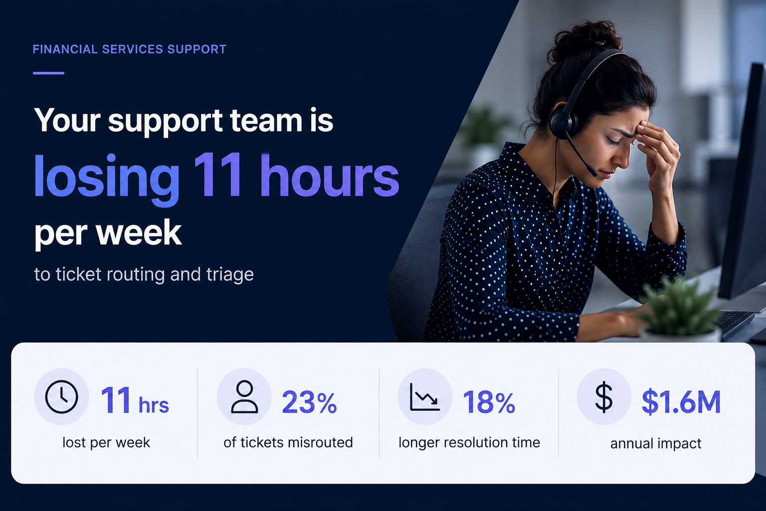
- Opens with industry-specific stats that quantify the problem (e.g., "Your support team is losing 11 hours per week to ticket routing")
- Followed by two slides unpacking why the status quo costs real money
- One slide introducing the solution at a headline level
- One customer proof point
- Calendar-link CTA
Why it works: It earns attention with specificity. A generic "companies waste time on X" slide gets skipped. A slide that names the prospect's actual pain with a number attached signals you've done your homework. The short length respects the buyer's time and makes the entire deck scrollable in under 90 seconds.
No more than a couple of your slides should be about you. The rest should be about the buyer's world. If your current cold deck has four company-about slides and two problem slides, flip it.
Pro tip: Match the client’s visual identity, not yours. Sending a cold deck styled in the buyer's brand palette is an instant credibility signal that takes seconds, rather than a manual design pass. Tools like Presentation.AI can match a brand template with just a URL.
Example 2: The "Before / After" Narrative Deck
Format: 10 slides. Two-act structure.
- Act 1 (slides 1–5): paints a vivid "before" picture of the buyer's current workflow, using screenshots, process diagrams, or data to show friction.
- Act 2 (slides 6–10): shows the "after". Same workflow, streamlined, with measurable improvements from a comparable customer.
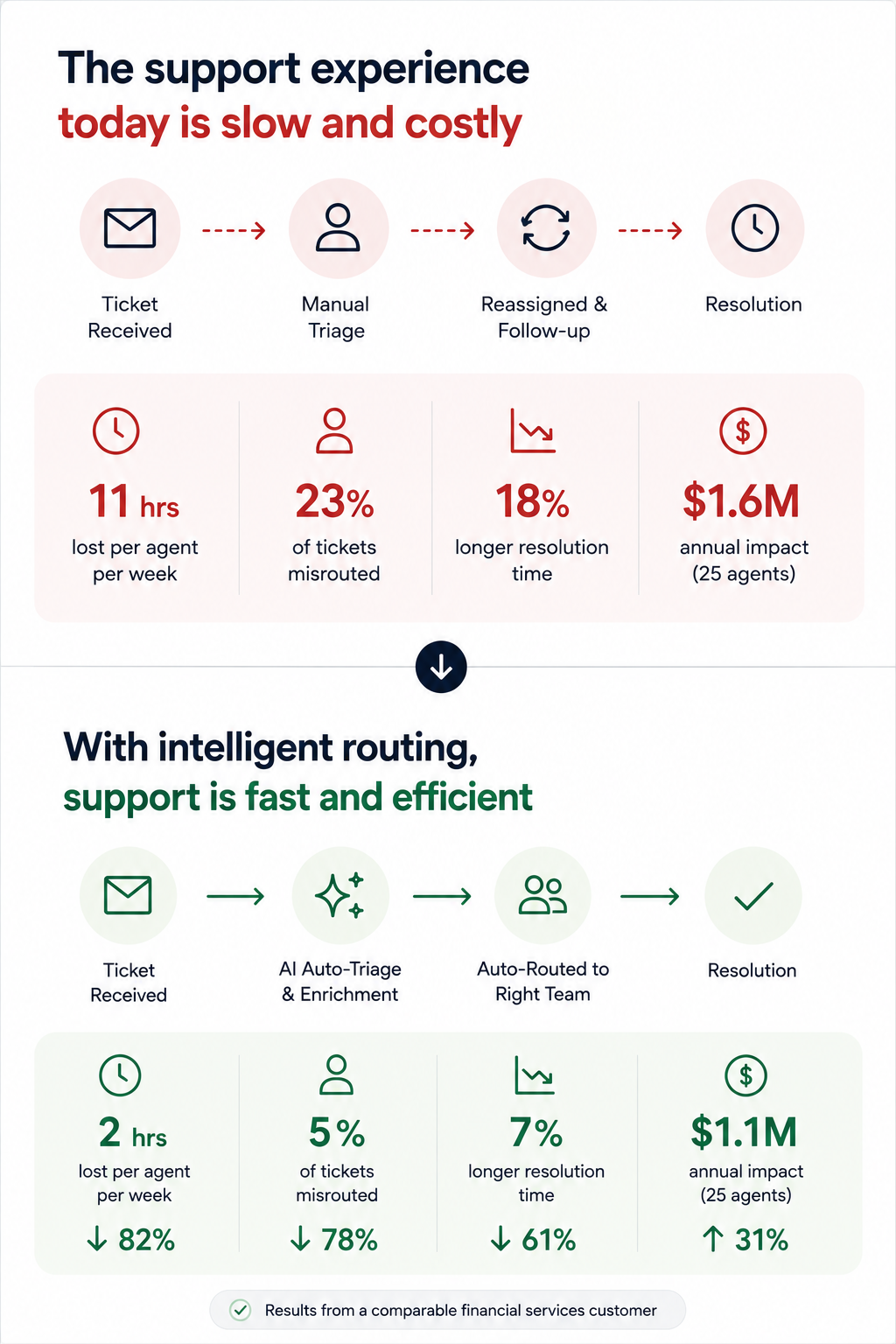
Why it works: It makes the transformation tangible without requiring a live demo. Prospects forward this format to internal stakeholders because it tells a self-contained story. The contrast structure is cognitively easy to follow, even for someone skimming at 6 PM on a Friday.
The side-by-side visual on the transition slide (usually slide 5 or 6). A single slide showing "Current state → future state" with a clear arrow does more persuasion work than three paragraphs of body copy.
Example 3: The Data-led Industry Brief
Format: 7 slides disguised as a mini-report. Opens with a market trend or benchmark stat relevant to the prospect's industry, spends three slides building the "so what?" behind the data, then pivots to how your product addresses the gap — framed as insight, not a pitch.
Why it works: It leads with value. The prospect opens it expecting to learn something, not to be sold. By the time your product appears on slide 5, you've already positioned yourself as someone who understands their market. This is the highest reply rate cold deck format we've seen in outbound sales orgs.
If the first slide of your cold outreach deck mentions your product name, you're pitching too early.
Example 4: The One-pager
Format: Technically one slide, but designed as a dense, scannable single page with modular content blocks: problem summary, solution headline, three proof points, and a next-step CTA, often exported as PDF.
Why it works: Buyers share it. It's the deck equivalent of a business card; easy to forward in Slack, attach to an internal email thread, or pull up in a procurement review. No scrolling required.
Forcing your entire pitch into one slide reveals what's actually essential. Build this version even if you also send a longer deck, since it's the artifact most likely to survive inside the buyer's organization.
Pro tip: Presentations.AI's anti-fragile templates keep these dense layouts intact when you swap content blocks for different verticals. One master one-pager, adapted per prospect, without layouts breaking every time you change a headline.
Example 5: The Video-embedded Micro Deck
Format: 4–5 slides. Slide 1 is a personalized Loom or video thumbnail. Slides 2–4 reinforce the video's key points visually: A problem slide, a product screenshot, and a results stat. Slide 5 is the CTA.
Why it works: Combines the warmth of video outreach with the scanability of a deck. Buyers who don't watch the video still get the core argument. Buyers who do watch get reinforcement. It covers both interaction styles within a single asset.
Every key point exists in two formats (spoken and visual). This is especially powerful for async deals where you can't control how each stakeholder consumes your material.
Demo decks serve a different purpose than outreach decks. Your buyer already agreed to a meeting — now the question is whether they'll agree to a next meeting. These sales presentation examples are designed for live walkthroughs, screen shares, and the critical first 20 minutes of a discovery or demo call.
Example 6: The Discovery-first Demo Framework
Format: 12–15 slides, but you only show 8–10 per call. Opens with 2–3 discovery slides (questions for the prospect, not statements about your product). Then branches into relevant product sections based on the answers. Ends with a mutual action plan slide, not a pricing table.
Why it works: It turns a monologue into a conversation. The branching structure means reps aren't flipping past irrelevant slides and saying, "We can skip this one." A move that silently communicates poor preparation. The discovery opening also surfaces objections early, rather than letting them stack up during a rushed Q&A.
Build 5–6 interchangeable product sections (3 slides each) that reps can sequence based on what the prospect says in the first five minutes. This requires templates that don't collapse when you reorder slides, which is exactly what anti-fragile layouts solve.
Example 7: The ROI Calculator Deck
Format: 10 slides. Follows a tight loop: Current cost → hidden cost → total cost of inaction → your product's cost → net savings → payback timeline. Slide 8 is always an interactive or semi-interactive calculation customized to the prospect's numbers (headcount, deal volume, average cycle time, whatever drives their cost).
Why it works: Finance gets involved in nearly every B2B deal over $25K. This deck gives your champion the exact ammunition they need for the budget conversation you'll never be invited to. The ROI slide gets screenshotted and dropped into internal justification docs more than any other single slide format.
The "payback timeline" slide. Showing when the investment breaks even reframes the decision from "should we spend this?" to "can we afford to wait?"\
Pro tip: Paste your prospect's earnings report URL or company brief into Presentations.AI as a source input. Clip-E will pull relevant data points to populate the cost assumptions, saving you from the manual research loop that leads reps to skip ROI slides entirely.
Example 8: The Competitive Displacement Deck
Format: 8–10 slides. Never mentions the competitor by name (critical). Instead, frames the comparison around the capability gaps the prospect has already expressed. Slide structure:
"What you told us matters" → "Where your current approach falls short" → "How our approach is architecturally different" → customer switch story → migration timeline.
Why it works: Naming competitors invites defensiveness. Framing the conversation around the buyer's stated frustrations keeps it collaborative. The migration timeline slide is the secret weapon — it answers the unspoken objection ("switching sounds painful") before the prospect has to voice it.
One real example of a company that moved from a similar setup, with a timeline and a before/after metric, neutralizes more risk anxiety than any feature comparison grid.
Example 9: The Multi-stakeholder Demo Deck
Format: 14–16 slides with clearly labeled "sections" for different personas:
- 3-slide executive summary for the VP
- 5-slide technical deep-dive for the implementation team
- 3-slide adoption/rollout plan for the end-user champion
Each section is visually distinct (With a different accent color or header treatment).
Why it works: Enterprise deals have 6–10 decision-makers. If you send a monolithic deck to stakeholders and expect them to hunt for what's relevant to them, most won't bother. This segmented format lets your champion say, "Skip to slide 9, that's the part for our team," and immediately shortens internal review cycles.
Even a simple color shift in the header bar signals "this part is for you" and gives the deck a built-in navigation system. Brand Sync handles this automatically — set your section palette once, and it propagates across every slide without manual color picking.
Example 10: The Renewal / Expansion Deck
Format: 6–8 slides. Used 60–90 days before contract renewal.
- Slide 1: Recap of original goals when the customer signed.
- Slide 2: Usage data and adoption metrics.
- Slide 3: Outcomes delivered (tied to their stated KPIs).
- Slide 4: What's changed since they started (new features, expanded capabilities).
- Slide 5: Expansion opportunity. What they're not using yet and what it would unlock.
- Slide 6: Renewal terms and next steps
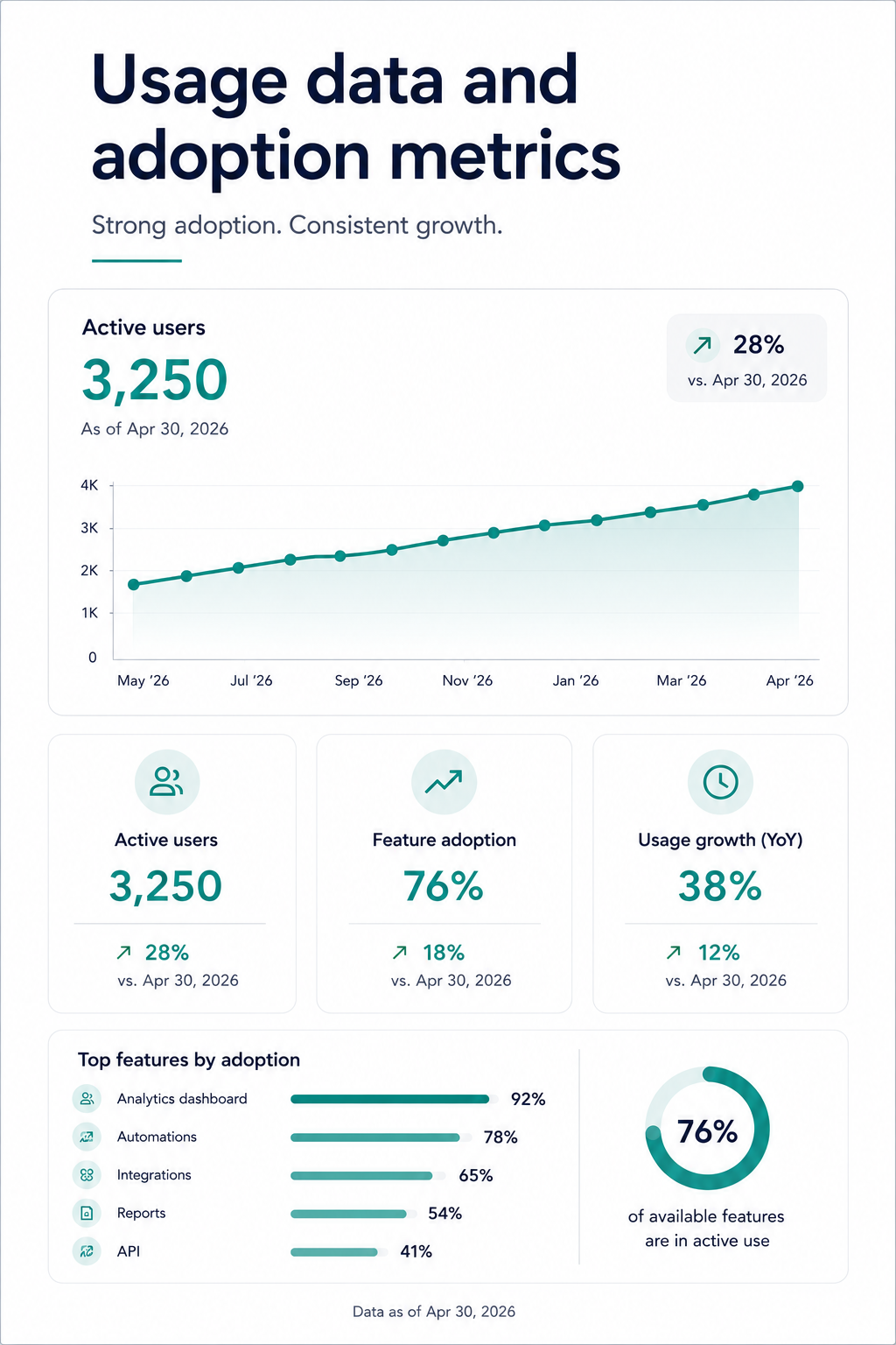
Why it works: Renewal conversations that start with "your contract is expiring" put the customer in evaluation mode. Renewal conversations that start with "here's what you've accomplished" put them in appreciation mode. This deck structure anchors the renewal decision to realized value, making price sensitivity secondary.
Show the customer their own engagement numbers. Logins, features used, workflows completed. It's hard to argue you don't need a tool when you're looking at proof that your team uses it 400 times a month.
Patterns Across All Examples: What the Best Sales Decks Have in Common
After walking through ten different formats, contexts, and use cases, a few structural principles show up in every single high-performing sales presentation:
The buyer's problem always comes before your product. Not a single effective sales deck on this list opens with a product overview. The strongest examples spend 40–60% of their slides in the buyer's world. Their pain, their cost, their workflow friction, before introducing a solution.
Every deck has exactly one job: Cold outreach decks earn a second meeting. Demo decks move to the next step. Proposal decks survive the committee. Renewal decks anchor to value delivered.
Customization speed: Manually matching brand colors, swapping logos, reformatting layouts for each prospect, and exporting without broken elements: That's the invisible tax that kills deck adoption across sales teams. The reps who close consistently aren't spending hours on design. They're spending minutes on customization and hours on the actual conversation.
Output format flexibility is non-negotiable: You need decks that are visually engaging on screen and structurally intact when exported as .pptx or PDF. If your presentation tool produces beautiful web renders but broken PowerPoint files, you're losing control of your narrative the moment it leaves your hands.
How to Build Your Own Sales Deck From These Examples
Studying examples is useful. Rebuilding them for your pipeline is where the value compounds. Here's a practical workflow that takes you from "I like that structure" to "I just sent it to my prospect", without a design detour.
Step 1: Pick the format that matches your sales stage. If you're sending a cold outreach to someone who's never heard of you, start with examples 1–5. If you're prepping for a live demo, use 6–8. Facing a buying committee? Use examples 9–10.
Step 2: Start with your content, not a blank canvas. The fastest path from example to finished deck is feeding your existing material. This could be a call transcript, a proposal doc, a product brief, or even a competitor's landing page URL.
Step 3: Let your brand show up automatically. Drop your company URL into Presentations.AI’s Brand Sync (Just an example). Your colors, fonts, and logo propagate across every slide without a single manual adjustment. If you're building a deck styled in the prospect's brand, drop their URL instead.
Step 4: Iterate conversationally, not slide-by-slide. Instead of clicking into each slide to make edits, use features such as Clip-E to make changes across the deck by describing what you want. "Make the ROI section more prominent." "Add a customer proof point after the problem slide." "Shorten this to 6 slides for the exec version." The deck adapts without layout breaking.
Step 5: Export clean and share smart. Export as .pptx for buyers who live in PowerPoint. Share a tracked link for buyers who'll view it in-browser. Either way, built-in analytics let you see which slides get viewed, how long prospects spend on the pricing page, and whether the deck got forwarded.
How To Build Your Next Deck
The line across all ten examples is straightforward: The buyer's problem comes first, the structure does the persuasion work, and customization happens fast enough that reps actually do it. None of that requires design talent or hours of prep. It requires the right starting point and a tool that handles the repetitive work so you can focus on the conversation.
Whether you're sending a cold one-pager to a prospect who's never heard of you or walking a six-person buying committee through an enterprise proposal, the format should be doing half the selling before you ever open your mouth.
Pick the example closest to your current sales stage, feed it your real content, and let your brand show up the way it should, consistently and without the manual cleanup. Tools such as Presentations.AI are built to make that the default.