TL;DR
- Interactive presentations use polls, quizzes, clickable navigation, and live Q&A to turn passive viewers into active, engaged participants throughout your deck.
- Embedded videos and purposeful animations add depth, but overusing them creates a distraction rather than the meaningful engagement you actually want from your audience.
- The best approach is to match each interactive element to a specific goal, such as reinforcing a point, checking understanding, or sparking real-time conversation.
- Spacing interactive moments every few slides keeps energy high without overwhelming your audience or breaking the narrative flow of your presentation.
- Presentations.AI works as an interactive presentation maker that lets you add polls, animations, and dynamic elements with AI-powered speed and simplicity.
You built a polished deck with great visuals and a solid narrative. Halfway through, your audience drifts, eyes on phones, energy fading. Ever had this problem? The trouble is the format. Static slides ask people to sit and absorb. Interactive presentations ask them to participate.
Interactive features such as polls, quizzes, clickable slides, embedded videos, and live Q&A turn a one-way broadcast into a two-way conversation. They give your audience a reason to stay present. Knowing which elements to use, where to place them, and how many is enough takes a bit more intention.
This guide walks you through making an interactive presentation step by step. You will learn what each element does best and when to deploy it. You will also learn how to avoid the common trap of overdoing it. For a broader foundation, presentation skills cover the core habits that make any format work better, interactive or not.
What Makes a Presentation Interactive
The word interactive gets tossed around loosely. A single transition effect does not make a deck interactive. Adding a flashy GIF on slide four falls short as well. True interactivity means the audience does something, such as clicking, responding, voting, or choosing, and the presentation responds.
Passive vs. Interactive: The Core Difference
A passive presentation flows in one direction. The speaker talks. The audience watches. An interactive presentation creates feedback loops. The audience provides input, and the content adapts or acknowledges that input in real time.
Think of it this way: a passive deck is a lecture. An interactive deck is a conversation.
Note: If your audience can leave the room and the presentation runs the same without them, it is not interactive. It is a slideshow.
Why Interactivity Matters More Now
Audiences are conditioned by apps, feeds, and platforms that respond to every tap. They expect participation, whether you are presenting in a boardroom, a classroom, or a virtual meeting. Interactivity is the fastest way to hold attention and improve retention.
The goal is to make your audience feel like they are part of the presentation, not just watching it.
Pro Tip: Start by identifying two or three moments in your deck where the audience's attention naturally dips. Those are your best insertion points for interactive elements.
How to Make an Interactive Presentation Step-by-step
Building an interactive deck requires deliberate choices at each stage of your workflow. Cramming every feature into every slide undermines that goal. Follow these steps to create a presentation that earns and holds attention from the first slide to the last.
Step 1: Define Your Goal and Audience
Before you touch a single slide, clarify two things. What do you want the audience to do after this presentation? And who exactly is sitting in those seats?
A training session for new hires calls for quizzes that reinforce learning. A sales pitch to executives needs clickable navigation so they can jump to the sections that matter most to them. A webinar for hundreds of attendees benefits from live polls that make a large crowd feel seen.
Your goal shapes which interactive elements belong in the deck. Your audience shapes how many you can include without losing them.
Step 2: Outline Your Content Before Adding Interactivity
Write your narrative arc first. Before adding any interactive layer, it helps to sketch out a presentation outline that maps your key messages and transitions. Treat interactivity as a layer you add on top of a strong foundation, not a substitute for one.
A common mistake is designing around the interactive feature instead of the message. Polls are not filler. Quizzes are not decoration. Every interactive moment should serve a purpose you can name in one sentence.
Pro Tip: Draft your outline on paper or in a simple document first. Mark the specific slides where audience energy might dip. Those are your interactive insertion points.
Step 3: Choose the Right Element for Each Moment
Match each interactive feature to the job it needs to do at that point in the deck.
- Opening slides: Use a poll or an icebreaker quiz to warm up the room and signal that participation is expected.
- After a complex section, insert a quick knowledge-check quiz to reinforce what you just covered.
- During a case study or demo: Embed a short video so your audience sees the concept in action without leaving the deck.
- Mid-presentation energy dip: Add a clickable slide that lets the audience choose which topic to explore next.
- Closing section: Open a live Q&A to address what matters most to the people in the room.
The key principle is one element per moment, one purpose per element. Stacking a poll and an animation on the same slide creates noise, not engagement.
Step 4: Build Your Slides With Interactive Layers
Now create your slides. Place your core content first: headlines, body text, visuals. Then layer in the interactive components where your outline marked them.
For animations, use progressive reveals to walk through complex ideas one point at a time. Keep embedded video clips under 90 seconds, so they support your narrative rather than hijack it. For clickable navigation, label buttons clearly so viewers know exactly where each path leads.
Note: Every interactive element should feel like a natural extension of the slide, not something bolted on as an afterthought.
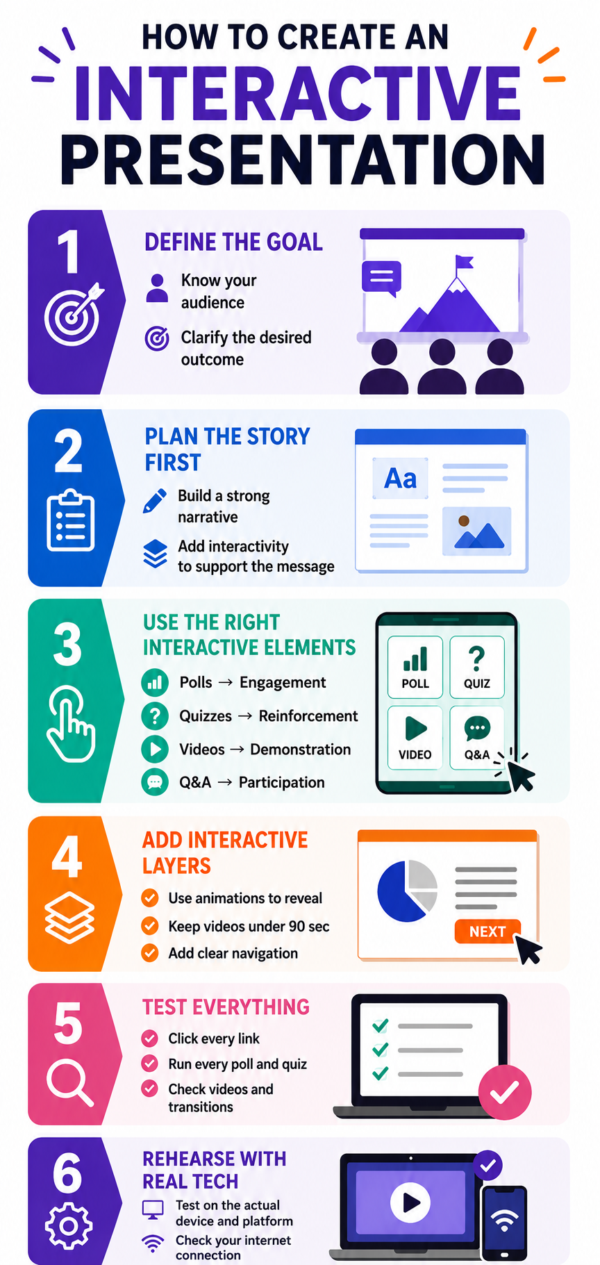
Step 5: Test the Flow From Start to Finish
Run through the entire presentation as if you are an audience member. Click every button. Answer every poll. Watch every embedded video. Check that each interactive moment lands at the right time, and that transitions back to your content feel smooth.
Ask a colleague to experience the deck cold. If they hesitate at any interactive prompt or skip past it, that element needs to be reworked or removed.
Step 6: Rehearse With the Tech
Interactive features depend on technology working as expected. Rehearse with the actual platform, screen, and internet connection you will use on presentation day. Test that polls load and videos play without lag.
A frozen poll or a video that fails to buffer kills interactive momentum faster than almost anything else.
6 Interactive Elements and When to Use Each
Knowing what each tool does is only half the equation. Knowing when to deploy it and when to leave it out separates a thoughtful interactive deck from a cluttered one. These presentation tips cover broader design principles that apply just as much to interactive elements as to static ones.
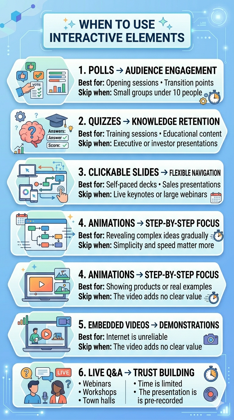
1. Polls: Best for Reading the Room
Polls shine at the start of a presentation or at transition points between major sections. They give the audience an immediate, low-effort way to participate. They also give you real-time data about who is in the room and what they care about.
Skip polls when your audience is smaller than ten people. In a small group, a verbal question creates a more personal connection than a digital poll will.
2. Quizzes: Best for Reinforcing Knowledge
Quizzes work exceptionally well in training decks, educational presentations, and any session where retention matters. Place them after you deliver a key concept so the audience can process and apply what they just learned.
Skip quizzes in executive briefings or investor pitches. Decision-makers want to evaluate your ideas, not be tested on them.
3. Clickable Slides: Best for Non-Linear Exploration
Clickable navigation turns a rigid slide sequence into a choose-your-own-path experience. This works well for self-paced decks and sales presentations where different stakeholders want different levels of detail.
Skip clickable slides in live keynotes or large webinars where you control the pace. Non-linear navigation in front of a large audience can feel disorganized if not thoroughly rehearsed.
Did You Know: Clickable slides are especially powerful for asynchronous presentations shared via email or link, which the viewer experiences alone, at their own pace.
4. Animations: Best for Controlled Reveals
Animations help you pace the delivery of information on a single slide. Bullet points that appear one at a time or diagrams that build piece by piece keep the audience focused on one idea at a time.
Skip animations when simplicity matters more than storytelling. In those cases, a clean, static slide communicates faster and with more authority than an animated one.
5. Embedded Videos: Best for Showing, Not Telling
Videos bring demonstrations and real-world context into your deck without forcing viewers to open a new tab or application. Use them when a visual explanation is stronger than a verbal one.
Skip videos when your internet connection is unreliable or when the video adds length without adding insight. If you cannot explain what the video accomplishes in one sentence, cut it.
6. Live Q&A: Best for Building Trust
Live Q&A signals transparency. It tells the audience you are confident enough to face unscripted questions. Use it at the end of webinars, town halls, and workshops where audience concerns need direct answers.
Skip live Q&A when time is extremely limited or when the format excludes spontaneous discussion, such as a pre-recorded presentation.
How to Avoid Overdoing Interactivity
The biggest risk with interactive presentations is too much engagement demand, not too little. When every slide demands something from the audience, participation starts to feel like work. The goal is rhythm, not relentless stimulation.
The Spacing Rule: One Interactive Moment Every 3-5 Slides
A practical rhythm is one interactive element every three to five slides. This gives the audience time to absorb your content between participation moments. It also keeps each interactive beat feeling fresh instead of repetitive.
A twenty-slide deck supports four to six interactive touchpoints total. That is more than enough to sustain engagement without exhausting your viewers.
Pro Tip: Map your interactive elements on a simple grid alongside your slide numbers. If you see two interactive moments back-to-back, move one or remove it entirely.
Mixing Element Types Keeps Energy Varied
反复使用同一种互动方式会降低其效果。一个连续包含五次投票的演示文稿会让人感到单调乏味,尽管每次投票理论上都能吸引参与。在投票、测验和可点击元素之间交替使用,让观众体验多样性。
把互动元素想象成调味料。每种加一点都能提升菜肴风味,但任何一种加太多都会盖过其他味道。
每个元素都应有明确的用途
在添加任何互动功能之前,问自己一个问题:它能实现什么静态幻灯片无法实现的功能?如果答案模糊不清,那这个元素就不应该存在。
能够收集真实观众反馈的投票才有其存在的价值。仅仅因为幻灯片看起来空荡荡而存在的投票则不然。对于那些只为满足演示者焦虑而非提升观众体验的互动功能,要毫不留情地删除。
警惕技术过载
互动元素越多,活动环节就越多。每个投票、嵌入视频或可点击按钮都可能成为潜在的故障点。添加得越多,现场演示时出现故障的可能性就越高。
保持你的互动层足够精简,以免单个技术故障破坏整个体验。对于演示文稿中的每个互动环节,都要准备一个口头备用方案。
注意: 最引人入胜的互动演示文稿让观众感觉毫不费力。这种轻松感源于克制,而非堆砌所有可用功能。
AI工具如何让制作互动演示文稿变得更简单
上述每一步手动操作都耗时费力。选择元素、将其放置在正确的幻灯片上以及格式化可点击导航会给你的工作流程增加数小时。而AI驱动的演示工具则能大幅缩短这一过程。
AI为你处理什么
现代AI演示平台会分析你的内容,并建议互动元素的最佳放置位置。你无需猜测哪张幻灯片需要投票,或哪里添加动画能增加价值,该工具会根据你的内容结构和受众类型推荐放置位置。
AI还会处理设计方面。投票、测验和可点击按钮会自动格式化以匹配你的视觉主题。你无需再为在几十张幻灯片中对齐形状和调整元素大小而进行繁琐的工作。
Presentations.AI 的用武之地
Presentations.AI 是一款 AI演示文稿制作工具 ,让你无需从头开始即可添加动画、嵌入式媒体和动态导航。只需描述你的主题或上传你的内容,该平台就会生成一份精美的演示文稿,其中已包含互动层。
在内容密集的章节后需要一个知识检测测验?一键即可添加。想要逐点揭示数据的渐进式动画?该 AI幻灯片创建器 它根据您的幻灯片内容进行构建。结果是生成一个完全交互式的演示文稿,所需时间仅为手动构建的一小部分。
专业提示: 将AI生成的交互式布局作为起点,然后根据您的特定受众和场景进行调整。该工具负责繁重的工作,而您则保留了创意控制权。
让您的下一次演示令人难忘
交互式演示是一种精心设计的体验,其中每个投票、测验和可点击元素都服务于一个明确的目的。其背后的原则很简单:明确目标,选择合适的元素,并有意识地放置它们。
从您的目标和受众开始。在添加互动元素之前,先勾勒出您的内容。将每个元素与它在叙述中需要完成的特定任务相匹配。每三到五张幻灯片安排一个互动点,这样节奏会感觉自然,而不是令人疲惫。然后在演示前测试所有内容。
令人遗忘的演示文稿与从头到尾引人入胜的演示文稿之间的区别,很少在于添加更多内容。在正确的位置添加正确的东西才是推动参与的关键。投票、测验、可点击导航、动画、嵌入式视频和实时问答,每一种都解决了特定的参与度问题。关键在于将每种元素与能创造最大价值的时刻相匹配。
Presentations.AI让您能够快速添加互动功能,从而专注于真正提升参与度的战略选择。从您的下一次演示开始,将这些步骤付诸实践。