Most of us keep looking at presentations day in and day out. After a point, we automatically tune out. A multimedia presentation tries to ensure that this doesn’t happen to your audience.
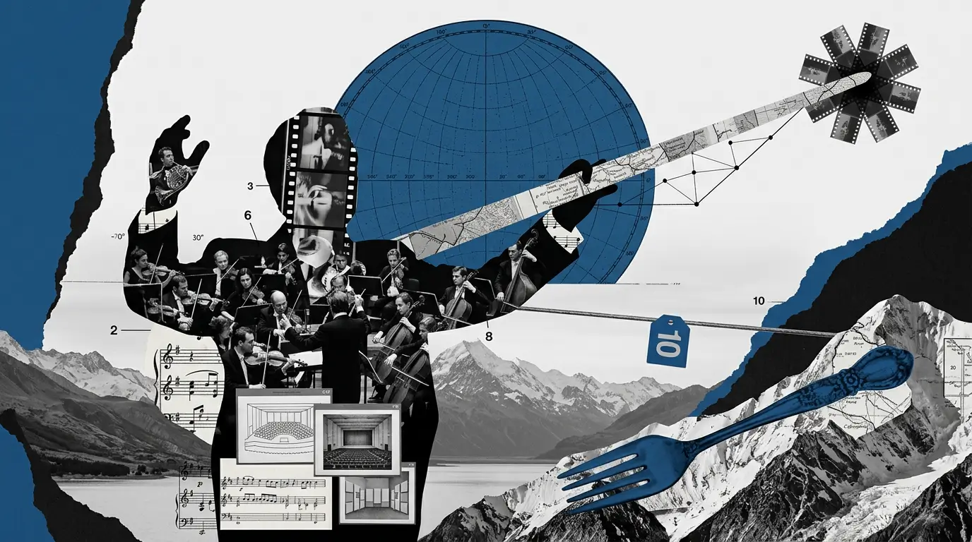
Multimedia presentations combine images, video, audio, animation, and interactive elements into a single deck. This gives your audience more ways to absorb and remember your message. The result is a presentation that feels dynamic and interactive.
Knowing that multimedia helps differs from knowing how to use it well. Which elements belong on which slides? How do you add video without making your file enormous? Where is the line between engaging and overwhelming?
This guide answers all of it. You will learn what multimedia presentations are, which building blocks they include, why they outperform plain slides, and how to build one step by step. Common mistakes and tools that simplify the process are also covered.
Key Takeaways
- Multimedia presentations combine text with images, video, audio, animation, and interactive elements to communicate ideas more effectively than plain slides.
- Each media type serves a specific purpose. Images anchor attention, video explains complexity, and animation guides the viewer through the story.
- Start with a clear goal and audience, then storyboard your content before choosing which media types belong on each slide.
- Common mistakes include overloading slides with too many elements, skipping accessibility, and using media that decorates rather than communicates.
- Presentations.AI lets you add images, video, and animation to any deck using AI. No design skills or extra tools needed.
What Is a Multimedia Presentation?
A multimedia presentation is a deck that combines two or more media types to deliver its message. Instead of relying on text and bullet points alone, it brings in images, video, audio, animation, or interactive content. Some decks use all of these elements, while others pick just one or two that fit the topic.
Callout: Multimedia presentation = any deck that goes beyond plain text and static bullet points by weaving in visuals, motion, sound, or interactivity.
Standard decks lean on walls of text, and the speaker reads aloud what the audience already sees on screen. Nothing on the slide adds meaning that the words alone could carry just as well.
A multimedia presentation takes a different approach. Each slide uses the media type best suited to the point it needs to make. A product demo might embed a short video instead of listing features in bullet points. A quarterly report might use animated charts. A training module might include an interactive quiz.
Multimedia presentations appear across nearly every setting where people share ideas:
- Sales teams use them in client pitches to show products in action
- Webinar hosts lean on them to keep remote audiences engaged.
- Trainers rely on them in onboarding programs
- Conference speakers use them to energize auditoriums
- Teachers build them for lessons where visuals hold attention better
The format is flexible, but the core principle stays the same: match the media to the message. In the sections ahead, you will learn which elements make up a multimedia deck, why they outperform plain slides, how to create a multimedia presentation from scratch, and which tools make the process faster.
The Core Elements of a Multimedia Presentation
Every multimedia deck draws from the same set of building blocks. Understanding what each element does and where it fits helps you choose wisely instead of piling everything onto one slide.
Images and Graphics
Static visuals are the foundation of most multimedia decks. Photos, illustrations, icons, and data visualizations give the audience something to anchor their attention on while you speak. A well-chosen image can set the tone for an entire section. A clean chart can make a data point land instantly.
The key is relevance. Every image should reinforce the point on that slide, not just fill space. Stock photos that feel generic weaken credibility. Custom graphics and purposeful data visualizations strengthen it.

Video and Audio
Embedded video lets you show what words struggle to describe. Product demos, customer testimonials, and screen recordings all work well inside a deck. Audio adds another layer. Narration guides self-paced viewers, and background music sets the mood.
The watch-out here is file size and timing. A two-minute video in a ten-slide deck can dominate the experience. Keep clips short, purposeful, and tested on the device you will present from.
Animation and Interactivity
Motion draws the eye. Animated charts that build bar by bar and kinetic text that reveals a headline word by word guide the viewer through your story at a controlled pace. Smooth slide transitions reinforce that sense of pacing.
Interactive content goes further. Clickable navigation lets audiences choose their own path. Embedded polls and quizzes turn passive viewers into participants. Live data connections keep numbers up to date without manual updates.
The risk with both is overuse. One or two animated moments per section feel polished. Animating every bullet point feels like a 2004 slideshow.
Through all of this, text still matters. Multimedia supports the message. Clear, concise writing remains the foundation that it supports.
Why Multimedia Presentations Work Better Than Plain Slides
Plain slides ask your audience to do one thing: read. Multimedia presentations ask them to watch, listen, and interact. That difference changes how much people absorb and how long they stay engaged.
Pairing a visual with a spoken explanation activates two processing channels at once. The audience takes in the image through one mental pathway and your narration through another. Those channels reinforce each other, which means your audience retains more than they would from text alone.
Did You Know: The brain processes visual and verbal information through separate channels. When both channels carry complementary content, like a diagram paired with narration, audiences absorb and recall significantly more than when they read text on its own. This is called dual-channel processing.
Varied media types also reset attention. A slide deck that looks the same from start to finish lets minds wander. Dropping in a short video clip after several static slides snaps focus back into place. An animated chart draws the eye in a way a static table never could. Each shift in media type acts like a small pattern interrupt that re-engages the room.
Multimedia also handles complexity better than text. A thirty-second animation can walk someone through a workflow that would need five dense bullet points to describe. A short audio clip of a customer explaining their experience lands harder than a pull quote on a slide.
A versatility advantage exists as well. A multimedia deck works live on stage, shared asynchronously over email, or posted on-demand for self-paced learning. The embedded media carries the message even when the speaker is absent from the room.
Finally, imagery and video create emotional tone. Text tells the audience what to think. Multimedia helps them feel it. If you want more ways to hold a room's attention beyond multimedia, there's a full list of presentation ideas worth trying.
How to Build a Multimedia Presentation Step by Step
Knowing the elements is one thing. Assembling them into a cohesive deck is another. This process works whether you are building your first multimedia presentation or upgrading an existing set of slides.
Define Your Goal and Audience
Start with two questions: what do you want the audience to do after this presentation, and what do they already know? A sales pitch to executives needs different media than a training module for new hires. The executive pitch might lean on short video testimonials and clean data visualizations. The training module might use interactive quizzes and step-by-step screen recordings.
Skipping this step is where media overload begins. Without a clear goal, every element feels equally important, and you end up cramming video and animation onto the same slide because you can, not because you should. Here's a practical guide to presentation tips that actually work if you want to go deeper on that.
Storyboard Before You Design
Once the goal is set, map the flow of your ideas before you open any tool. Write one key point per slide. Next to each point, note which media type best serves it. Some slides need nothing more than a strong image and a single sentence. Others genuinely call for an embedded video or an animated diagram.
Choosing a starting structure at this stage also saves time. Instead of staring at a blank canvas, begin with presentation templates that already handle layout, typography, and spacing. You can then swap in your own media assets without worrying about design fundamentals.
Assemble, Review, and Rehearse
With your storyboard and assets ready, start placing elements slide by slide. Keep visual consistency. Use the same font family, a limited color palette, and uniform image sizing throughout. Watch file sizes as you go. Compressing images and trimming video clips before embedding prevents a sluggish deck.
Once assembly is done, test every embed. Play each video. Click every interactive element. Check that animations trigger in the right order. Then rehearse the full presentation at least twice. The first run catches timing issues. The second run builds confidence.
Finally, choose the right export format for how the deck will be delivered. A live talk needs a format that preserves animations and embeds. An async share might work better as a video export or an interactive link. Matching the format to the context keeps your multimedia intact when it reaches the audience.
Common Mistakes That Weaken Multimedia Presentations
Adding media to a deck is easy. Using it well takes discipline. These are the mistakes that turn a promising multimedia presentation into a cluttered mess. If you are specifically building your deck with AI, there is a separate list of common AI presentation mistakes worth reading.
Overloading slides with too many media types at once. A slide with a video, an animated chart, and three competing images fights for attention. The audience has no clear focal point. Pick one focal element per slide and let it breathe.
Using video or audio without a clear purpose. A clip that looks impressive but fails to advance the message is decoration, not communication. Every piece of media should earn its place by doing something that text alone cannot.
忽略文件大小和兼容性。 一个50 MB的演示文稿加载时间过长。在笔记本电脑上播放正常的嵌入式视频,在会议室投影仪上可能会出现故障。在嵌入资产之前对其进行压缩,并在实际演示设备上进行测试。
对比度差、文字过小或颜色选择不当。 多媒体增加了幻灯片设计的复杂性。这种复杂性使得人们更容易忽视基本要素,例如可读性、高对比度、清晰的字体大小以及对色盲友好的调色板。
忽略无障碍性。 没有字幕的视频会将听力障碍观众排除在外。没有替代文本的图片会将屏幕阅读器用户排除在外。无障碍设计是强制性的,特别是对于异步共享给广大受众的演示文稿。
跳过使用实际技术设备的彩排。 动画在旧硬件上可能会卡顿。依赖互联网的嵌入内容在没有Wi-Fi的情况下会失效。在真实设备上进行全面彩排可以发现屏幕预览中遗漏的所有问题。
提示: 经验法则:幻灯片上的每一项媒体都应该回答“这是否能帮助我的观众理解或感受到仅凭文字无法传达的内容?”这个问题。如果不能,就删除它。
轻松制作多媒体演示文稿的工具
制作精美的多媒体演示文稿需要合适的工具,而非设计或视频编辑专业知识。合适的平台可以承担繁重的工作,让您专注于传达信息。
在这一领域,最大的转变是人工智能。现代AI工具可以自动生成布局、推荐视觉元素并处理设计决策。您无需盯着空白幻灯片思考视频放在哪里,工具会提出一个已经考虑了平衡和层次结构的布局。对于没有设计背景的人来说,这消除了制作多媒体演示文稿的最大障碍。
像PowerPoint和Canva这样的传统选项各有优势。PowerPoint提供深度定制。Canva简化了图库媒体的获取。Prezi增加了空间化的非线性导航。原生AI平台则采取了不同的方法,将所有功能整合到一个工作流程中。
Presentations.AI 的核心理念正是如此。它让您能够在一个平台上,利用 AI 生成的设计和内容,为任何演示文稿添加图片、视频和动画。无需在不同工具间切换、手动调整布局或具备专业设计知识。只需描述您的需求,平台即可为您组装一个多媒体演示文稿,供您润色和展示。您可以探索 AI 演示文稿制作工具 通过一个简单的提示词来构建多媒体演示文稿。
让多媒体为您的信息服务
多媒体演示文稿能为您提供比纯文本幻灯片更丰富的工具。图片能吸引注意力,视频能解释复杂概念,互动元素则能将被动观众转变为参与者。一旦您了解每个构成元素的作用及其适用场景,构建起来就会非常简单。
真正的技巧在于克制。每一张图片、每一个片段和动画都应服务于信息,而非喧宾夺主。从明确的目标开始,设计前先进行故事板规划,并在演示前在实际设备上测试所有内容。避免在每张幻灯片上都使用所有元素的冲动。
无论是向客户提案还是授课,一个精心制作的多媒体演示文稿都能传达纯文本无法表达的内容。选择合适的元素,有目的地放置它们,让媒体完成您的要点列表无法做到的工作。