TL;DR
- Interactive presentations use polls, quizzes, clickable navigation, and live Q&A to turn passive viewers into active, engaged participants throughout your deck.
- Embedded videos and purposeful animations add depth, but overusing them creates a distraction rather than the meaningful engagement you actually want from your audience.
- The best approach is to match each interactive element to a specific goal, such as reinforcing a point, checking understanding, or sparking real-time conversation.
- Spacing interactive moments every few slides keeps energy high without overwhelming your audience or breaking the narrative flow of your presentation.
- Presentations.AI works as an interactive presentation maker that lets you add polls, animations, and dynamic elements with AI-powered speed and simplicity.
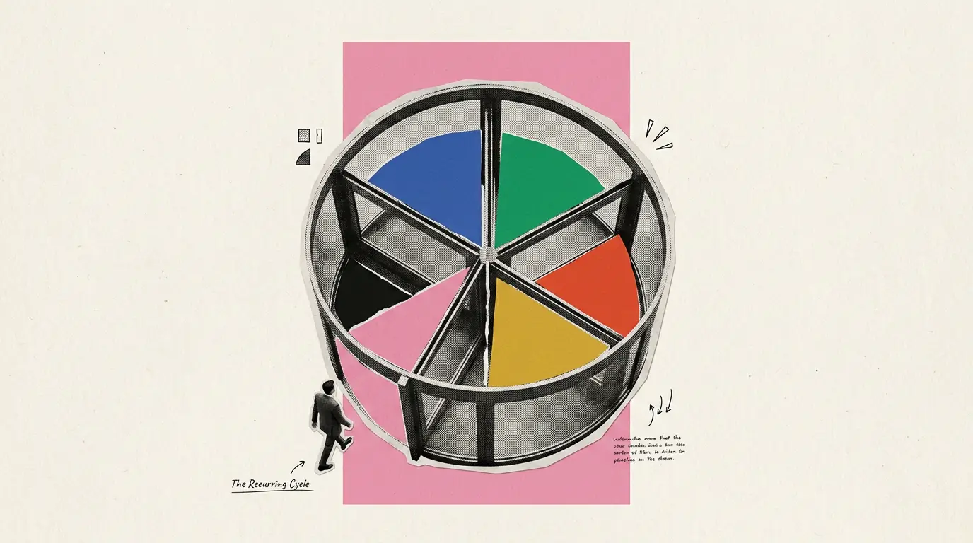
You built a polished deck with great visuals and a solid narrative. Halfway through, your audience drifts, eyes on phones, energy fading. Ever had this problem? The trouble is the format. Static slides ask people to sit and absorb. Interactive presentations ask them to participate.
Interactive features such as polls, quizzes, clickable slides, embedded videos, and live Q&A turn a one-way broadcast into a two-way conversation. They give your audience a reason to stay present. Knowing which elements to use, where to place them, and how many is enough takes a bit more intention.
This guide walks you through making an interactive presentation step by step. You will learn what each element does best and when to deploy it. You will also learn how to avoid the common trap of overdoing it. For a broader foundation, presentation skills cover the core habits that make any format work better, interactive or not.
What Makes a Presentation Interactive
The word interactive gets tossed around loosely. A single transition effect does not make a deck interactive. Adding a flashy GIF on slide four falls short as well. True interactivity means the audience does something, such as clicking, responding, voting, or choosing, and the presentation responds.
Passive vs. Interactive: The Core Difference
A passive presentation flows in one direction. The speaker talks. The audience watches. An interactive presentation creates feedback loops. The audience provides input, and the content adapts or acknowledges that input in real time.
Think of it this way: a passive deck is a lecture. An interactive deck is a conversation.
Note: If your audience can leave the room and the presentation runs the same without them, it is not interactive. It is a slideshow.
Why Interactivity Matters More Now
Audiences are conditioned by apps, feeds, and platforms that respond to every tap. They expect participation, whether you are presenting in a boardroom, a classroom, or a virtual meeting. Interactivity is the fastest way to hold attention and improve retention.
The goal is to make your audience feel like they are part of the presentation, not just watching it.
Pro Tip: Start by identifying two or three moments in your deck where the audience's attention naturally dips. Those are your best insertion points for interactive elements.
How to Make an Interactive Presentation Step-by-step
Building an interactive deck requires deliberate choices at each stage of your workflow. Cramming every feature into every slide undermines that goal. Follow these steps to create a presentation that earns and holds attention from the first slide to the last.
Step 1: Define Your Goal and Audience
Before you touch a single slide, clarify two things. What do you want the audience to do after this presentation? And who exactly is sitting in those seats?
A training session for new hires calls for quizzes that reinforce learning. A sales pitch to executives needs clickable navigation so they can jump to the sections that matter most to them. A webinar for hundreds of attendees benefits from live polls that make a large crowd feel seen.
Your goal shapes which interactive elements belong in the deck. Your audience shapes how many you can include without losing them.
Step 2: Outline Your Content Before Adding Interactivity
Write your narrative arc first. Before adding any interactive layer, it helps to sketch out a presentation outline that maps your key messages and transitions. Treat interactivity as a layer you add on top of a strong foundation, not a substitute for one.
A common mistake is designing around the interactive feature instead of the message. Polls are not filler. Quizzes are not decoration. Every interactive moment should serve a purpose you can name in one sentence.
Pro Tip: Draft your outline on paper or in a simple document first. Mark the specific slides where audience energy might dip. Those are your interactive insertion points.
Step 3: Choose the Right Element for Each Moment
Match each interactive feature to the job it needs to do at that point in the deck.
- Opening slides: Use a poll or an icebreaker quiz to warm up the room and signal that participation is expected.
- After a complex section, insert a quick knowledge-check quiz to reinforce what you just covered.
- During a case study or demo: Embed a short video so your audience sees the concept in action without leaving the deck.
- Mid-presentation energy dip: Add a clickable slide that lets the audience choose which topic to explore next.
- Closing section: Open a live Q&A to address what matters most to the people in the room.
The key principle is one element per moment, one purpose per element. Stacking a poll and an animation on the same slide creates noise, not engagement.
Step 4: Build Your Slides With Interactive Layers
Now create your slides. Place your core content first: headlines, body text, visuals. Then layer in the interactive components where your outline marked them.
For animations, use progressive reveals to walk through complex ideas one point at a time. Keep embedded video clips under 90 seconds, so they support your narrative rather than hijack it. For clickable navigation, label buttons clearly so viewers know exactly where each path leads.
Note: Every interactive element should feel like a natural extension of the slide, not something bolted on as an afterthought.
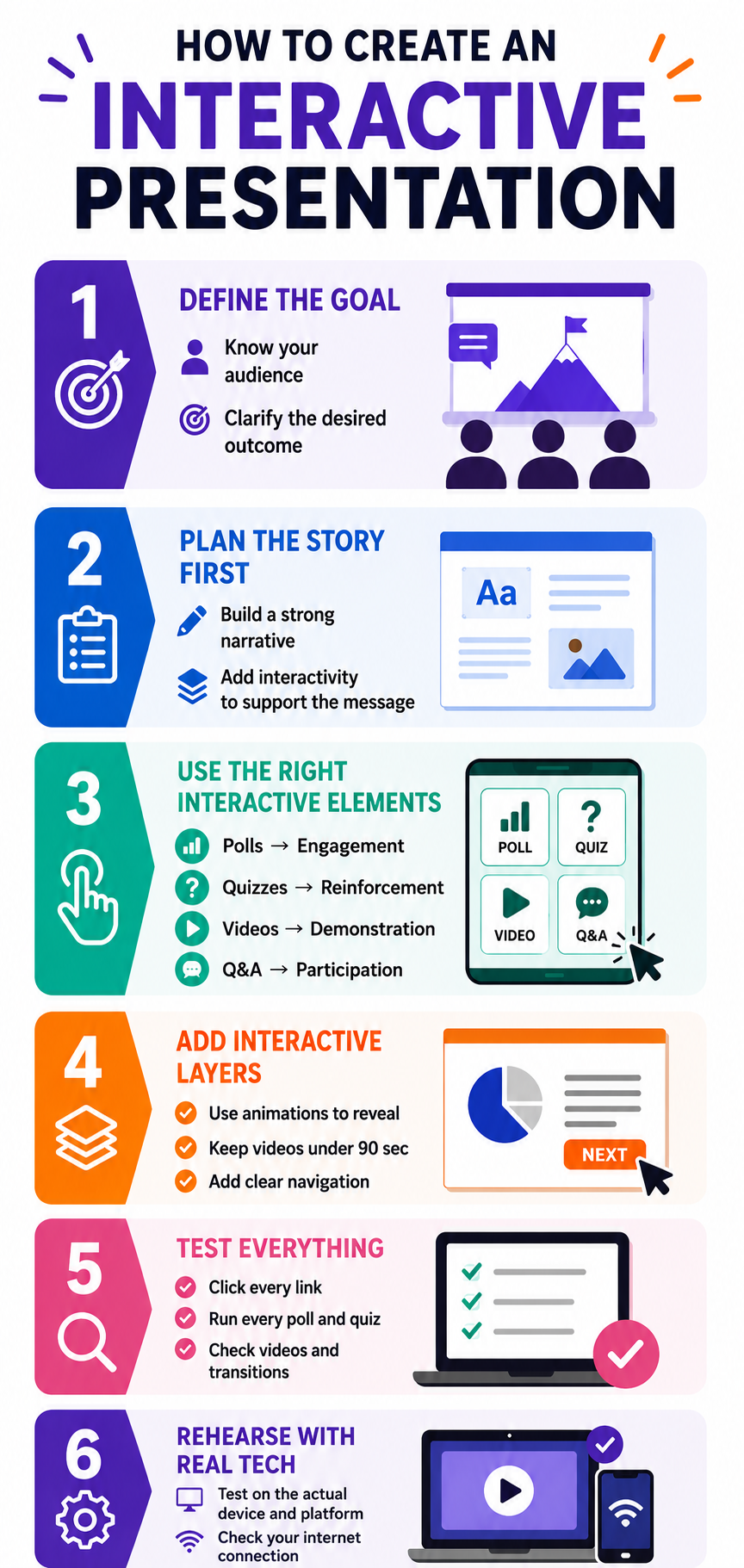
Step 5: Test the Flow From Start to Finish
Run through the entire presentation as if you are an audience member. Click every button. Answer every poll. Watch every embedded video. Check that each interactive moment lands at the right time, and that transitions back to your content feel smooth.
Ask a colleague to experience the deck cold. If they hesitate at any interactive prompt or skip past it, that element needs to be reworked or removed.
Step 6: Rehearse With the Tech
Interactive features depend on technology working as expected. Rehearse with the actual platform, screen, and internet connection you will use on presentation day. Test that polls load and videos play without lag.
A frozen poll or a video that fails to buffer kills interactive momentum faster than almost anything else.
6 Interactive Elements and When to Use Each
Knowing what each tool does is only half the equation. Knowing when to deploy it and when to leave it out separates a thoughtful interactive deck from a cluttered one. These presentation tips cover broader design principles that apply just as much to interactive elements as to static ones.
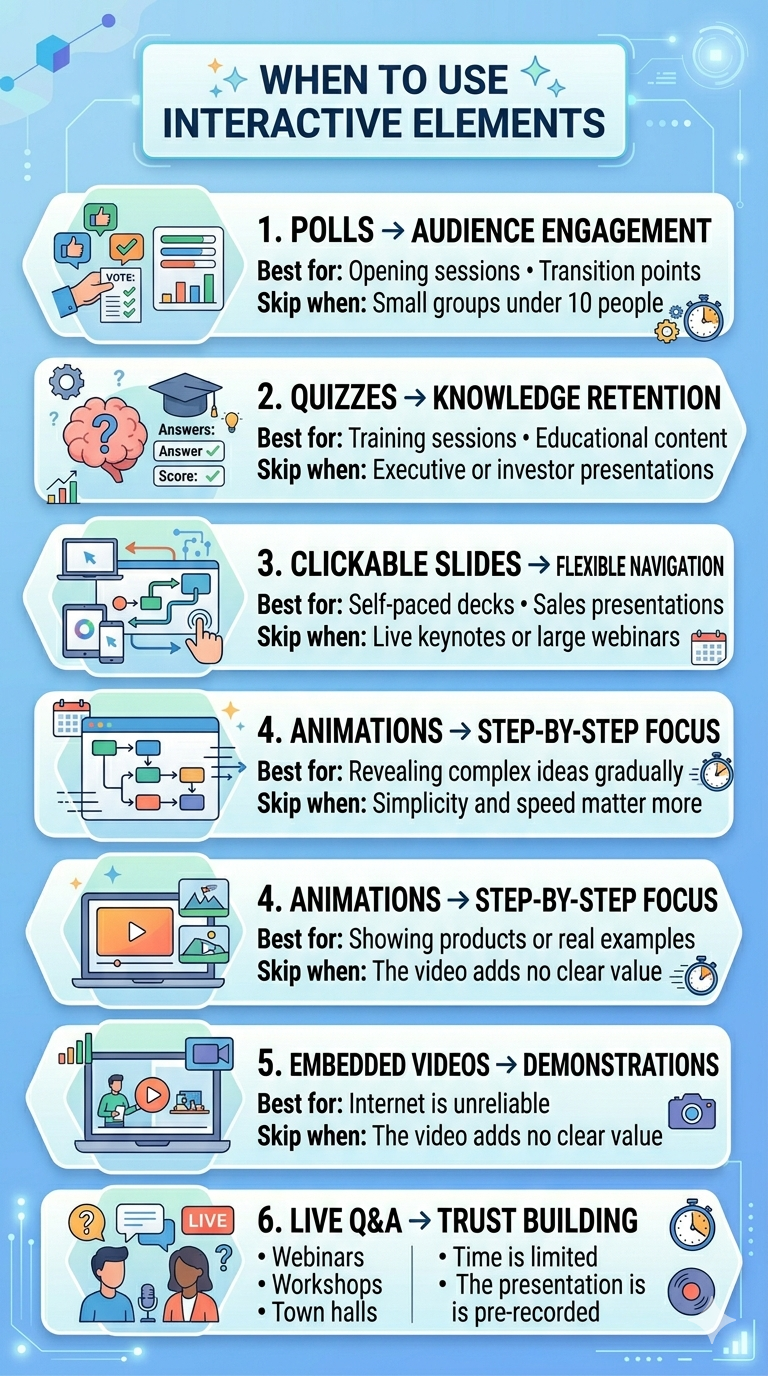
1. Polls: Best for Reading the Room
Polls shine at the start of a presentation or at transition points between major sections. They give the audience an immediate, low-effort way to participate. They also give you real-time data about who is in the room and what they care about.
Skip polls when your audience is smaller than ten people. In a small group, a verbal question creates a more personal connection than a digital poll will.
2. Quizzes: Best for Reinforcing Knowledge
Quizzes work exceptionally well in training decks, educational presentations, and any session where retention matters. Place them after you deliver a key concept so the audience can process and apply what they just learned.
Skip quizzes in executive briefings or investor pitches. Decision-makers want to evaluate your ideas, not be tested on them.
3. Clickable Slides: Best for Non-Linear Exploration
Clickable navigation turns a rigid slide sequence into a choose-your-own-path experience. This works well for self-paced decks and sales presentations where different stakeholders want different levels of detail.
Skip clickable slides in live keynotes or large webinars where you control the pace. Non-linear navigation in front of a large audience can feel disorganized if not thoroughly rehearsed.
Did You Know: Clickable slides are especially powerful for asynchronous presentations shared via email or link, which the viewer experiences alone, at their own pace.
4. Animations: Best for Controlled Reveals
Animations help you pace the delivery of information on a single slide. Bullet points that appear one at a time or diagrams that build piece by piece keep the audience focused on one idea at a time.
Skip animations when simplicity matters more than storytelling. In those cases, a clean, static slide communicates faster and with more authority than an animated one.
5. Embedded Videos: Best for Showing, Not Telling
Videos bring demonstrations and real-world context into your deck without forcing viewers to open a new tab or application. Use them when a visual explanation is stronger than a verbal one.
Skip videos when your internet connection is unreliable or when the video adds length without adding insight. If you cannot explain what the video accomplishes in one sentence, cut it.
6. Live Q&A: Best for Building Trust
Live Q&A signals transparency. It tells the audience you are confident enough to face unscripted questions. Use it at the end of webinars, town halls, and workshops where audience concerns need direct answers.
Skip live Q&A when time is extremely limited or when the format excludes spontaneous discussion, such as a pre-recorded presentation.
How to Avoid Overdoing Interactivity
The biggest risk with interactive presentations is too much engagement demand, not too little. When every slide demands something from the audience, participation starts to feel like work. The goal is rhythm, not relentless stimulation.
The Spacing Rule: One Interactive Moment Every 3-5 Slides
A practical rhythm is one interactive element every three to five slides. This gives the audience time to absorb your content between participation moments. It also keeps each interactive beat feeling fresh instead of repetitive.
A twenty-slide deck supports four to six interactive touchpoints total. That is more than enough to sustain engagement without exhausting your viewers.
Pro Tip: Map your interactive elements on a simple grid alongside your slide numbers. If you see two interactive moments back-to-back, move one or remove it entirely.
Mixing Element Types Keeps Energy Varied
Aynı tür etkileşimi tekrar tekrar kullanmak etkisini köreltir. Her anket teknik olarak katılımı davet etse de arka arkaya beş anket içeren bir deste monoton geliyor. İzleyicilerin çeşitlilikle karşılaşması için anketler, sınavlar ve tıklanabilir anlar arasında geçiş yapın.
Baharat gibi etkileşimli öğeleri düşünün. Her birinin bir tutamı yemeği geliştirir. Herhangi birinin çok fazlası tadı bastırır.
Her Elemanın Net Bir İşe İhtiyacı Var
Herhangi bir etkileşimli özellik eklemeden önce kendinize bir soru sorun: Bu, statik bir slaytın yapamadığı neyi başarır? Cevap belirsizse, öğe ait değildir.
Gerçek izleyici duyarlılığını toplayan bir anket yerini kazanıyor. Yalnızca slayt boş olduğu için var olan bir anket yoktur. İzleyicinin deneyiminden ziyade sunum yapan kişinin kaygısına hizmet eden etkileşimli özellikleri kesme konusunda acımasız olun.
Teknik Aşırı Yükü İzleyin
Daha etkileşimli öğeler, daha fazla hareketli parça anlamına gelir. Her anket, gömülü video veya tıklanabilir düğme potansiyel bir başarısızlık noktasıdır. Ne kadar çok eklerseniz, canlı sunumunuz sırasında bir şeyin kırılma şansı o kadar yüksek olur.
Etkileşimli katmanınızı, tek bir teknik aksaklığın tüm deneyimi rayından çıkarmayacak kadar yalın tutun. Destenizdeki her etkileşimli an için her zaman sözlü bir yedekleme planına sahip olun.
Not: En ilgi çekici etkileşimli sunumlar izleyiciye zahmetsiz geliyor. Bu zahmetsizlik, mevcut her özelliği paketlemekten değil, kısıtlamadan gelir.
Yapay Zeka Araçları İnteraktif Sunumlar Oluşturmayı Nasıl Kolaylaştırır
Yukarıda özetlenen her adım manuel olarak yapıldığında zaman alır. Öğeleri seçmek, bunları doğru slaytlara yerleştirmek ve tıklanabilir gezinmeyi biçimlendirmek iş akışınıza saatler ekler. Yapay zeka destekli sunum araçları bu süreci önemli ölçüde sıkıştırır.
Yapay Zeka Sizin İçin Ne İşe Yarar
Modern yapay zeka sunum platformları içeriğinizi analiz eder ve etkileşimli öğelerin en iyi nerede uyduğunu önerir. Araç, hangi slaytın anket gerektirdiğini veya bir animasyonun nerede değer kattığını tahmin etmek yerine, içerik yapınıza ve kitle türünüze göre yerleşimler önerir.
AI ayrıca tasarım tarafını da ele alır. Anketler, sınavlar ve tıklanabilir düğmeler görsel temanıza uyacak şekilde otomatik olarak biçimlendirilir. Düzinelerce slaytta şekilleri hizalama ve öğeleri yeniden boyutlandırma gibi sıkıcı çalışmayı atlarsınız.
Presentations.AI Nereye Uyuyor
Presentations.AI bir olarak çalışır AI sunum yapımcısı sıfırdan başlamadan animasyonlar, gömülü medya ve dinamik gezinme eklemenizi sağlar. Konunuzu tanımlayın veya içeriğinizi yükleyin, ve platform zaten yerleşik etkileşimli katmanlarla cilalı bir deste oluşturur.
Yoğun bir bölümden sonra bir bilgi kontrolü testine ihtiyacınız var? Bir tıklama ile ekleyin. Verileri her seferinde bir noktada ortaya çıkaran aşamalı animasyonlar mı istiyorsunuz? AI slayt oluşturucu bunları slayt içeriğinize göre oluşturur. Sonuç, manuel inşaatın gerektirdiği zamanın çok azında üretilen tamamen etkileşimli bir güvertedir.
Profesyonel İpucu: Başlangıç noktası olarak yapay zeka tarafından oluşturulan etkileşimli yerleşimleri kullanın, ardından hedef kitlenize ve ayarınıza göre ayarlayın. Alet, yaratıcı kontrolü korurken ağır kaldırma işlemlerini halleder.
Bir Sonraki Sunumunuzu İnsanların Gerçekten Hatırladığı Bir Şekilde Yapın
Etkileşimli bir sunum, her anketin, sınavın ve tıklanabilir öğenin net bir amaca hizmet ettiği kasıtlı olarak tasarlanmış bir deneyimdir. Arkasındaki ilkeler basittir: hedefinizi bilin, doğru unsurları seçin ve bunları niyetle yerleştirin.
Hedefiniz ve hedef kitlenizle başlayın. Etkileşimde katmanlama yapmadan önce içeriğinizi ana hatlarıyla belirtin. Her öğeyi anlatınızın o noktasında yapması gereken belirli işle eşleştirin. Bu anları her üç ila beş slaytta bir yerleştirin, böylece ritim yorucu değil doğal hissettirir. O zaman sunmadan önce her şeyi test edin.
Unutulabilir bir güverte ile baştan sona dikkat çeken güverte arasındaki fark, nadiren daha fazlasını eklemekle ilgilidir.. Doğru şeyleri doğru yerlere eklemek, katılımı yönlendiren şeydir. Anketler, sınavlar, tıklanabilir gezinme, animasyonlar, gömülü videolar ve canlı Soru-Cevap her biri belirli bir etkileşim sorununu çözer. Beceri, her birini en fazla değeri yarattığı anla eşleştiriyor.
Presentations.AI etkileşimli özellikleri hızlı bir şekilde katmanlamanıza olanak tanır, böylece etkileşimi gerçekten yönlendiren stratejik seçeneklere odaklanabilirsiniz. Bir sonraki sunumunuzla başlayın ve bu adımları uygulamaya koyun.