TL;DR
- Yapay zeka tarafından oluşturulan slaytlar her zaman insan eliyle bir düzenleme gerektirir. Bitmiş gibi görünen bir sunum, doğru bir sunumla aynı şey değildir.
- Metin yığılması, düzenlenmemiş bir yapay zeka sunumunun en belirgin işaretidir. Slayt başına bir net fikir kuraldır.
- Slaytlarınız birinin ödünç aldığı bir şablona benziyorsa, sorun tasarım tutarlılığıdır.
- Yapay zeka istatistikleri uydurabilir ve geçerliliği olmayan kendinden emin iddialarda bulunabilir. Sunmadan önce her veri noktasını doğrulayın.
- Presentations.ai gibi araçlar, akıllı düzenler, Brand Sync ve sohbet tabanlı düzenleme sayesinde bu sorunların çoğunu varsayılan olarak azaltır.
Yapay Zeka Sunum Araçları Neden Öngörülebilir Hatalar Üretir?
Yapay zeka sunum araçları, boş bir sayfadan bitmiş görünümlü bir sunuma ne kadar hızlı geçebileceğinizi değiştirdi. Ancak hız aynı zamanda bir sorunu da gizler. Yapay zeka tarafından oluşturulan slaytlar kutudan çıktığı gibi cilalı göründüğü için, düzenleme adımını atlamaya teşvik edilebilirsiniz.
Sunumun bir yapısı, görselleri ve mantıksal bir akışı var, bu yüzden bitmiş gibi hissettiriyor. Sonra sunumu yaparlar ve odanın ortasında bir yerde, sessizleştiklerinde, aslında tam olarak bitmediğini fark ederler.
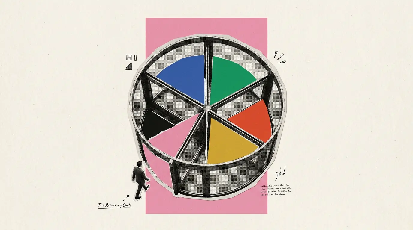
İnsanların yapay zeka sunumlarında yaptığı hatalar öngörülebilirdir. Bunlar rastgele değildir ve sizin hatanız da değildir. Bu araçların çalışma şeklinin ve neyi optimize etmek için tasarlandıklarının doğal bir sonucudur. Neye dikkat etmeniz gerektiğini bildiğinizde, düzeltmeler hızlıdır. Bu yazı, en yaygın yedi hatayı ele alıyor ve bir sonraki sunumunuzdan önce her birini nasıl düzelteceğinizi gösteriyor. İyi bir yapay zeka destekli slayt oluşturmanın baştan nasıl göründüğünü görmek isterseniz, Presentations.ai bakmaya değer.
Her yapay zeka sunum aracı temelde kabaca aynı şekilde çalışır. Ona bir komut verirsiniz; o da büyük bir veri kümesinden öğrendiği kalıplara dayanarak slayt içeriği oluşturur, ardından bu içeriğe görsel bir düzen uygular.
Yapamayacağı şeyler ise kitlenizi anlamak, kendi iddialarını doğrulamak, sizin özel bağlamınızda neyin en önemli olduğuna karar vermek veya vurgu ve ton hakkında yargı kararları vermektir.
Bu yüzden sunumu paylaşmadan önce kısa bir düzenleme kontrolü yapmanız gerekecek. Bu kalıpları baştan en aza indirmek için tasarlanmış bir araç arıyorsanız, Presentation.ai'nin yapay zeka sunum oluşturucusu düzenlemeye başlamadan önce bile en yaygın sorunları azaltan akıllı varsayılanlar içerir.
Yapay Zeka Sunum Araçları İçin İstem Yazarken Sık Yapılan 7 Hata
İstem yazarken ortak nokta, mümkün olduğunca spesifik olmak ve böylece hatalara veya yanlış yorumlamalara yer bırakmamaktır.
Hızlı Referans: 7 Hata ve Çözümleri
Hata
Hızlı Çözüm
Belirsiz istemler
Kitlenin kim olduğunu, neye karar vermeleri gerektiğini ve onlardan hangi eylemi beklediğinizi belirtin
Düzenlemeyi atlamak
Her üretimden sonra 10 dakikalık bir kontrol yapın: açılışı, kapanışı, madde işaretlerini ve verileri kontrol edin
Metin fazlalığı
Slayt başına bir fikir. Diğer her şeyi konuşmacı notlarına taşıyın veya kesin
Tutarsız tasarım
Oluşturmadan önce marka girdilerinizi ayarlayın, ardından görsel tutarlılığı slayt slayt doğrulayın
Doğrulanmamış bilgiler
Yapay zeka tarafından oluşturulan her istatistiği bir yer tutucu olarak kabul edin ve sunmadan önce doğrulayın
Çok fazla slayt
İstemde slayt sayınızı belirtin ve aslında yüksek sesle söylemeyeceğiniz her şeyi kesin
Anlatı akışı yok
Üç bölüme yeniden yapılandırın: sorun, çözüm, eylem
Tablo başlığı: Hataları en aza indirmek için manuel düzenleme ve kontrollere birkaç dakika ayırın
1. Hata: Yapay Zekaya Belirsiz Bir Komut Vermek
Kötü yapay zeka sunumlarının çoğu buradan başlar. Biri "Ürünümüz hakkında bir sunum yap" veya "3. çeyrek sonuçları hakkında bir sunum hazırla" yazar ve oluştur düğmesine basar. Araç elinden gelenin en iyisini yapar, ancak üzerinde çalışabileceği neredeyse hiçbir gerçek bağlamı yoktur. Girdi genel olduğu için çıktı da genel olur.
Yapay zeka araçları zihin okuyucu değildir. Onlara daha iyi ham madde verdiğinizde daha iyi çıktı üretirler. Belirsiz bir komut ile belirli bir komut arasındaki fark uzunluk meselesi değildir. Bu bir detay meselesidir.

Presentations.ai’nin Clip-E’si, bir sunum oluşturmadan önce daha fazla bağlam ister
Çözüm
Komutunuzu yazmadan önce üç soruyu yanıtlayın:
- Bu sunumu kimler görecek?
- Ne biliyorlar ve neye karar vermeleri gerekiyor?
- Son slayttan sonra ne yapmalılar?
Bu yanıtları komutunuza ekleyin. "İki tedarikçi seçeneğini değerlendiren bir Satış Başkan Yardımcısı için 10 slaytlık bir sunum hazırla. Hedef kitle sektörümüzü biliyor ancak ürünümüzü bilmiyor. Amaç, hafta sonuna kadar bir demo planlamak." gibi bir komut, tek satırlık bir komuttan daha iyi sonuçlar verecektir.
2. Hata: Çıktıyı Düzenlememek
Bu en yaygın hatadır ve bu listedeki diğer tüm hataları katlar. Yapay zeka tarafından oluşturulan slaytlar cilalı görünür. Temiz düzenlere, makul bir yapıya ve uygun görünen görsellere sahiptirler. Bu yüzden insanlar işin bittiğini varsayar ve sunumu hiç dokunmadan paylaşırlar.
Bir sunum profesyonel görsel tasarıma sahip olabilir ancak yine de boş ifadeler, hedef kitleniz hakkında yanlış varsayımlar, zayıf bir açılış ve hiçbir işe yaramayan bir kapanış slaytı içerebilir. Bunların hiçbiri ilk bakışta belli olmaz.
Çözüm
Her yapay zeka üretiminden sonra sürecinize kısa bir düzenleme aşaması ekleyin. Uzun olmasına gerek yok. Ne aradığınızı biliyorsanız, standart bir sunum için on dakika yeterlidir. Açılış slaytını okuyun ve şirketiniz hakkında hiçbir şey bilmeyen birine mantıklı gelip gelmeyeceğini sorun.
Kapanış slaytını okuyun ve belirli bir eylem içerip içermediğini kontrol edin. Her madde işaretini tarayın ve hedef kitlenizin kendi başına tahmin edemeyeceği hiçbir şey eklemeyenleri kaldırın. Yalnızca bu üç kontrol, yapay zeka tarafından oluşturulan çoğu sunumu önemli ölçüde iyileştirecektir.
Hata 3: Slaytları Metinle Aşırı Yüklemek
Yapay zeka araçları varsayılan olarak her şeyi detaylıca ele alma eğilimindedir. Onlara karmaşık bir konu verdiğinizde, onu tamamen ele almaya çalışırlar, bu da slaytları madde işaretleriyle doldurmaları anlamına gelir. Sonuç, her slaytın birinin yanlışlıkla sunuma dönüştürdüğü yazılı bir rapora benzediği bir sunumdur.
Metin dolu slaytlar, daha az metin içeren slaytlardan daha etkili iletişim kurmaz. Hatta daha az etkili iletişim kurarlar çünkü kitleniz dinlemek yerine okur ve ya geride kalır ya da ilgisini kaybeder. Bir sunum bir belge değildir. İki format farklı amaçlara hizmet eder.
Çözüm
Slayt başına bir fikir kuralını uygulayın. Her slayt tek bir net nokta içermelidir. Bir slaytta dört veya beş madde işareti varsa, kitlenizin en çok hangi tek şeyi hatırlamasını istediğinizi sorun. Bu, başlık olur. Diğer noktalar ya kesilir, ya kendi slaytlarına geçer ya da konuşmacı notlarınıza taşınır. Bir sunum sırasında slayt metnini kelimesi kelimesine yüksek sesle okurken bulursanız kendinizi, bu içeriğin slaytta değil, notlarda olması gerektiğinin bir işaretidir.
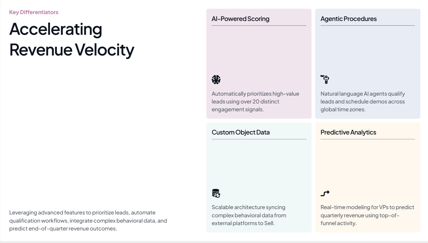
Presentations.ai tarafından oluşturulan bu slaytta, temel fikir gelir hızını artırmaktır
Kaynak
Hata 4: Tasarım Tutarlılığını Göz Ardı Etmek
Yapay zeka tarafından oluşturulan sunumlarla ilgili yaygın bir şikayet, şirketinizden gelmiş gibi değil, birinin ödünç aldığı bir şablona benzemeleridir. Renkler tam oturmamıştır. Yazı tipleri markanızla eşleşmez. Logo ilk slaytta vardır ve başka hiçbir yerde yoktur. Üçüncü slayta gelindiğinde, sunum zaten başkasına aitmiş gibi görünür.
Bu, çoğu yapay zeka sunum aracının siz söylemedikçe markanız hakkında hiçbir şey bilmemesinden kaynaklanır. Sahip oldukları varsayılan görsel temayı uygularlar; bu temiz görünebilir ancak sıfır marka kimliği taşır. Sunumunuz sizi hiç tanımayan bir karar vericiye ulaştığında, bu kimlik eksikliği bir sorundur.
Çözüm
Herhangi bir şey oluşturmadan önce, aracınızın markanızı bildiğinden emin olun. Minimumda, bu, birincil renklerinizi ve yazı tipinizi belirtmek ve logonuzu sağlamak anlamına gelir. Oluşturduktan sonra bunları manuel olarak ayarlıyorsanız, her slaytı gözden geçirmek ve görsel stilin baştan sona tutarlı olduğundan emin olmak için birkaç dakika daha ayırın. Simge setlerine, görsel tonuna ve arka plan düzenlemelerine dikkat edin, çünkü bunlar yapay zeka çıktısında slayttan slayta değişme eğilimindedir.
Hata 5: Yapay Zeka Tarafından Oluşturulan Gerçeklere Kontrol Etmeden Güvenmek
Yapay zeka araçları istatistikleri, pazar rakamlarını ve araştırma alıntılarını tam bir güvenle oluşturur. Bu rakamların bazıları doğrudur. Birçoğu ise değildir. Sorun şu ki, çıktıda gerçek olanlar ile uydurma olanlar arasında görünür bir fark yoktur. Aynı slaytta yan yana, aynı şekilde biçimlendirilmiş olarak dururlar ve hangilerini bir toplantıda gerçekten sunabileceğinize dair hiçbir gösterge yoktur.

Yapay zeka tarafından oluşturulan sunumlarda gördüğünüz sayıları her zaman doğrulayın
Kaynak
Gerçek rakamı bilen birinin de bulunduğu bir odada uydurma bir istatistik sunmak rahatsız edici bir deneyimdir. Bir yönetim kurulu sunumunda veya yatırımcı sunumunda böyle bir şey sunmak daha da kötüdür. Bu, sadece yanlış çıkan iddia hakkında değil, sunumunuzdaki diğer tüm iddialar hakkında soru işaretleri uyandırır.
Çözüm
Yapay zeka tarafından oluşturulan her istatistiği bir yer tutucu olarak kabul edin. Düzenleme aşamasında, bir tarayıcı sekmesi açın ve her veri noktasını birincil bir kaynakla doğrulayın. Kaynağı 30 ila 60 saniye içinde bulamazsanız, sayıyı gerçekten arkasında durabileceğiniz bir ifadeyle değiştirin. Belirli bir yüzde olmadan "önemli ölçüde daha hızlı" demek o kadar etkileyici olmayabilir, ancak geçerliliği olmayan bir yüzdeden çok daha güvenlidir. Önemli olan herhangi bir veri slaytı için, yapay zekadan sayıları uydurmasını istemek yerine, sayıları kendiniz sağlayın.
Presentations.AI'ın editörü, doğrulanmış verilerinizi düzeni bozmadan kolayca değiştirmenizi sağlar. Ücretsiz deneyin.
Gerçek kontrolü hakkında bir not
Bu, günümüzde hiçbir yapay zeka aracının tam olarak çözemediği tek hatadır. Doğrulama adımı her zaman size aittir. İyi bir aracın yapabileceği şey, tek tek slaytları düzenlemeyi ve doğrulanmış verilerinizi düzeni bozmadan değiştirmeyi kolaylaştırmaktır. Presentations.ai'ın düzenleme arayüzü, bu tür hedefe yönelik revizyonlar için tasarlanmıştır.
Hata 6: Çok Fazla Slayt Oluşturmak
Yapay zeka aracına slayt sayısı belirtmeden orta derecede karmaşık bir konu verdiğinizde, genellikle ihtiyacınızdan daha fazla slayt üretir. Araç, kapsamı optimize etmeye çalışır. Hiçbir şeyin dışarıda kalmadığından emin olmak ister, bu yüzden sunum kapsamlı hissedilene kadar her alt nokta ve alt-alt nokta için bir slayt ekler.
10 slayta ihtiyacınız varken 20 slaytlık bir sunum, argümanınıza daha fazla ağırlık katmaz. Aksine, onu seyreltir. Asıl noktanızın bulunduğu üç veya dört slayt, kimsenin istemediği bağlam ekleyen slaytların arasında kaybolur. Kitleniz konuyu kaybeder ve siz sunumu kesmeniz gereken slaytları aceleyle geçerek tamamlarsınız.
Çözüm
İstemde slayt sayınızı belirtin. "8 slaytlık bir sunum oluştur" ifadesi, ucu açık bir isteğe göre anlamlı ölçüde farklı bir çıktı verir. Oluşturduktan sonra, sunumu küçük resim görünümünde gözden geçirin ve her slayt için kendinize sorun: 5 dakikam daha az olsaydı, bundan gerçekten bahseder miydim? Cevap hayır ise, onu kesin. Net bir argümana sahip daha kısa bir sunum, her şeyi kapsayan uzun bir sunumdan daha iyi etki bırakır.
Hata 7: Anlatı Yapısını Atlamak
Yapay zeka sunum araçları, bilgiyi mantıksal bir sıraya göre düzenlemede iyidir. Ancak bir sonuca götüren bir argüman oluşturmada iyi değillerdir. İlgili konuların bir listesi ile bir kitleyi tanıdıkları bir sorundan istedikleri bir çözüme taşıyan bir sunum arasında fark vardır. Yapay zeka tarafından oluşturulan sunumların çoğu ilkini üretir.
Sonuç, slayt formatında okunan bir rapor gibi hissettiren bir sunumdur. Her slayt kendi başına anlamlıdır, ancak hiçbir şey birbiri üzerine inşa edilmez. Gerilim, dönüş noktası veya argümanın kurulumdan öneriye geçtiği bir an yoktur. Sunum hiçbir yere varmadığı için izleyiciler ilgisini kaybeder.
Çözüm
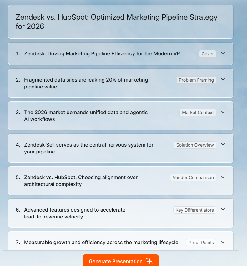
Sunumunuzu oluşturduktan sonra, onu üç ana bölüme ayırarak yeniden yapılandırın. İlk bölüm, yaklaşık ilk iki veya üç slayt, sorunu ve neden şimdi önemli olduğunu ortaya koyar. Orta bölüm, çözümünüzü destekleyici kanıtlarla sunar. Son bölüm, son bir veya iki slayt, belirli bir eylemi belirtir. Yapay zekanın oluşturduğu içerik büyük ölçüde iyi olabilir. Sıralama muhtemelen üzerinde çalışılmaya ihtiyaç duyar. Yapı bu şekli takip edene kadar slaytları hareket ettirmek genellikle yeterlidir. Bu konuya derinlemesine dalmak için, blogumuzu okuyun.
Presentations.ai Bu Hataları Varsayılan Olarak Nasıl Azaltır
Presentations.ai tarafından oluşturulan bir sunumun yapısı
Yukarıdaki hataların çoğu iki şeye bağlıdır: belirsiz girdiler ve atlanmış düzenleme. Presentations.ai her ikisini de azaltmak için oluşturulmuştur. Tüm özellik seti hakkında daha fazla bilgiyi şu adresten okuyabilirsiniz. Presentations.ai AI sunum yapımcısı sayfası, ama işte özellikle en yaygın sorunları nasıl ele alıyor.
Marka Senkronizasyonu: Şirketinizin URL'sini sağlayın ve Presentations.ai renklerinizi, yazı tiplerinizi ve logonuzu otomatik olarak çeker. Oluşturulan destedeki her slayt, herhangi bir manuel yapılandırma olmaksızın markanızı baştan yansıtır.
Presentations.ai markanızın renklerini ve yazı tiplerini doğrudan URL'nizden alabilir
Esnek şablonlar: Mizanpajlar, içeriği kaldırdığınızda kırılmak yerine düzenledikçe uyarlanır. Bu, düzeni sıfırdan yeniden oluşturmadan slaytları basitleştirmeyi ve metni kesmeyi kolaylaştırır. Presentation.ai dosyalarına göz atın şablonlar burada.
Çoklu giriş formatları: Metin isteminin ötesinde PDF'leri, Word belgelerini yükleyebilir veya başlangıç noktanız olarak bir URL yapıştırabilirsiniz. Bu, konunuzla ilgili genel bilgilerden ziyade gerçek içeriğinizdeki AI'yı temel alır.
Clip-E konuşma düzenleme: Nesilden sonra, bir sohbet arayüzü aracılığıyla desteyi iyileştirirsiniz. Belirli bir slaytın diğer slaytlara dokunmadan yeniden yazılmasını, kısaltılmasını veya yeniden yapılandırılmasını isteyin. Bu, düzenlemenin daha hızlı ve daha hedefli geçmesini sağlar.
PowerPoint dışa aktarma: Desteler tam sadakatle .pptx dosyasına aktarılır. Yazı tipleri, düzenler ve marka öğeleri bozulmadan aktarılır, böylece düzenleyicide gördüğünüz şey, kitlenizin sunuyu PowerPoint'te açtıklarında gördükleri şeydir.
Bunların hiçbiri düzenleme kartınıza, özellikle veri doğrulama adımına olan ihtiyacı ortadan kaldırmaz. Ancak, düzeltmeniz gereken şeylerin sayısını azaltır ve kalan düzeltmelerin uygulanmasını daha hızlı hale getirir.
Kısacası
Yapay zeka sunum araçları gerçekten kullanışlıdır. Bitmiş güverteler ürettikleri için yararlı değildirler. Yararlıdırlar çünkü çok hızlı bir şekilde güçlü ilk taslaklar üretirler, bu da size boş bir slayt ve son tarih yerine çalışabileceğiniz gerçek bir şey verir.
Bu gönderideki yedi hatanın tümü aynı temel sorundan kaynaklanıyor: AI çıktısını sadece bir başlangıç noktası olduğunda yapıldığı gibi ele almak. Düzeltmeler karmaşık değil. Daha iyi istemler, kısa bir düzenleme geçişi, bir slayt sayısı kısıtlaması, bir yapı kontrolü ve doğrulanmış veriler, AI tarafından oluşturulan çoğu desteyi iyi görünen bir şeyden gerçekten işe yarayan bir şeye dönüştürecektir.
Marka tutarlılığı ve düzen sorunlarını otomatik olarak ele alan ve düzenleme kartınızın biçimlendirme yerine içeriğe odaklanabilmesi için bir araçla başlamak istiyorsanız, Presentations.ai bunun için oluşturulmuştur. presentations.ai adresinde ücretsiz deneyin.
Presentations.ai ile Daha İyi Sunumlar Oluşturun
Fikirden bitmiş güverteye dakikalar içinde geçin.
Presentations.ai Ücretsiz Deneyin
(Kredi Kartı Gerekmez)