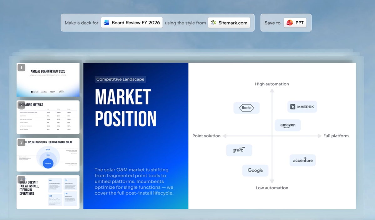
TL;DR
- Slide yang dihasilkan AI selalu membutuhkan sentuhan edit dari manusia. Presentasi yang terlihat selesai tidak sama dengan presentasi yang akurat.
- Teks berlebihan adalah tanda paling jelas dari presentasi AI yang belum diedit. Satu ide jelas per slide adalah aturannya.
- Jika slide Anda terlihat seperti template pinjaman, konsistensi desain adalah masalahnya.
- AI dapat menghalusinasi statistik dan membuat klaim yang meyakinkan tetapi tidak berdasar. Verifikasi setiap titik data sebelum Anda mempresentasikannya.
- Alat seperti Presentations.ai mengurangi sebagian besar masalah ini secara default melalui tata letak cerdas, Brand Sync, dan pengeditan percakapan.
Mengapa Alat Presentasi AI Menghasilkan Kesalahan yang Dapat Diprediksi
Alat presentasi AI telah mengubah seberapa cepat Anda dapat beralih dari halaman kosong ke presentasi yang terlihat selesai. Namun kecepatan juga menyembunyikan masalah. Karena slide yang dihasilkan AI terlihat rapi sejak awal, Anda mungkin tergoda untuk melewatkan langkah pengeditan.
Presentasi tersebut memiliki struktur, visual, dan alur logis, sehingga terasa sudah selesai. Kemudian mereka mempresentasikannya, dan di tengah ruangan, saat mereka terdiam, mereka menyadari bahwa presentasi itu ternyata belum sepenuhnya selesai.
Kesalahan yang dibuat orang dengan presentasi AI dapat diprediksi. Itu bukan acak, dan itu bukan salah Anda. Itu adalah hasil alami dari cara kerja alat-alat ini dan apa yang dioptimalkan untuknya. Setelah Anda tahu apa yang harus dicari, perbaikannya cepat. Posting ini membahas tujuh kesalahan paling umum dan menunjukkan cara memperbaikinya sebelum presentasi Anda berikutnya. Jika Anda ingin melihat seperti apa pembuatan slide berbantuan AI yang baik sejak awal, Presentations.ai patut dicoba.
Setiap alat presentasi AI bekerja kurang lebih dengan cara yang sama secara internal. Anda memberinya perintah; ia menghasilkan konten slide berdasarkan pola yang telah dipelajari dari kumpulan data besar, lalu menerapkan tata letak visual pada konten tersebut.
Yang tidak bisa dilakukannya adalah memahami audiens Anda, memverifikasi klaimnya sendiri, memutuskan apa yang paling penting dalam konteks spesifik Anda, atau membuat penilaian tentang penekanan dan nada.
Jadi Anda perlu melakukan pengeditan singkat sebelum membagikan presentasi tersebut. Jika Anda mencari alat yang dirancang untuk meminimalkan pola-pola ini sejak awal, Presentation.ai’s pembuat presentasi AI memiliki pengaturan default cerdas yang mengurangi masalah paling umum bahkan sebelum Anda mulai mengedit.
7 Kesalahan Umum Saat Menulis Prompt untuk Alat Presentasi AI
Kunci utamanya saat menulis prompt adalah agar sespesifik mungkin, sehingga meminimalkan ruang untuk kesalahan atau salah tafsir.
Panduan Singkat: 7 Kesalahan dan Cara Mengatasinya
Kesalahan
Solusi Cepat
Prompt yang tidak jelas
Sertakan siapa audiensnya, apa yang perlu mereka putuskan, dan tindakan apa yang Anda inginkan dari mereka
Melewatkan pengeditan
Luangkan 10 menit untuk memeriksa setelah setiap generasi: periksa pembukaan, penutup, poin-poin, dan data
Teks berlebihan
Satu ide per slide. Pindahkan yang lainnya ke catatan pembicara atau hapus saja
Desain tidak konsisten
Tetapkan input merek Anda sebelum membuat, lalu verifikasi konsistensi visual slide demi slide
Fakta yang belum diverifikasi
Perlakukan setiap statistik yang dihasilkan AI sebagai placeholder dan verifikasi sebelum presentasi
Terlalu banyak slide
Tentukan jumlah slide Anda di prompt dan potong apa pun yang tidak akan Anda ucapkan dengan lantang
Tidak ada alur narasi
Restrukturisasi menjadi tiga bagian: masalah, solusi, tindakan
Keterangan tabel: Luangkan beberapa menit untuk pengeditan dan pemeriksaan manual guna meminimalkan kesalahan
Kesalahan 1: Memberikan Prompt yang Tidak Jelas kepada AI
Di sinilah sebagian besar presentasi AI yang buruk bermula. Seseorang mengetik "Buat presentasi tentang produk kami" atau "buat dek tentang hasil Q3" lalu menekan tombol hasilkan. Alat tersebut sudah berusaha sebaik mungkin, tetapi hampir tidak memiliki konteks nyata untuk dikerjakan. Hasilnya menjadi umum karena masukannya juga umum.
Alat AI bukanlah pembaca pikiran. Mereka menghasilkan keluaran yang lebih baik ketika Anda memberi mereka bahan mentah yang lebih baik. Perbedaan antara prompt yang tidak jelas dan yang spesifik bukanlah masalah panjang. Ini adalah masalah detail.

Clip-E dari Presentations.ai meminta lebih banyak konteks sebelum menghasilkan presentasi
Solusi
Sebelum Anda mengetik prompt Anda, jawab tiga pertanyaan:
- Siapa yang akan melihat presentasi ini?
- Apa yang sudah mereka ketahui, dan apa yang perlu mereka putuskan?
- Apa yang harus mereka lakukan setelah slide terakhir?
Masukkan jawaban-jawaban ini ke dalam prompt Anda. Prompt seperti "Buat dek 10 slide untuk VP Penjualan yang mengevaluasi dua opsi vendor. Audiens mengetahui industri kami tetapi tidak produk kami. Tujuannya adalah untuk menjadwalkan demo pada akhir minggu" akan menghasilkan hasil yang lebih baik daripada prompt satu baris.
Kesalahan 2: Tidak Mengedit Hasil Keluaran
Ini adalah kesalahan paling umum, dan memperparah setiap kesalahan lain dalam daftar ini. Slide yang dihasilkan AI terlihat rapi. Mereka memiliki tata letak yang bersih, struktur yang masuk akal, dan visual yang tampak sesuai. Jadi orang-orang menganggap pekerjaan sudah selesai dan membagikan dek tersebut tanpa menyentuhnya.
Sebuah dek bisa memiliki desain visual yang profesional namun masih berisi frasa kosong, asumsi yang salah tentang audiens Anda, pembukaan yang lemah, dan slide penutup yang tidak mengatakan apa pun yang berguna. Tidak ada satu pun dari itu yang terlihat sekilas.
Solusi
Sertakan proses pengeditan singkat ke dalam alur kerja Anda setelah setiap generasi AI. Tidak perlu lama. Sepuluh menit sudah cukup untuk dek standar jika Anda tahu apa yang harus dicari. Baca slide pembuka dan tanyakan apakah itu akan masuk akal bagi seseorang yang tidak tahu apa-apa tentang perusahaan Anda.
Baca slide penutup dan periksa apakah itu berisi tindakan spesifik. Pindai setiap poin dan hapus yang tidak menambahkan apa pun yang tidak bisa ditebak sendiri oleh audiens Anda. Ketiga pemeriksaan itu saja akan secara signifikan meningkatkan sebagian besar dek yang dihasilkan AI.
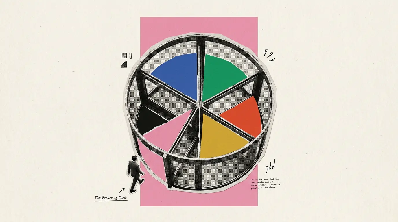
Kesalahan 3: Membanjiri Slide dengan Teks
Alat AI secara bawaan cenderung menyeluruh. Ketika Anda memberi mereka topik yang kompleks, mereka berusaha membahasnya secara lengkap, yang berarti mereka memenuhi slide dengan poin-poin. Hasilnya adalah sebuah dek presentasi di mana setiap slide terlihat seperti laporan tertulis yang tidak sengaja diubah menjadi presentasi.
Slide yang penuh teks tidak berkomunikasi lebih efektif daripada slide dengan teks yang lebih sedikit. Mereka berkomunikasi kurang efektif karena audiens Anda membaca daripada mendengarkan, dan mereka bisa tertinggal atau kehilangan minat. Presentasi bukanlah dokumen. Kedua format tersebut memiliki tujuan yang berbeda.
Solusinya
Terapkan aturan satu ide per slide. Setiap slide harus menyampaikan satu poin yang jelas. Jika sebuah slide memiliki empat atau lima poin, tanyakan hal tunggal apa yang paling Anda ingin audiens Anda ingat. Itu menjadi judul utama. Poin-poin lainnya bisa dihapus, mendapatkan slide sendiri, atau dipindahkan ke catatan pembicara Anda. Jika Anda mendapati diri Anda membaca teks slide kata demi kata selama presentasi, itu adalah tanda bahwa konten tersebut seharusnya ada di catatan, bukan di slide.
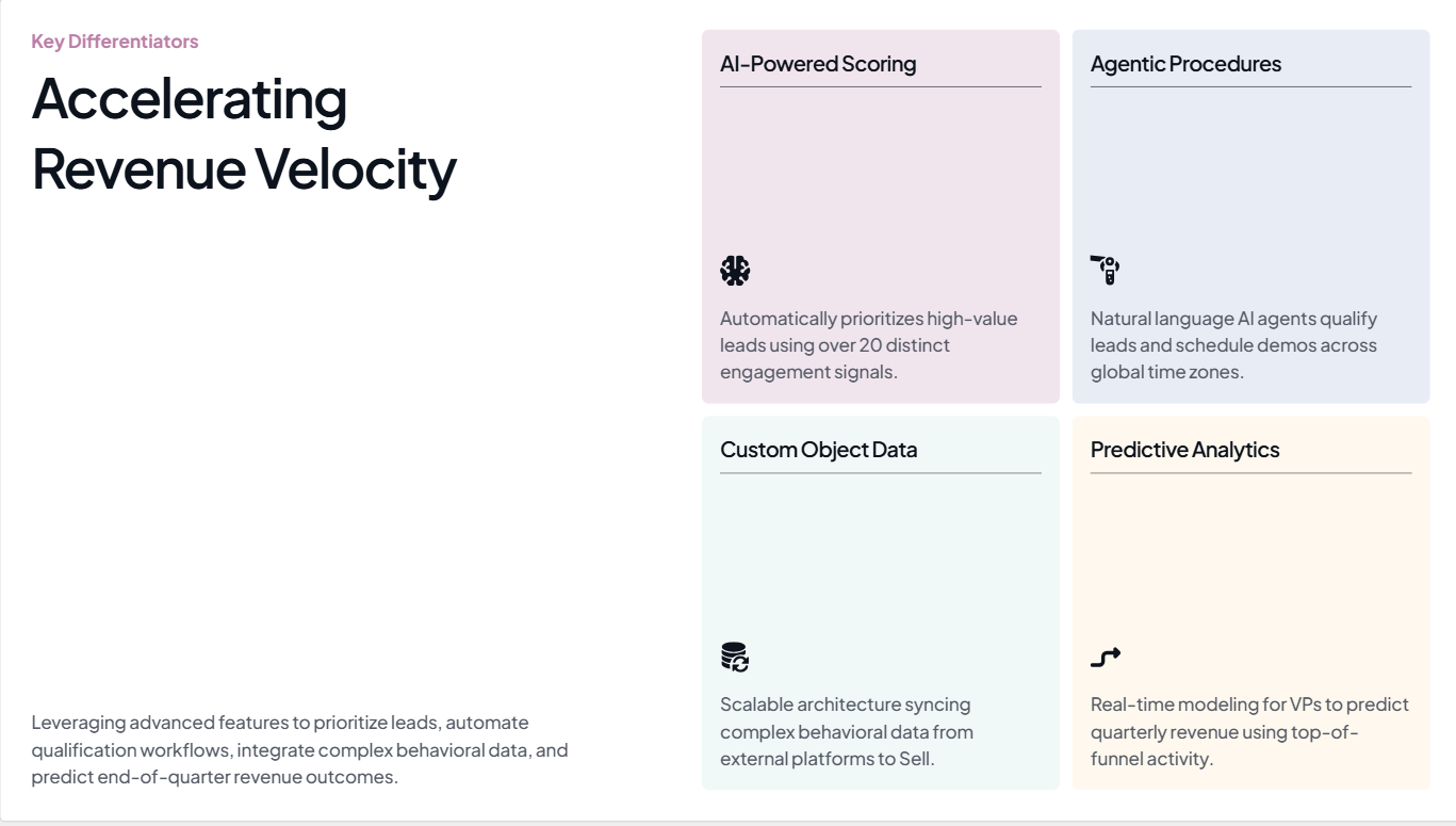
Pada slide ini yang dihasilkan oleh Presentations.ai, ide utamanya adalah mempercepat laju pendapatan
Sumber
Kesalahan 4: Mengabaikan Konsistensi Desain
Keluhan umum tentang presentasi yang dihasilkan AI adalah bahwa tampilannya seperti templat pinjaman, bukan seperti sesuatu yang berasal dari perusahaan Anda. Warnanya sedikit melenceng. Font-nya tidak sesuai dengan merek Anda. Logo hanya ada di slide pertama dan tidak di tempat lain. Pada slide ketiga, dek presentasi sudah terlihat seperti milik orang lain.
Ini terjadi karena sebagian besar alat presentasi AI tidak mengetahui apa pun tentang merek Anda kecuali Anda memberitahunya. Mereka menerapkan tema visual default apa pun yang mereka miliki, yang mungkin terlihat bersih tetapi tidak memiliki identitas merek sama sekali. Ketika dek presentasi Anda sampai ke pembuat keputusan yang belum pernah bertemu Anda, kurangnya identitas itu menjadi masalah.
Solusinya
Sebelum Anda menghasilkan apa pun, pastikan alat Anda mengetahui merek Anda. Minimal, itu berarti menentukan warna dan font utama Anda, serta menyediakan logo Anda. Jika Anda menyesuaikannya secara manual setelah pembuatan, luangkan beberapa menit ekstra untuk memeriksa setiap slide dan memastikan gaya visualnya konsisten dari awal hingga akhir. Perhatikan set ikon, nada gambar, dan perlakuan latar belakang, karena hal-hal tersebut cenderung bergeser dari slide ke slide dalam output AI.
Kesalahan 5: Mempercayai Fakta yang Dihasilkan AI Tanpa Memeriksanya
Alat AI akan menghasilkan statistik, angka pasar, dan kutipan penelitian dengan keyakinan penuh. Beberapa angka tersebut akurat. Banyak yang tidak. Masalahnya adalah tidak ada perbedaan yang terlihat antara yang asli dan yang dibuat-buat dalam output. Mereka berdampingan di slide yang sama, diformat secara identik, tanpa indikasi mana yang benar-benar dapat Anda presentasikan dalam rapat.

Selalu verifikasi angka yang Anda lihat pada presentasi yang dihasilkan AI
Sumber
Mempresentasikan statistik yang dihalusinasi di depan ruangan yang berisi seseorang yang mengetahui angka sebenarnya adalah pengalaman yang tidak nyaman. Mempresentasikannya dalam dek dewan direksi atau presentasi investor lebih buruk. Ini menimbulkan pertanyaan tentang setiap klaim lain dalam presentasi Anda, bukan hanya yang ternyata salah.
Solusinya
Anggap setiap statistik yang dihasilkan AI sebagai *placeholder*. Saat Anda melakukan penyuntingan, buka tab browser dan verifikasi setiap titik data dengan sumber primer. Jika Anda tidak dapat menemukan sumbernya dalam 30 hingga 60 detik, ganti angka tersebut dengan pernyataan yang benar-benar bisa Anda pertanggungjawabkan. "Jauh lebih cepat" tanpa persentase spesifik memang tidak terlalu mengesankan, tetapi jauh lebih aman daripada persentase yang tidak akurat. Untuk setiap slide data yang penting, berikan angka-angkanya sendiri daripada meminta AI untuk mengarangnya.
Editor Presentations.AI memudahkan Anda untuk mengganti data yang sudah terverifikasi tanpa merusak tata letak. Cobalah secara gratis.
Catatan tentang pemeriksaan fakta
Ini adalah satu-satunya kesalahan yang belum bisa sepenuhnya diatasi oleh alat AI mana pun saat ini. Langkah verifikasi selalu menjadi tanggung jawab Anda. Yang bisa dilakukan oleh alat yang baik adalah memudahkan Anda mengedit slide individual dan mengganti data yang sudah terverifikasi tanpa mengganggu tata letak. Antarmuka penyuntingan Presentations.ai dirancang untuk revisi terarah semacam itu.
Kesalahan 6: Membuat Terlalu Banyak Slide
Ketika Anda memberikan topik yang cukup kompleks kepada alat AI tanpa menentukan jumlah slide, biasanya alat tersebut akan menghasilkan lebih banyak slide daripada yang Anda butuhkan. Alat tersebut mengoptimalkan cakupan. Alat tersebut ingin memastikan tidak ada yang terlewat, sehingga ia menambahkan slide untuk setiap sub-poin dan sub-sub-poin hingga presentasi terasa komprehensif.
Presentasi 20 slide padahal Anda hanya butuh 10 slide tidak akan membuat argumen Anda lebih kuat. Justru akan mengencerkan argumen Anda. Tiga atau empat slide yang berisi poin utama Anda akan terkubur di antara slide-slide yang menambahkan konteks yang tidak diminta siapa pun. Audiens Anda akan kehilangan fokus, dan Anda akan menghabiskan presentasi dengan terburu-buru melewati slide-slide yang seharusnya Anda potong.
Solusinya
Tentukan jumlah slide Anda dalam *prompt*. "Buat presentasi 8 slide" akan menghasilkan keluaran yang jauh berbeda dibandingkan permintaan yang tidak spesifik. Setelah dihasilkan, tinjau presentasi dalam tampilan *thumbnail* dan tanyakan pada diri Anda, untuk setiap slide: apakah saya benar-benar akan membicarakan ini jika waktu saya berkurang 5 menit? Jika jawabannya tidak, potonglah. Presentasi yang lebih singkat dengan argumen yang jelas akan lebih efektif daripada presentasi panjang yang mencakup segalanya.
Kesalahan 7: Melewatkan Struktur Naratif
Alat presentasi AI bagus dalam mengatur informasi menjadi urutan yang logis. Namun, alat tersebut tidak pandai dalam menyusun argumen yang mengarah pada kesimpulan. Ada perbedaan antara daftar topik terkait dan presentasi yang menggerakkan audiens dari masalah yang mereka kenali menuju solusi yang mereka inginkan. Sebagian besar presentasi yang dihasilkan AI menghasilkan yang pertama.
Hasilnya adalah presentasi yang terasa seperti laporan yang dibaca dalam format slide. Setiap slide masuk akal secara terpisah, tetapi tidak ada yang saling membangun. Tidak ada ketegangan, tidak ada perubahan, tidak ada momen di mana argumen bergeser dari pengantar ke rekomendasi. Audiens menjadi tidak tertarik karena presentasi tidak mengarah ke mana-mana.
Solusinya
Setelah Anda menghasilkan presentasi, restrukturisasi menjadi tiga bagian. Bagian pertama, kira-kira dua atau tiga slide pertama, menetapkan masalah dan mengapa itu penting sekarang. Bagian tengah menyajikan solusi Anda dengan bukti pendukung. Bagian terakhir, satu atau dua slide terakhir, menyebutkan tindakan spesifik. Konten yang dihasilkan AI mungkin sebagian besar baik-baik saja. Urutannya mungkin perlu diperbaiki. Memindahkan slide hingga strukturnya mengikuti bentuk tersebut biasanya sudah cukup. Untuk mendalami topik ini, baca blog kami.
Bagaimana Presentations.ai Mengurangi Kesalahan Ini Secara Default
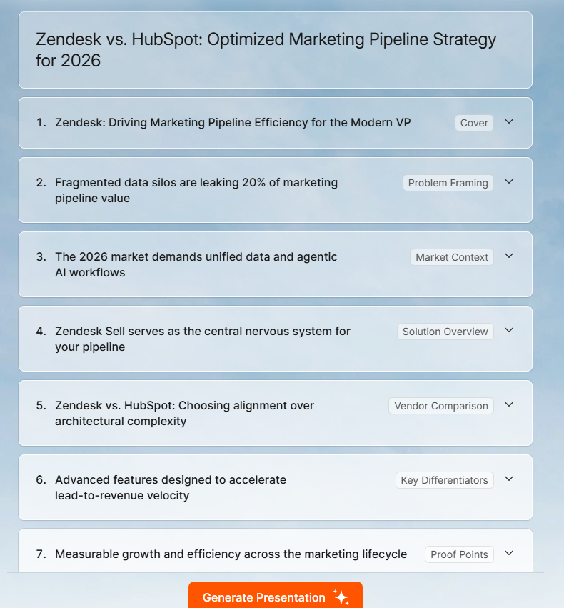
Struktur presentasi yang dihasilkan oleh Presentations.ai
Sebagian besar kesalahan di atas bermuara pada dua hal: input yang tidak jelas dan pengeditan yang dilewati. Presentations.ai dibangun di sekitar mengurangi keduanya. Anda dapat membaca lebih lanjut tentang set fitur lengkap di Halaman pembuat presentasi AI Presentations.ai, tetapi inilah cara ini secara khusus mengatasi masalah yang paling umum.
Sinkronisasi merek: Berikan URL perusahaan Anda, dan Presentations.ai secara otomatis menarik warna, font, dan logo Anda. Setiap slide di dek yang dihasilkan mencerminkan merek Anda sejak awal, tanpa konfigurasi manual apa pun.
Presentations.ai dapat mengambil warna dan font merek Anda langsung dari URL Anda
Template fleksibel: Tata letak beradaptasi saat Anda mengedit alih-alih rusak saat Anda menghapus konten. Itu membuatnya lebih mudah untuk menyederhanakan slide dan memotong teks tanpa membangun kembali tata letak dari awal. Lihat Presentation.ai templat di sini.
Beberapa format masukan: Selain prompt teks, Anda dapat mengunggah PDF, dokumen Word, atau menempelkan URL sebagai titik awal Anda. Itu mendasari AI dalam konten Anda yang sebenarnya daripada informasi umum tentang topik Anda.
Pengeditan percakapan Clip-E: Setelah generasi, Anda memperbaiki dek melalui antarmuka obrolan. Mintalah slide tertentu untuk ditulis ulang, dipersingkat, atau direstrukturisasi tanpa menyentuh slide lainnya. Itu membuat pengeditan berlalu lebih cepat dan lebih bertarget.
Ekspor PowerPoint: Dek diekspor ke.pptx dengan kesetiaan penuh. Font, tata letak, dan elemen merek ditransfer utuh, jadi apa yang Anda lihat di editor adalah apa yang dilihat audiens Anda ketika mereka membuka presentasi di PowerPoint.
Semua ini tidak menghilangkan kebutuhan akan tinjauan pengeditan Anda, terutama langkah verifikasi data. Namun, ini mengurangi jumlah hal yang perlu Anda perbaiki dan membuat perbaikan yang tersisa lebih cepat untuk diterapkan.
Intinya
Alat presentasi AI benar-benar bermanfaat. Manfaatnya bukan karena menghasilkan dek yang sudah jadi. Manfaatnya adalah karena alat ini menghasilkan draf pertama yang kuat dengan sangat cepat, yang memberi Anda sesuatu yang nyata untuk dikerjakan alih-alih slide kosong dan tenggat waktu.
Ketujuh kesalahan dalam postingan ini semuanya berasal dari masalah inti yang sama: memperlakukan output AI sebagai produk jadi padahal itu hanyalah titik awal. Perbaikannya tidak rumit. Prompt yang lebih baik, tinjauan pengeditan singkat, batasan jumlah slide, pemeriksaan struktur, dan data terverifikasi akan mengubah sebagian besar dek yang dihasilkan AI dari sesuatu yang terlihat lumayan menjadi sesuatu yang benar-benar berfungsi.
Jika Anda ingin memulai dengan alat yang secara otomatis menangani konsistensi merek dan masalah tata letak, sehingga tinjauan pengeditan Anda dapat berfokus pada konten alih-alih pemformatan, Presentations.ai dibuat untuk tujuan tersebut. Coba gratis di presentations.ai.
Buat Presentasi yang Lebih Baik dengan Presentations.ai
Dari ide hingga dek yang selesai dalam hitungan menit.
Coba Presentations.ai Gratis
(Tidak Perlu Kartu Kredit)