You've seen the demos: A prompt goes in, a full deck comes out in minutes. Will this actually hold up when a real audience sees it?
That's the right question to ask. Some AI presentations are good. Others are generic. The difference has nothing to do with whether AI can make slides (it clearly can) and everything to do with which tool you use and what you put into it.
This breakdown covers the four things that actually determine quality: Design, content accuracy, customization, and how AI decks compare to hand-built ones. We'll use Presentations.AI as a real example of what better AI output actually looks like.
Before judging AI output, it helps to be clear about the standard. A good presentation does four things:
- The message lands, and your audience walks away with the right takeaway.
- Slides support what you're saying instead of distracting from it.
- The brand, tone, and specifics reflect your company’s brand.
- Clean export, no formatting collapse, no font weirdness.
Let’s dive deeper into the factors that make a presentation good.
TL;DR
- AI presentations can look genuinely professional in 2026, but the tool you pick makes all the difference.
- Vague prompts = generic slides. Give the AI real source material, and you get real output.
- Brand consistency, editable exports, and conversational editing separate good tools from bad ones.
- AI handles the structure and design. You still own the story and the judgment call.
- The fastest way to find out if it works for you: try it with a real deck, not a demo prompt.
Design Quality: What Do AI Slides Actually Look Like?
This is usually the first thing people are skeptical about, and rightly so. Early AI presentation tools produced slides that looked like they were made in 2009 PowerPoint during a lunch break. That has changed, but not evenly across all tools.
Where AI design holds up in 2026
The best AI presentation tools now produce slides with visual hierarchy: Clear headers, balanced whitespace, readable fonts, and one idea per slide. They understand layout logic. A three-point slide distributes content in a visually organized way rather than just stacking bullet points.
Presentations.AI is a useful example here. Its AI presentation maker generates slides polished enough to send across to a stakeholder without redesigning them.
Layouts adapt as your content changes, so adding an extra point doesn't cause the whole slide to break. Browse the template library to see the design range it works within.
If you want to see what polished presentation design actually looks like across different use cases, the presentation examples library is a useful reference point before you start building.
Where AI design still looks "AI-made"
A few tells still give away lower-quality AI output.
- Stock imagery that's too perfect and too generic (smiling people in offices, handshakes on white backgrounds)
- Layouts that look identical slide after slide, just with different text swapped in
- Color palettes that default to the tool's brand instead of yours
- Icon choices that feel slightly off for your industry
The fix for most of these is brand configuration. Tools that automatically pull your colors, logo, and fonts from your company URL (like Presentations.AI's Brand Sync feature) eliminate the "made by a robot" feel almost entirely. The slides stop looking generic and start looking like your team built them.
Content Accuracy: Can AI Get the Facts Right?
If you feed an AI tool a vague prompt like "Make me a deck on marketing strategy," you'll get something that doesn’t really add any value. Generic headings, broad statements, nothing specific to your company, your market, or your actual strategy. It's not wrong, exactly. It's just not useful.
Content accuracy improves when you give the tool something real to work with. Upload a strategy doc, a product brief, a PDF report, or paste in your speaker notes. When AI tools can read your source material, they stop hallucinating and start summarizing. The output reflects your actual data instead of what a language model thinks a marketing strategy deck should contain.
The caveat: AI still misses nuance. It doesn't know the three words your CEO hates seeing on slides. It doesn't know that your Q3 numbers need context before they're mentioned. It doesn't know a prospect's specific objection.
That's not a reason to avoid AI tools. It's a reason to review the output before hitting send. Think of AI as a very fast first-draft writer who needs an editor, not a replacement for one. For a practical checklist on what to look for when reviewing any deck, see presentation tips that actually improve your output.
Customization: How Much Can You Actually Change?
You put a prompt into the AI presentation maker and get a deck; it looks clean. Then you try to customize it. You add a fourth bullet to a three-bullet slide, and the layout collapses. You swap a section title, and the spacing gets messed up. You want to add an actual case study, and there's no obvious way to do it without rebuilding the slide from scratch.
Rigid templates with an AI wrapper are common. They generate a first draft, but the moment you deviate from their preset structure, they break. That's a problem when your presentation has specific requirements.
What to look for in a tool that actually handles customization well:
- Adaptable layouts: Templates that adapt as your content changes rather than requiring content to fit them.
- Conversational editing: The ability to type "make this section shorter" or "add a comparison slide here" and have the AI do it.
- Multi-device editing: Presentations you can update on your laptop, hand off to a colleague, or present from a tablet without losing formatting.
- Multilingual support: If you present to global audiences, this matters more than most tools acknowledge.
Presentations.AI is built around the idea that editing should work the same way generation does: through natural language. Its AI assistant (Clip-E) handles restructuring, rewriting, and layout changes on request. You can explore what this looks like on the homepage.
AI Decks vs. Hand-Built Decks
Let’s take a look at where the two types of decks differ.
The real-world answer for most teams: AI handles most of what you need, and handles it faster. The remaining is your expertise, your story, and your relationship with the audience. A hand-built deck puts 100% on you for everything, including the parts AI is genuinely better at.
The teams getting the best results aren't choosing between AI and manual. They use AI to build a solid, branded, structured first draft in minutes, then apply human judgment where it's needed.
The Three Tiers of AI Presentation Tools
Not all AI presentation tools are equal. They fall into three quality levels:
Tier 1: Prompt-to-draft generators
Fast, minimal, and shallow. You put in a prompt and get a rough deck in seconds. The content reads as if it were written by someone who skimmed the topic, and the layouts are repetitive. You'll spend as much time fixing the output as building from scratch.
Tier 2: Template platforms with AI added on
Tools like Canva Presentations and Beautiful.ai started as design platforms and later layered in AI features. The design range is broader, but the AI layer is thin: it might suggest layouts or auto-fill text, but it doesn't understand your content deeply. The platform's template logic limits customization.
Tier 3: AI-native platforms built around the full workflow
These tools generate, refine, and iterate using natural language throughout the process. Brand identity applies automatically. Layouts flex as content grows. Export quality is reliable. Presentations.AI sits in this tier, designed from the start to keep AI in the loop from first prompt to final export. The tier you use determines whether AI presentations feel like a shortcut or a real solution.
When AI Wins and When to Build by Hand
Here are the use cases where you can use AI and those that can be crafted by hand.
Use AI for:
- Weekly team updates and internal reviews (clear, fast, on-brand).
- First-draft sales decks your team customizes for each prospect.
- Conference talks and webinars where you already have the content and just need a structure.
- Board decks and reports built from existing documents (upload the source, let AI organize it).
- Any situation where you're building multiple similar decks per week.
- Any presentation where the structure and flow matter more than visual creativity. If you need help with that side of things, this guide on how to start a presentation is worth a read first.
Build by hand (or use AI as a starting point only) for:
- High-stakes pitches where the narrative has to be surgically precise.
- Creative presentations like product launches or brand reveals where originality matters.
- Situations where you're presenting to someone who knows every detail of the topic.
- Decks with complex data visualizations that require careful manual treatment.
Real-World Demo: The Same Slide, Two Ways
Descriptions of AI presentations only tell you so much. Here's what the actual process looks like, start to finish, for the same competitive landscape slide, built in PowerPoint and built in Presentations.AI.
How this slide was built in PowerPoint
Open the template. The first thing you do is delete. Extra shapes, background decorations, placeholder graphics, and text boxes you'll never use. That takes a few minutes just to clear the canvas.
Now add your content. Text boxes in PowerPoint don't snap to logical positions, so you drag them around, resize them, and nudge them pixel by pixel until they sit where you want. The alignment guides help, but not reliably when you're working with multiple overlapping elements.
Color boxes and background fills need to be sent to the back explicitly; otherwise, they cover your text. Then bring your text boxes to the front. Double-check that your layer order is correct on every element. If you have a logo, add it. Resize it. Check the color against your brand guide. Resize it again.
Add your chart or diagram. PowerPoint's native charts are functional but not beautiful out of the box. Match the font to your deck font. Match the color to your palette. Adjust the axis labels. Make sure it reads clearly at the font size you're using.
Go back and check alignment on everything. Redo the logo color because you realized it's 2% off. Export as PDF to see how it looks outside editing mode. Notice that one text box is clipping. Fix it.
1スライドあたり約15分。スライド数で計算してみてください。
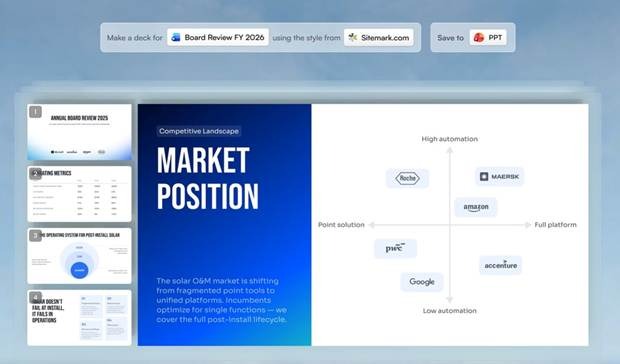
Presentations.AIでこのスライドがどのように作成されたか
会社のURLを入力してください。Brand Syncがそれを読み取り、色、フォント、ロゴを自動的に抽出します。16進数コードの入力も、手動でのアップロードも、スタイルガイドを別のタブで開く必要もありません。
ソース資料は、PDF、Word文書、スプレッドシート、テキストフィールドの生メモなど、どのような形式でもアップロードできます。AIがそれを読み取り、内容に基づいて利用するため、でたらめに作成されることはありません。
テンプレートを選択するか、スタイルを記述します。「当社のブランドを使用して、2026年度の役員会レビュー資料を作成してください」と指示を入力すると、AIがすべてのスライドにわたって、構造化されたブランドに沿った資料を生成します。
ここからは、微調整を行うだけです。慌てて修正する必要はありません。例えば、次のようなプロンプトを使用できます。
- 「スライド3をもっと簡潔にしてください。」
- 「スライド2の後に競合分析のスライドを追加してください。」
- 「導入が堅苦しすぎるので、もう少しくだけた感じにしてください。」
AIは各リクエストを再構築ではなく編集として処理します。作業が完了したら、最終配布用にPowerPointにエクスポートしてください。ファイルは編集可能で、正しくフォーマットされており、フォントも保持されています。
デッキ全体の80%完成状態までの合計時間は、時間単位ではなく、数分で済みます。
PowerPointが悪いというわけではありません。問題は、PowerPointがデザインの負担をすべてあなたに課すことです。AIは本来あなたの仕事ではない部分を取り除き、あなたがメッセージに集中できるようにします。
ステップごとの比較を並べて見てみましょう。
では、AIが生成したプレゼンテーションは本当に良いのでしょうか?
簡潔に言えば、はい。適切なツールを選び、実際に使える情報を提供すれば、良いものができます。
より詳しく言えば、「AIプレゼンテーション」と一口に言っても、その範囲は非常に広いものです。あるツールは、ありきたりで印象に残らないスライドしか作れません。また別のツールは、顧客に送ったり、役員会議で発表したりするのに本当に使えるような資料を作成します。どのツールを使うかによって、アウトプットの品質はそれほど大きく異なります。
これまでに説明した内容から、以下の点を覚えておくと良いでしょう。
テクノロジーそのものよりも、ツールが重要です。AIというカテゴリー自体に、本質的な良し悪しはありません。一流のプロンプトからスライドを生成するツールと、Presentations.AIのような三流プラットフォームは、どちらも「AIツール」ですが、その成果物は雲泥の差です。悪い最初の経験だけで、そのカテゴリー全体を判断しないでください。
入力内容がアウトプットを決定します。曖昧なプロンプトからは、曖昧なスライドしか生まれません。実際の資料、ブリーフィング、データ、戦略文書などをアップロードすれば、あなたの仕事内容を正確に反映したスライドが得られます。
AIはあなたの判断力を置き換えるものではなく、判断力を必要としない部分を処理するだけです。レイアウト、ブランドの一貫性、ドラフトの構成、エクスポート形式。これらのどれも、そもそもあなたの専門知識を必要としませんでした。AIがそれらを処理することで、あなたは専門知識が必要な部分に集中できるようになります。
もし今でもすべてのスライドを手作業で作成しているなら、切り替えることによる投資対効果は非常に大きいです。時間の節約だけでなく、特に週に複数の資料を作成している場合は、アウトプットの一貫性においても効果があります。
自分の意見を形成する最善の方法は、テスト用のプロンプトではなく、実際に必要なプレゼンテーションで試してみることです。そうすることで、それがあなたのユースケースに合っているかどうかを確認できます。